dev.SYS
Index:
1.Introduction
Prelude
Aim
Result
Resources
Limitations
Studies
2.System
3.Organisation
4.Generation
5.Co-relation in the anatomy
6.Edge Variations
7.Battle between Uniformity and Legibility (WIP)
8.Application of study (WIP)
9.Construction of DEV.NMBRS (WIP)
10.Graphical Representation
1. Introduction
1.1. Prelude
In 2018, our team pitched a few merchandising designs for a Bollywood movie called Gully Boy by Excel entertainment. We recommended the type Shumi®, which is a bold typeface with minimal negative space.The negative space formed small lines in-between the fills of the form interpreted by us to represent small gullies or lanes. The brief required us to create visual representation of phrases from Hindi songs. We used elements from Shumi to create these phrases. Since these phrases merely took into account a few glyphs, we worked around the ones that were required at that time.The translation of an existing Latin Font to a Devnagri counterpart, stirred our curiosity to map out all the similarities relative to these both scripts.

︎First Iteratins of the glyphs 2018
So we extended this exercise for the 36daysoftype 2019. Where we created 25 Devanagri glyphs deriving attributes from Shumi.
Here is where we learnt how much the Devanagri script variates. And the level of discipline it takes to map out this complete translation. Due to a lot of inconsistencies we had create our own system that kept everything as uniform and organised as possible.


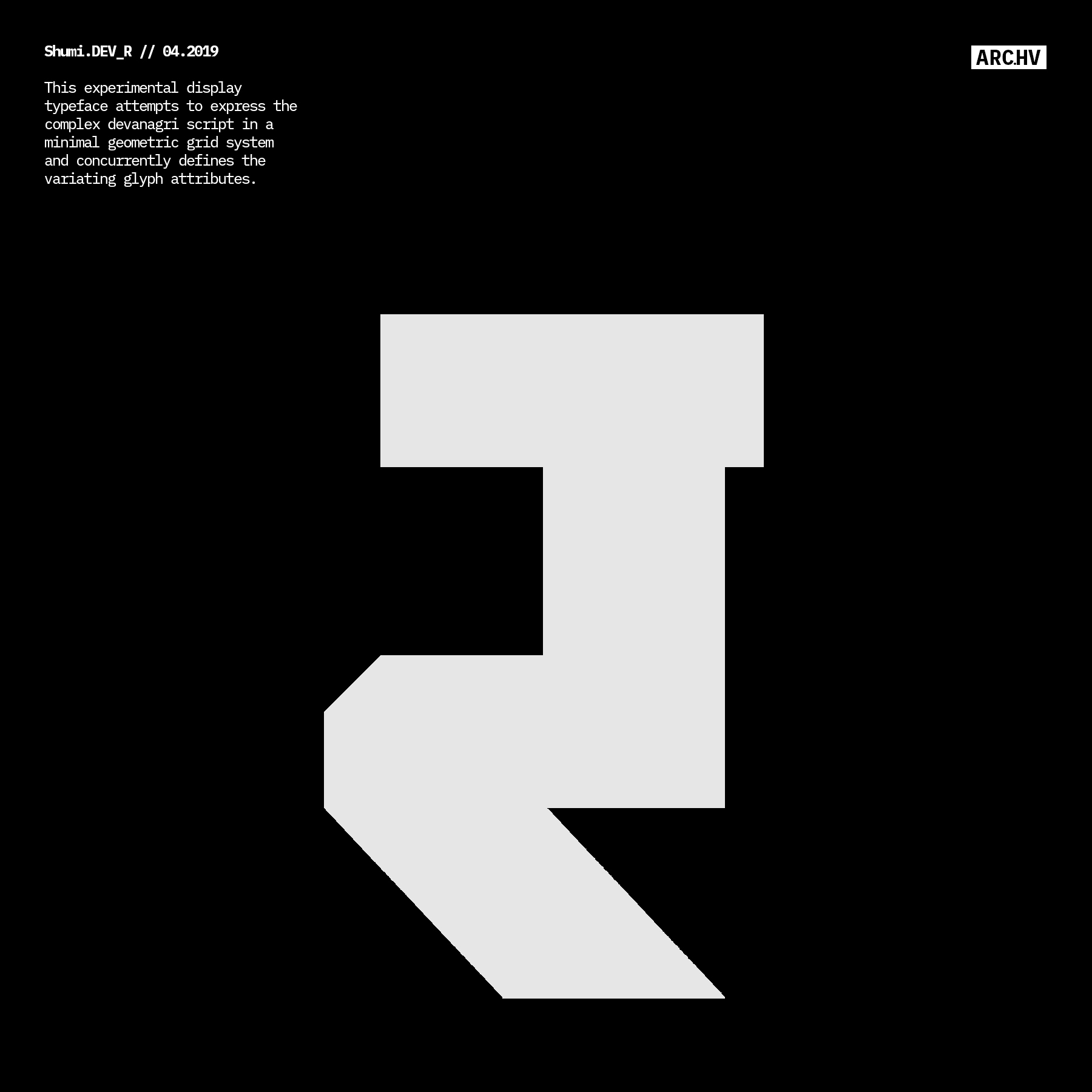


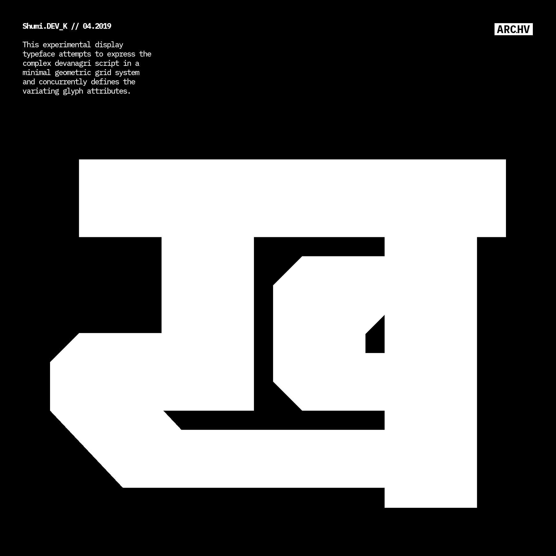


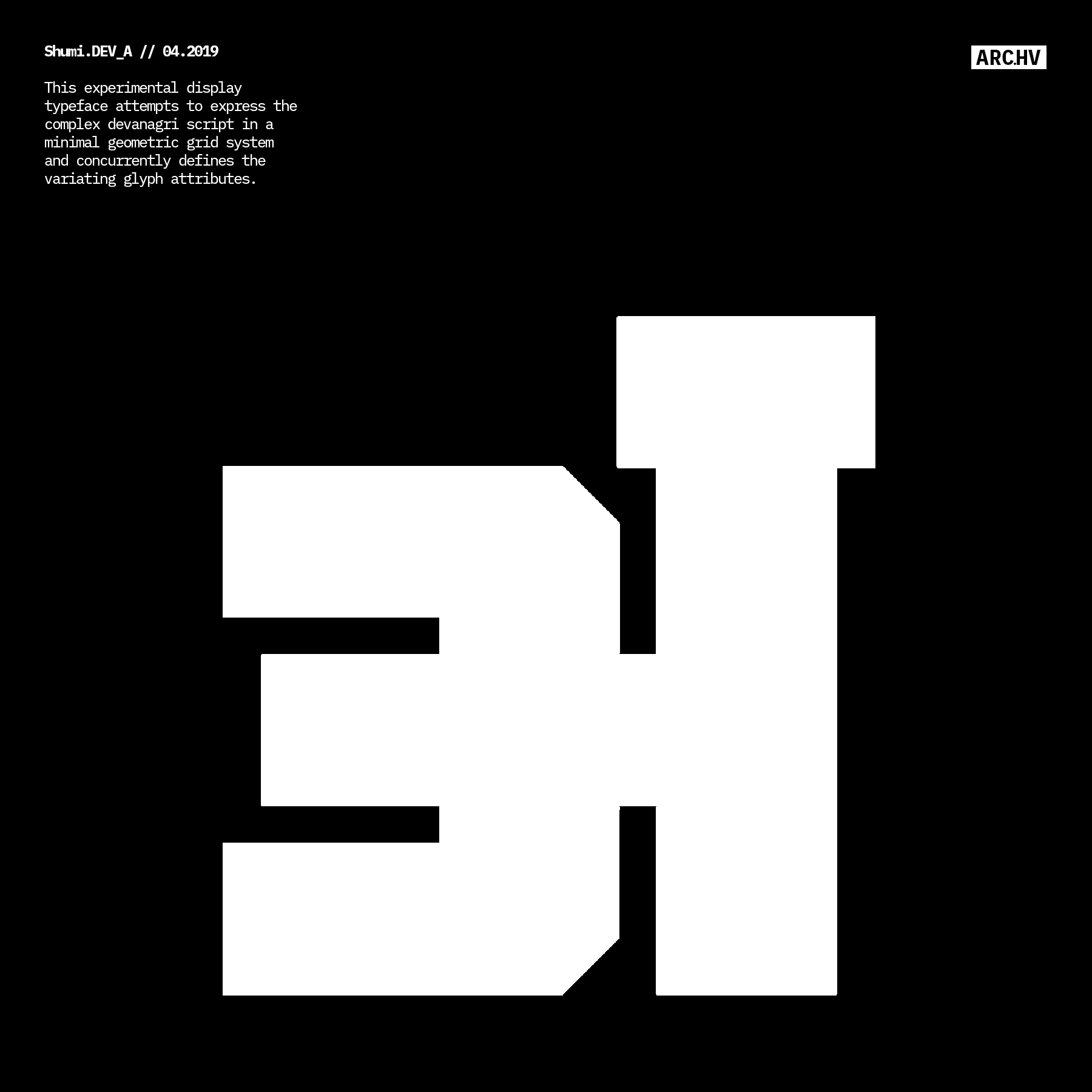
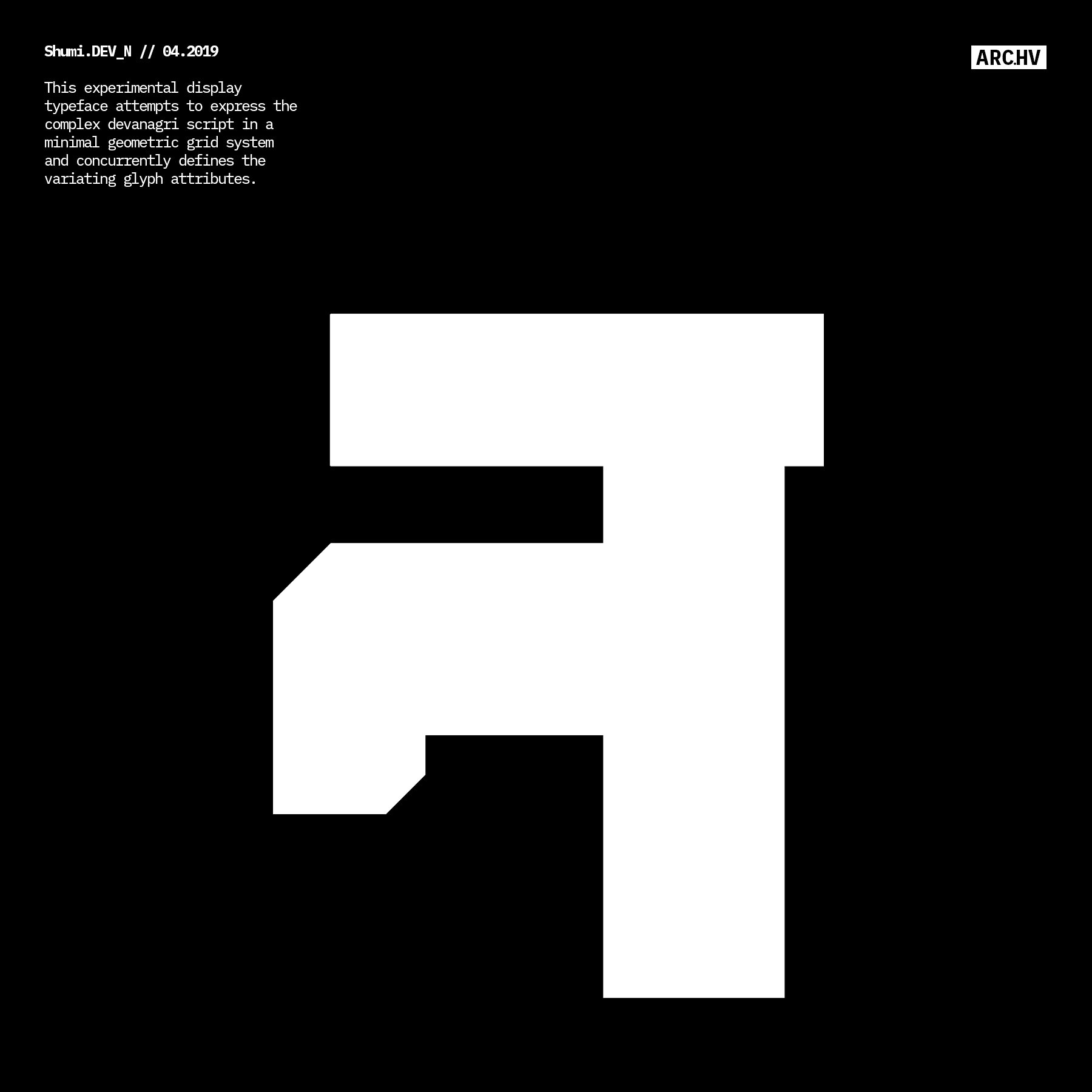
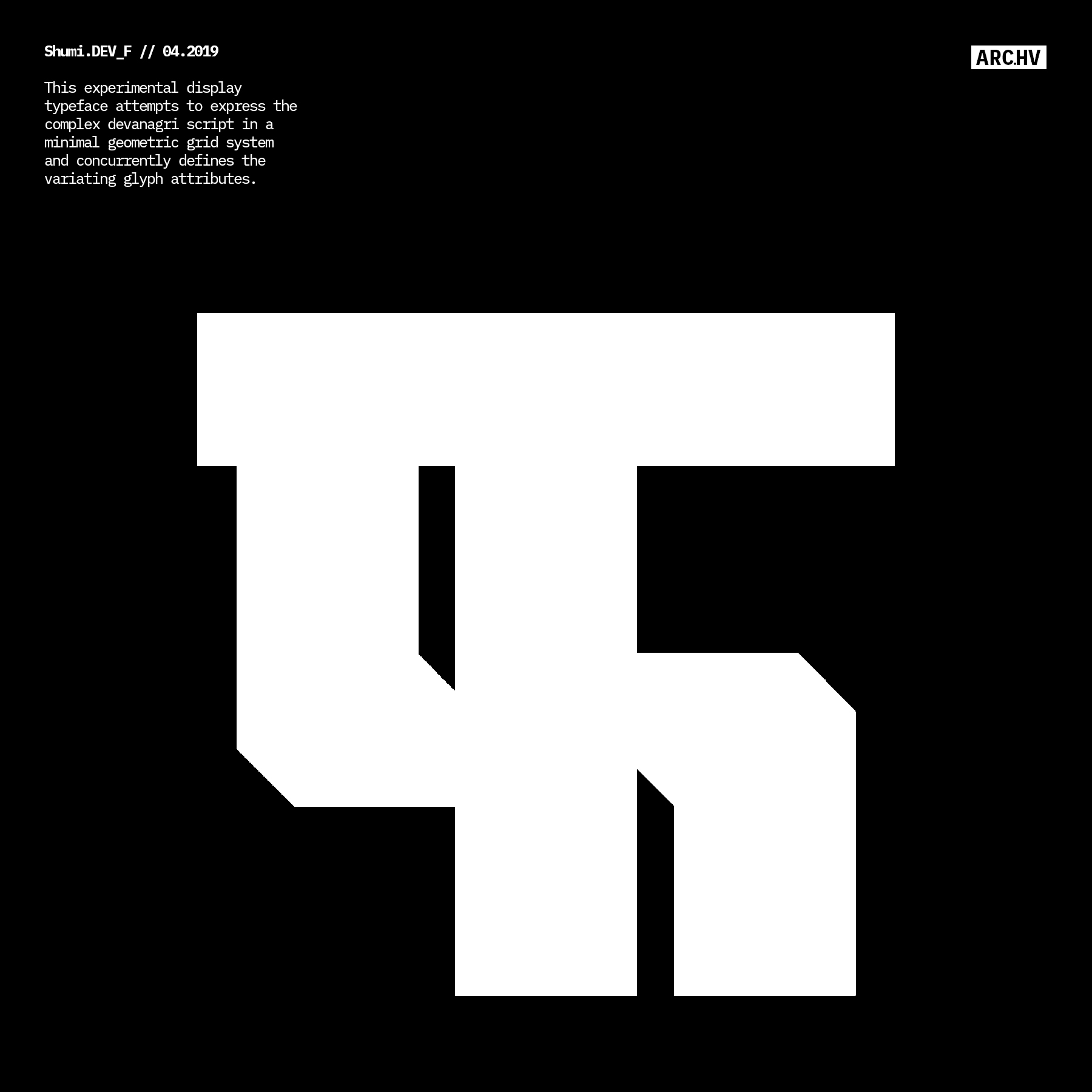
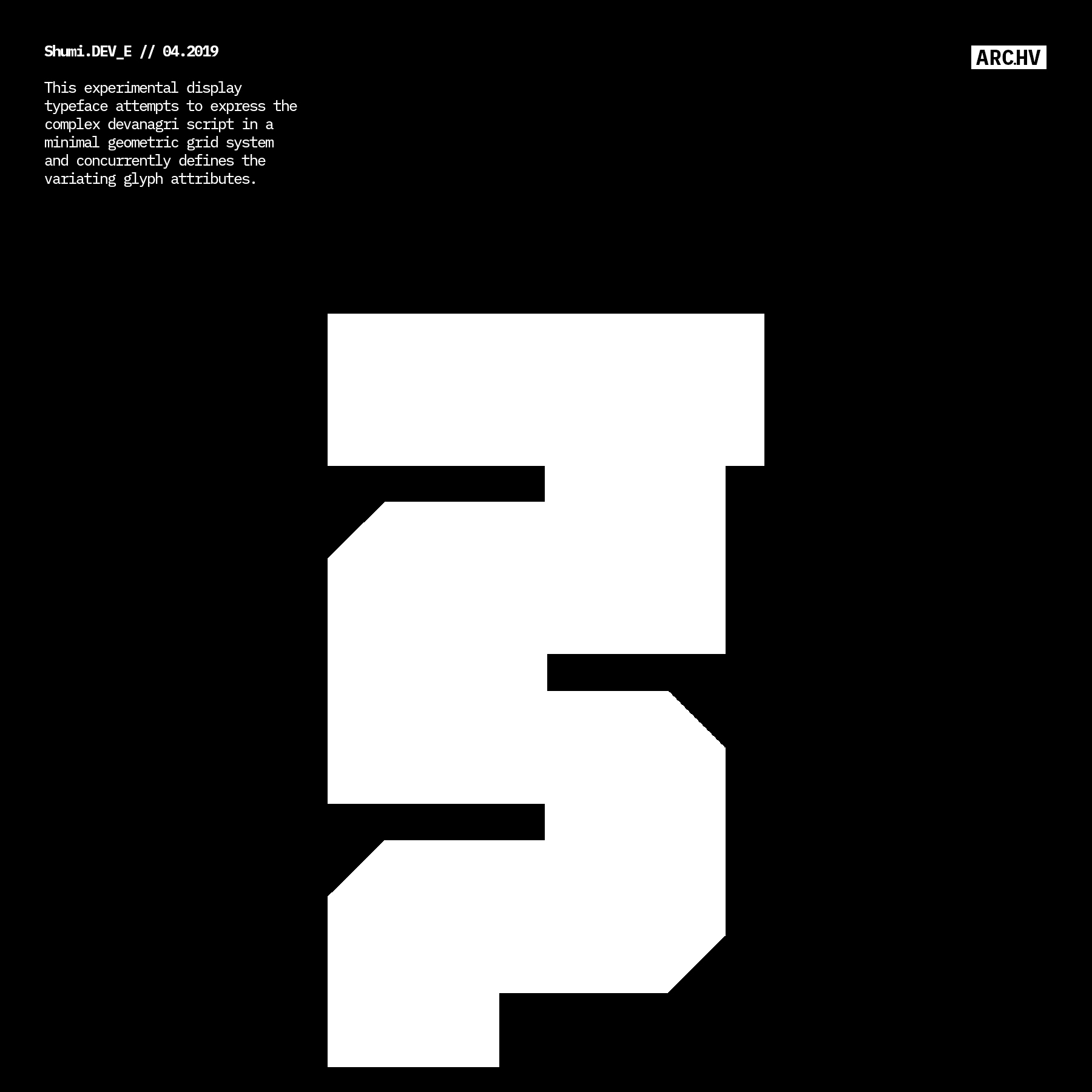
︎36Daysoftype 2019
1.2. Aim:
This study attempts to map out the co-relations between the anatomy of Latin and Devanagari script. Through an experimental display typeface which is acquired by defining a system that is followed to mould the anatomy for both Latin and Devanagari scripts simultaneously.
The process of the Devanagri Script required some level of segregation and organisation, in order to relate it to Latin Script.
Hopefully this study helps us translate for digital processing.
1.3 Result:
An ongoing study of correlation of their anatomy.
&
Two open source experimental display typefaces of the same family.
DEV.SCPRT® & LAT.SCRPT®
A Work in Progress.
1.4 Limitations of this study:
•No Ligatures considered yet (08/18)
•Numbers fail to be incrporated into the system, due to their difference in visual attributes (06/18)
•This study just takes into account single stroke letter forms. Keeping the structure extremely simple, but easy to modify (06/18)
•It does not take into serifs into consideration. But treats them as add-on/plugins to the defined system (06/18)
•Curves and angled lines are not considered, due to the orthogonal form of the structure (06/18)
2. System:
A guideline is formed by defining the proportion of the negative space to the stroke (positive space) for the anatomy.
The proprtion ratio-
negative space : stroke
1x:3x
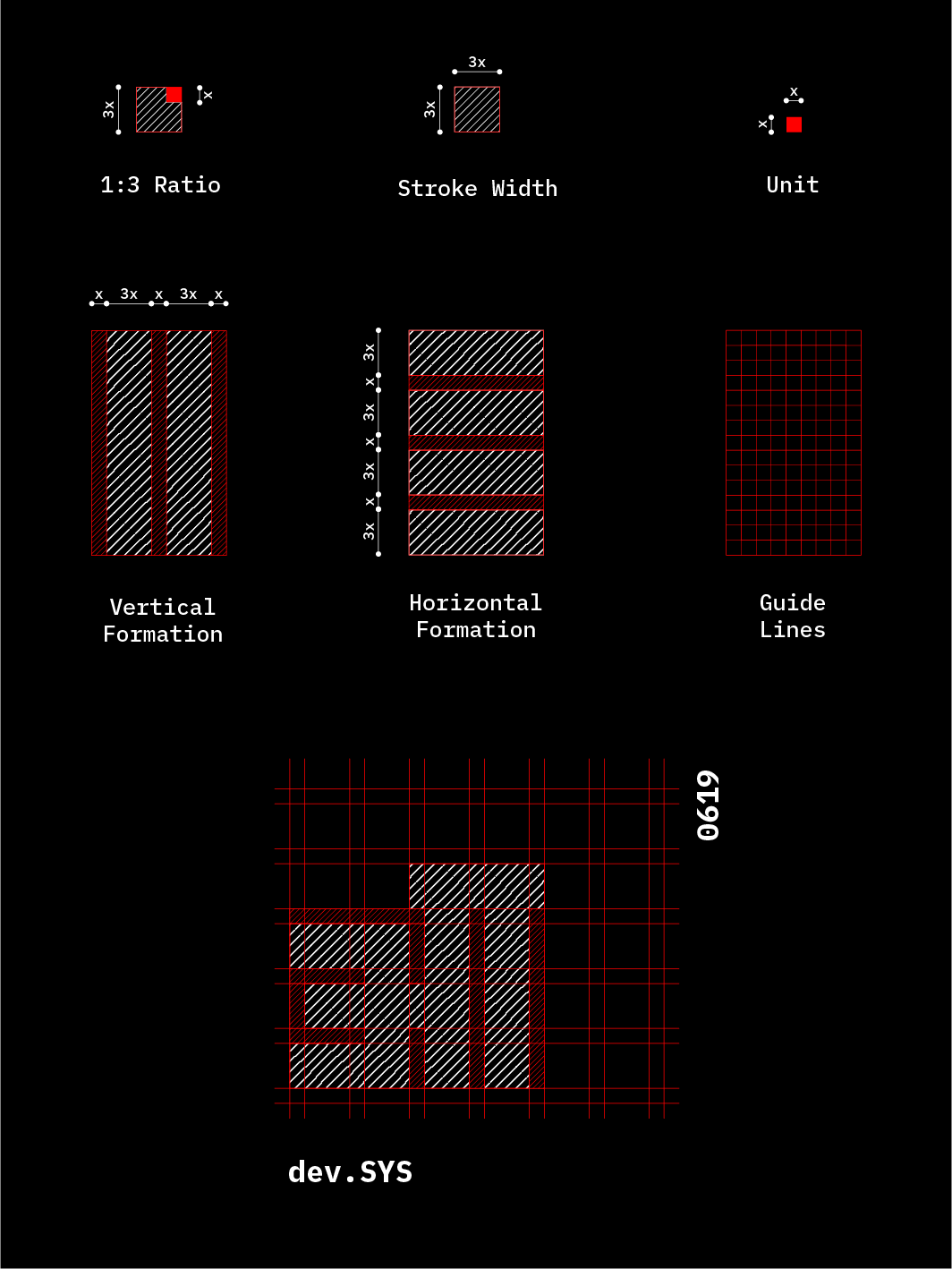
These proportions create a bold display typeface, while maintaining very little negative space.
The system is kept simple and plain since the study is experimental, complicating the the basis of it might divert it from its goal.
Based on trial and errors, an average height of the grid was fixed.
3. Organisation:
DEV.SCRPT
Based on the similarities in their form, the glyphs are organised into 9 different groups, along with one extra group of letterforms that don’t fit into any of the categories classified. Totalling 10 groups of letterforms.
Adding to this we have a group of maatras and one for numbers, since numbers and mantras follow their own form of geometry.
All groups are coded with a different color.
Group A,B,C,D,E,F,G,H,I
Glyphs with identical letter-forms
Group X
Glyphs that don’t fall into any group
Group M
Set of maatras
Group N
Group of Numbers
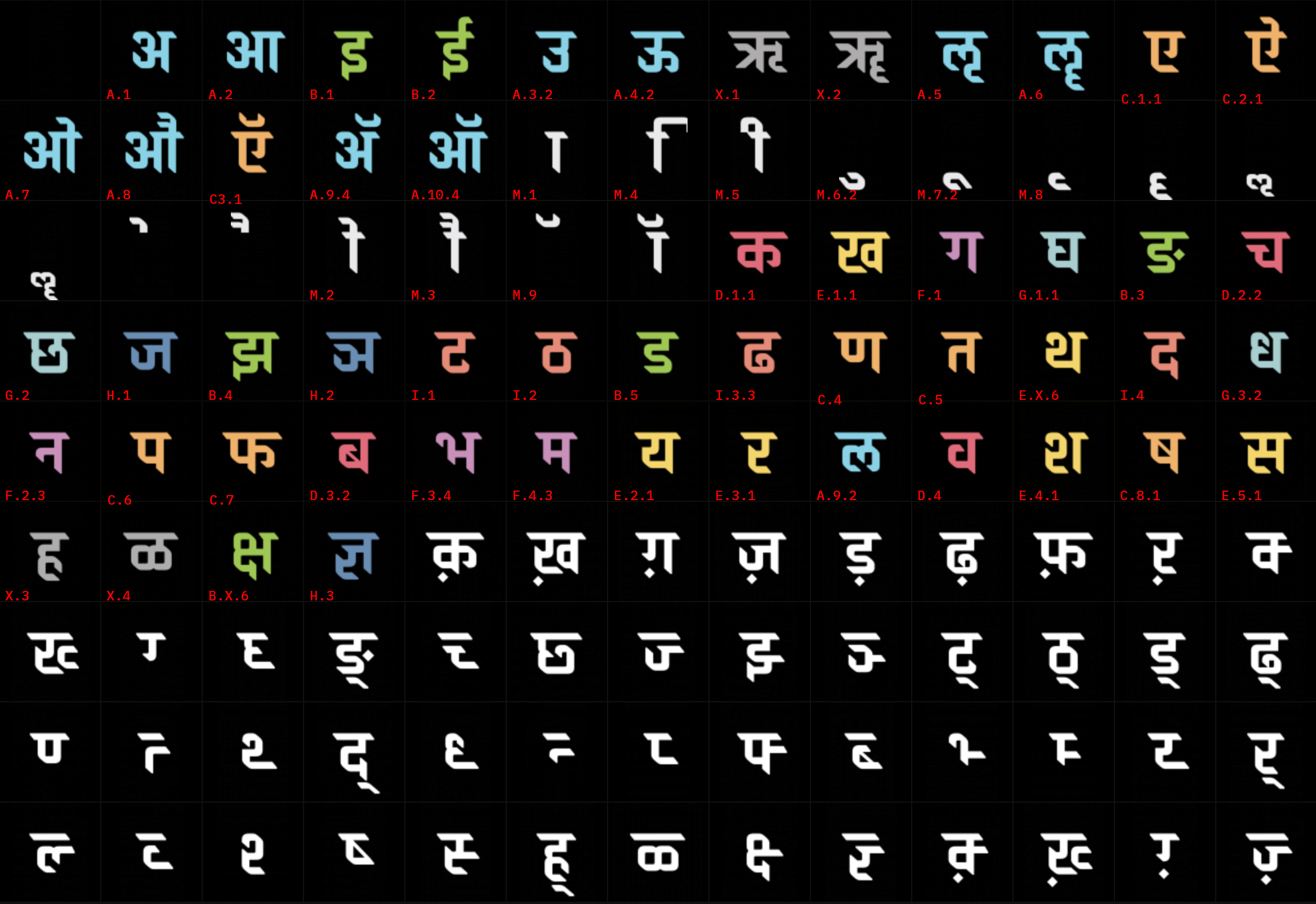
︎Glyph set of Brahmos Devanagri by Hitesh Malaviya. Sourced from ITF.
The group is composed of a parent member from which the form structure of the other glyphs are derived .
Parents of each group are identified.
Group A
Parent: अ
Group B
Parent: ड
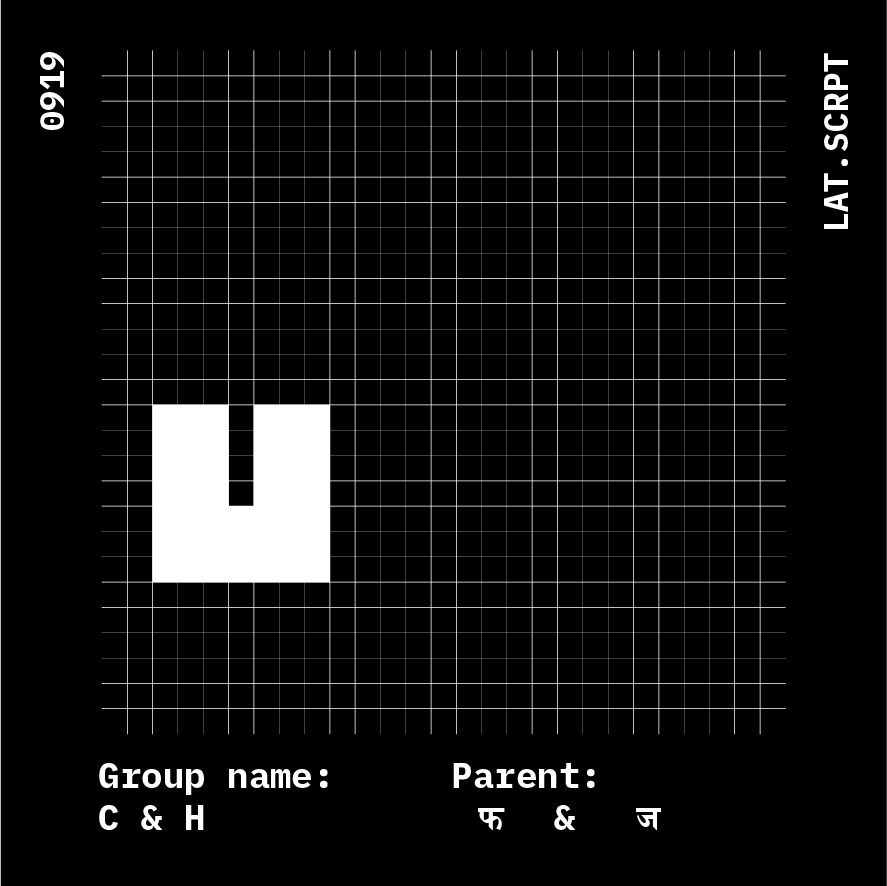
Group C
Parent: फ
Group D
Parent: व
Parent: अ
Group B
Parent: ड
Group C
Parent: फ
Group D
Parent: व
Group E
Parent: र
Group F
Parent: म
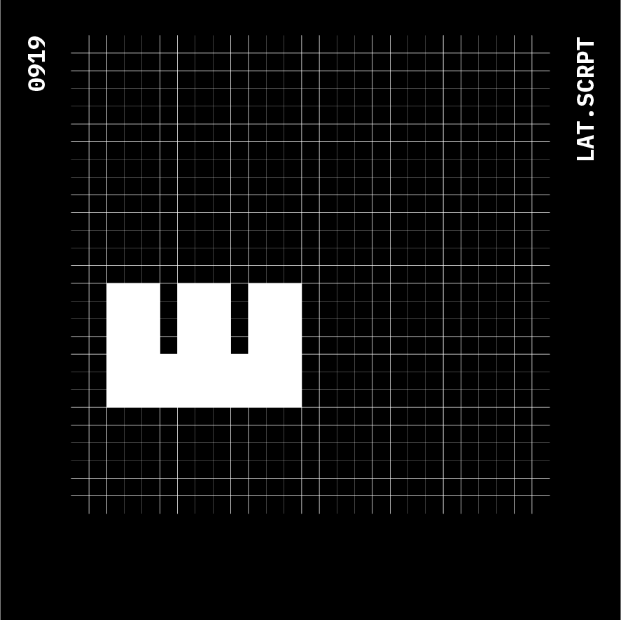
Group G
Parent: घ
Group H
Parent: ज
Parent: र
Group F
Parent: म
Group G
Parent: घ
Group H
Parent: ज
Group I
Parent: ट
Group X
Parent: Misc.
Group M
Parent: Misc.
Group N
Parent: NA
Parent: ट
Group X
Parent: Misc.
Group M
Parent: Misc.
Group N
Parent: NA
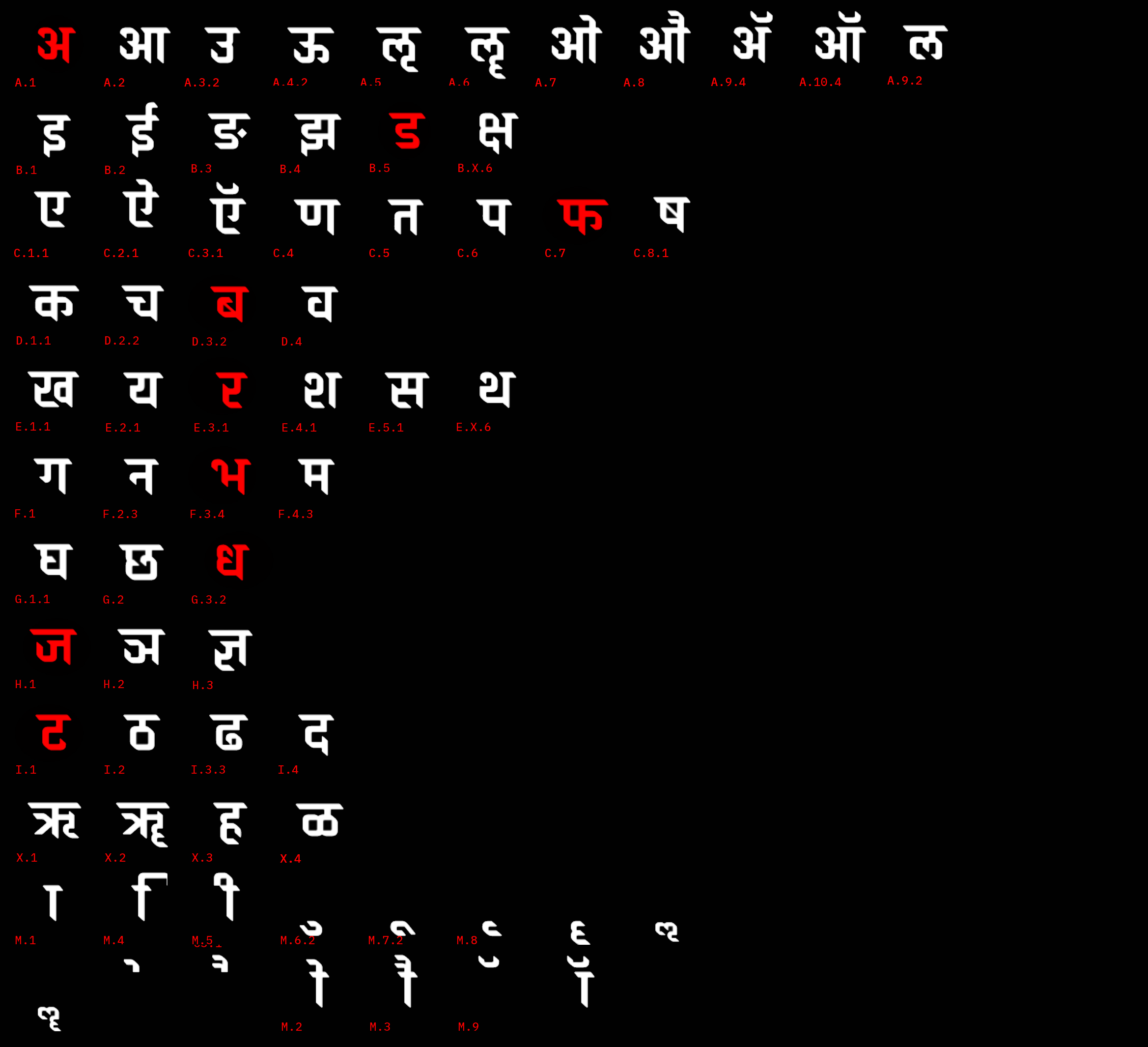
︎Parent marked in RED.
Glyph set of Brahmos Devanagri by Hitesh Malaviya. Sourced from ITF. Organised as per dev.SYS
Glyph set of Brahmos Devanagri by Hitesh Malaviya. Sourced from ITF. Organised as per dev.SYS
4. Generation:
Following the system and organisation group wise, the rest of the glyphs are generated.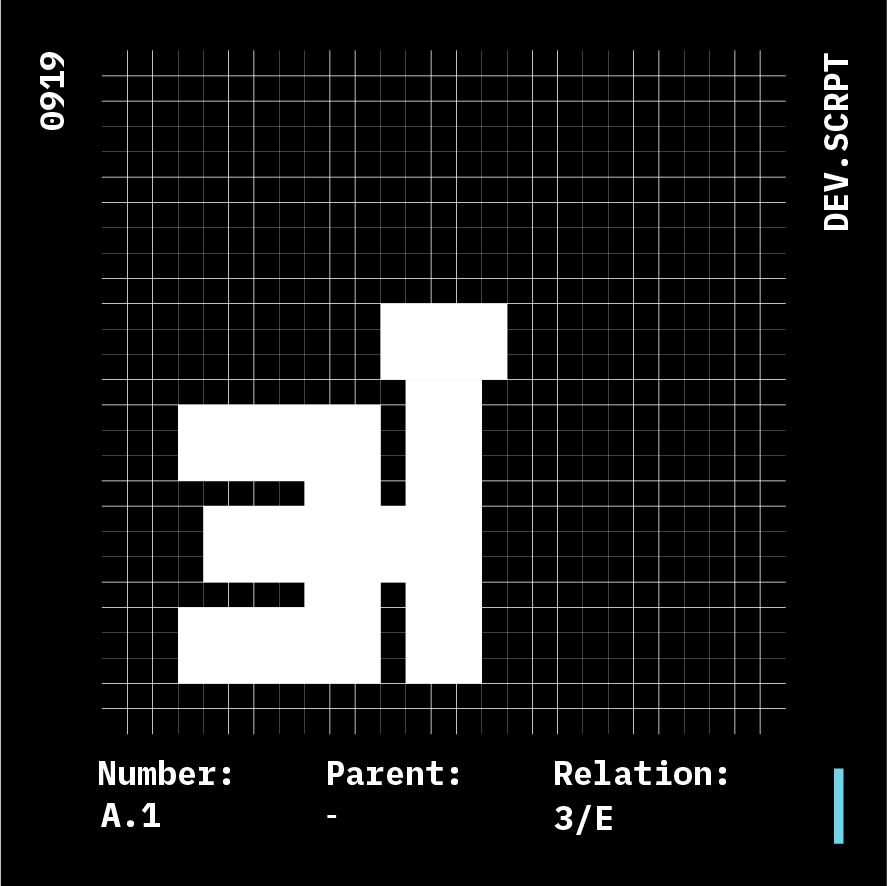
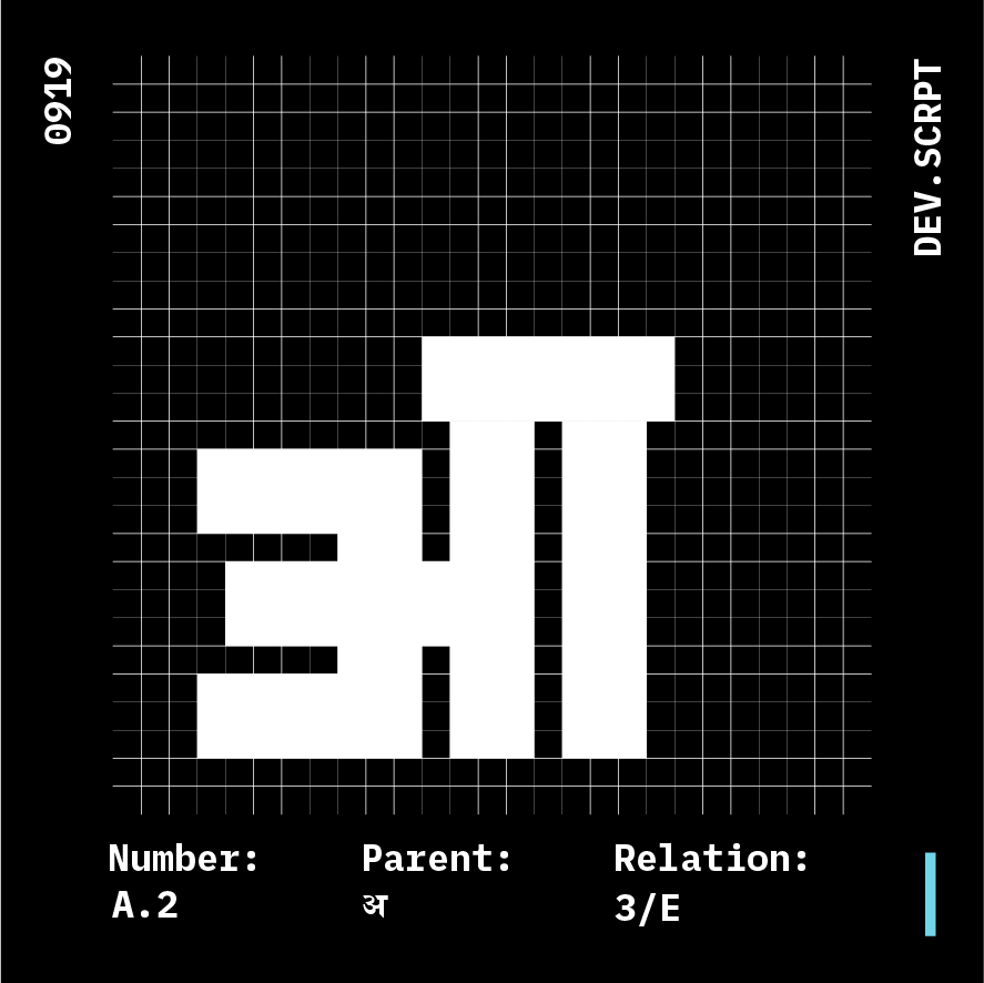
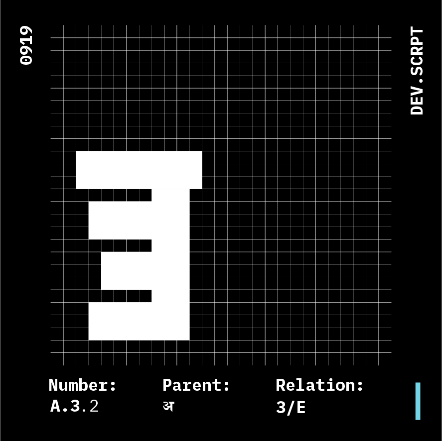
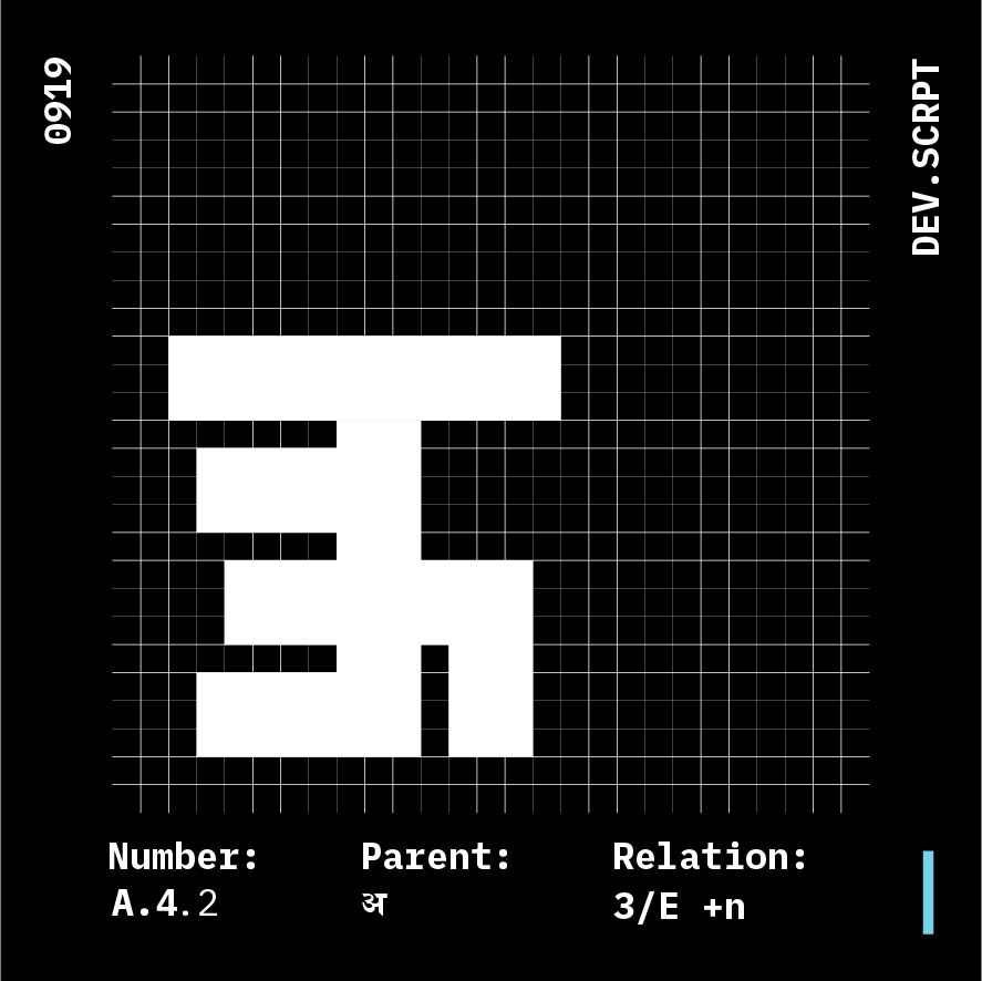
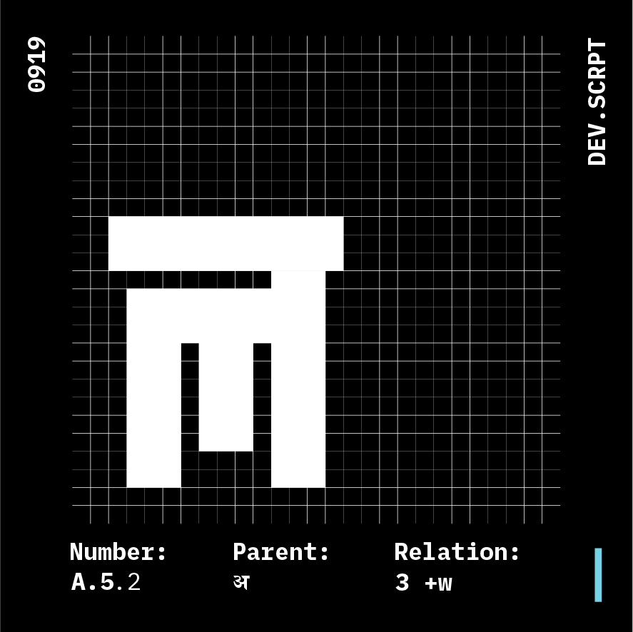
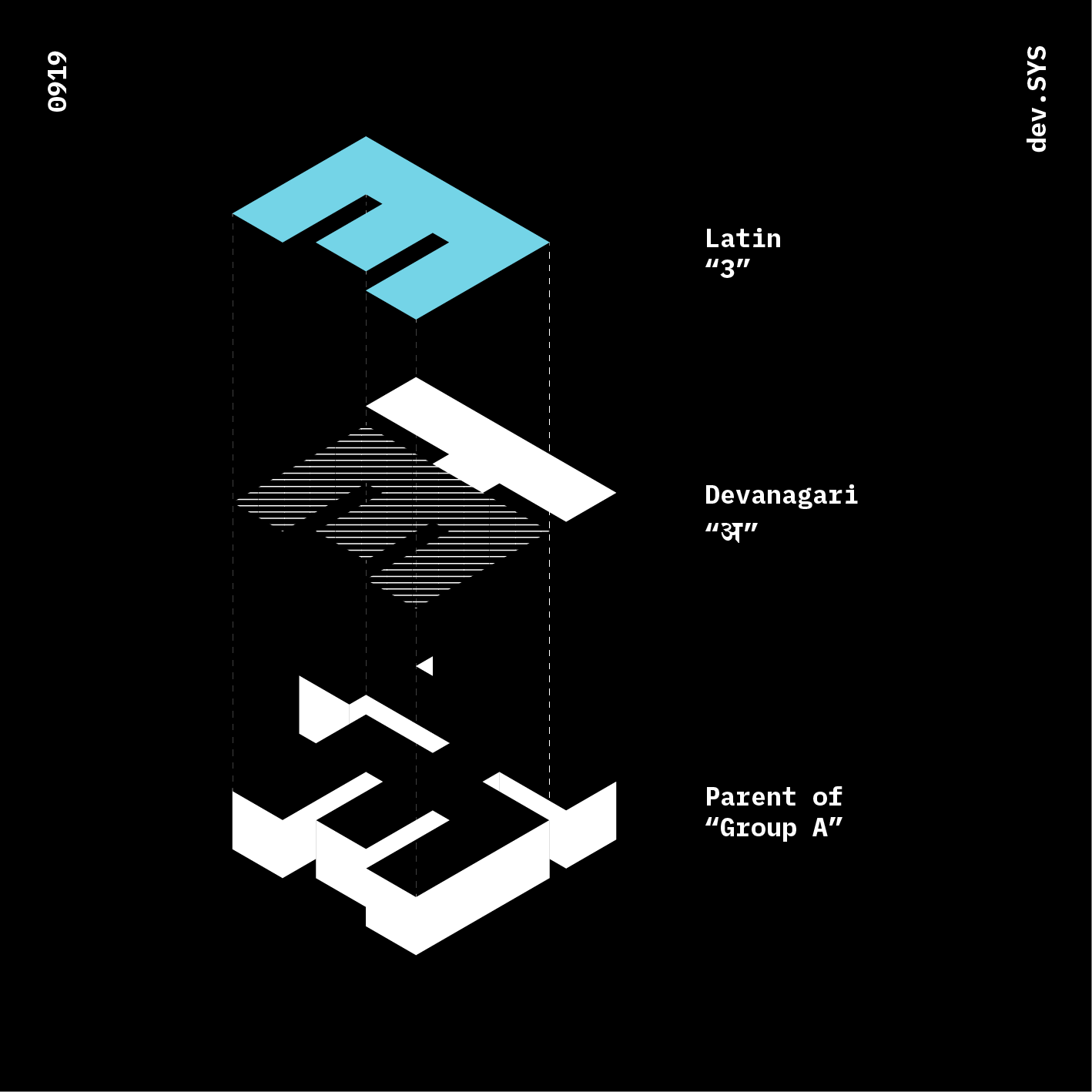
Group A
Glyphs: 5
Parent: अ
Anatomy Relation: 3/E

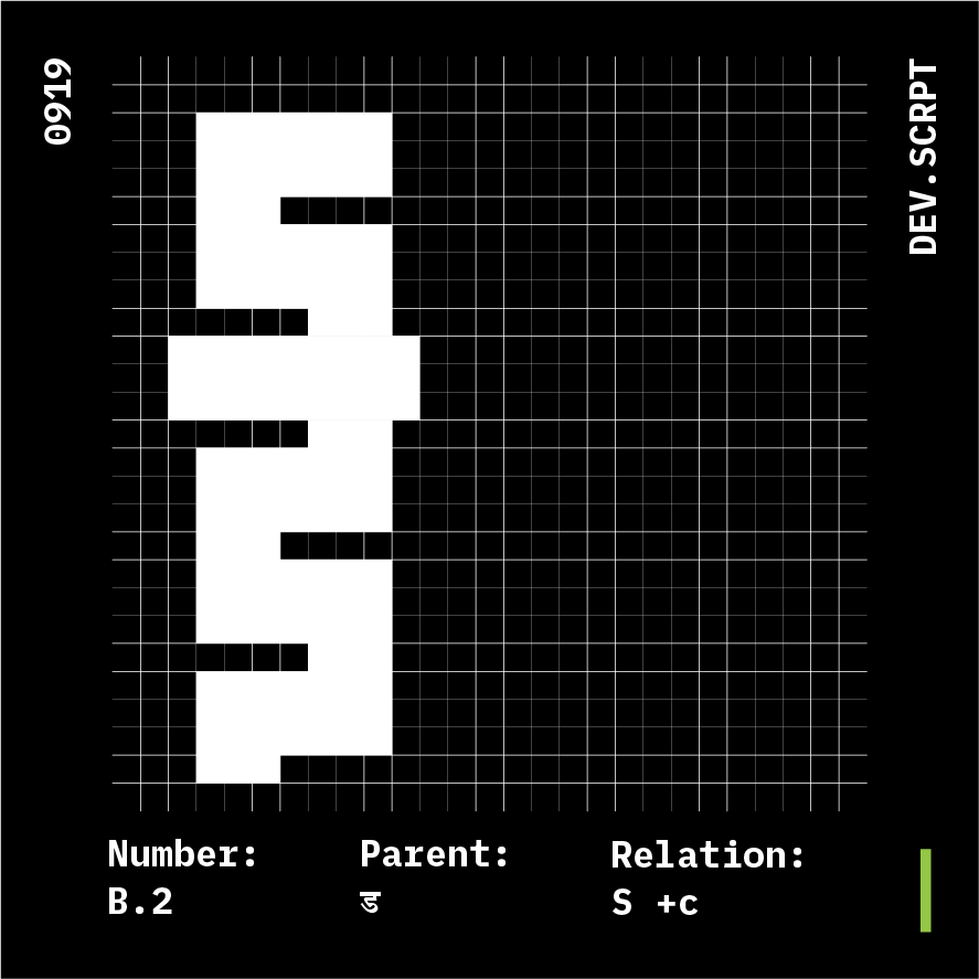
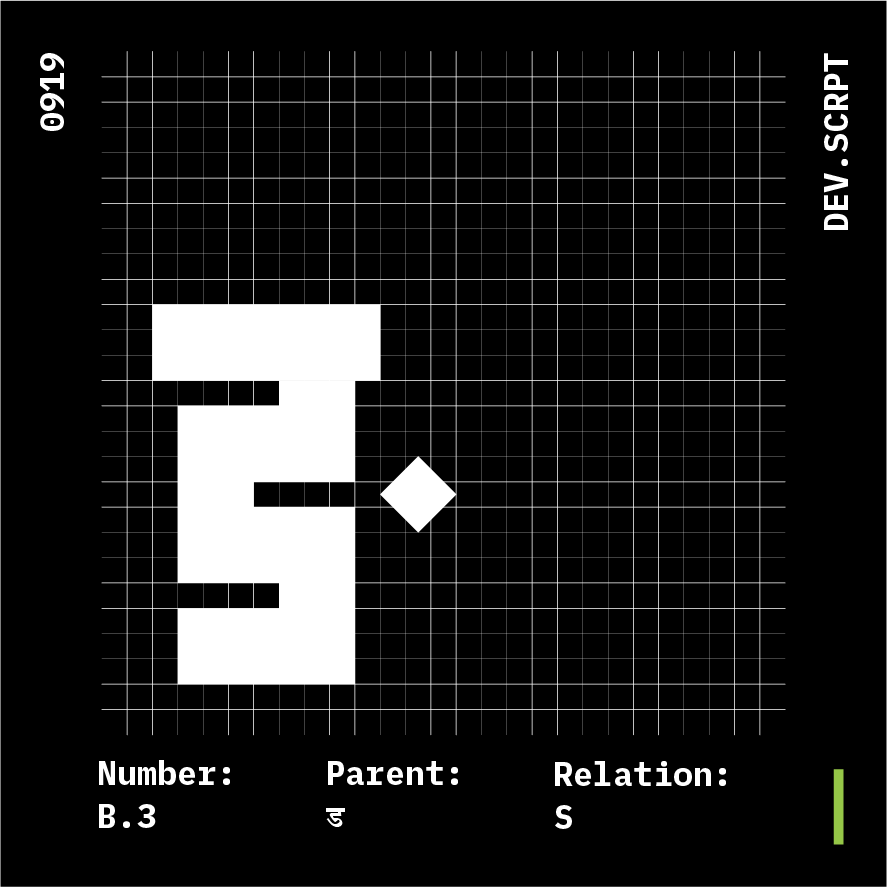
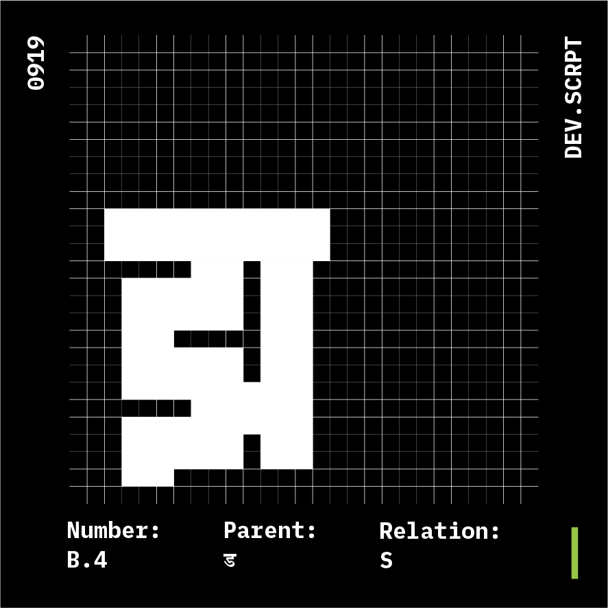


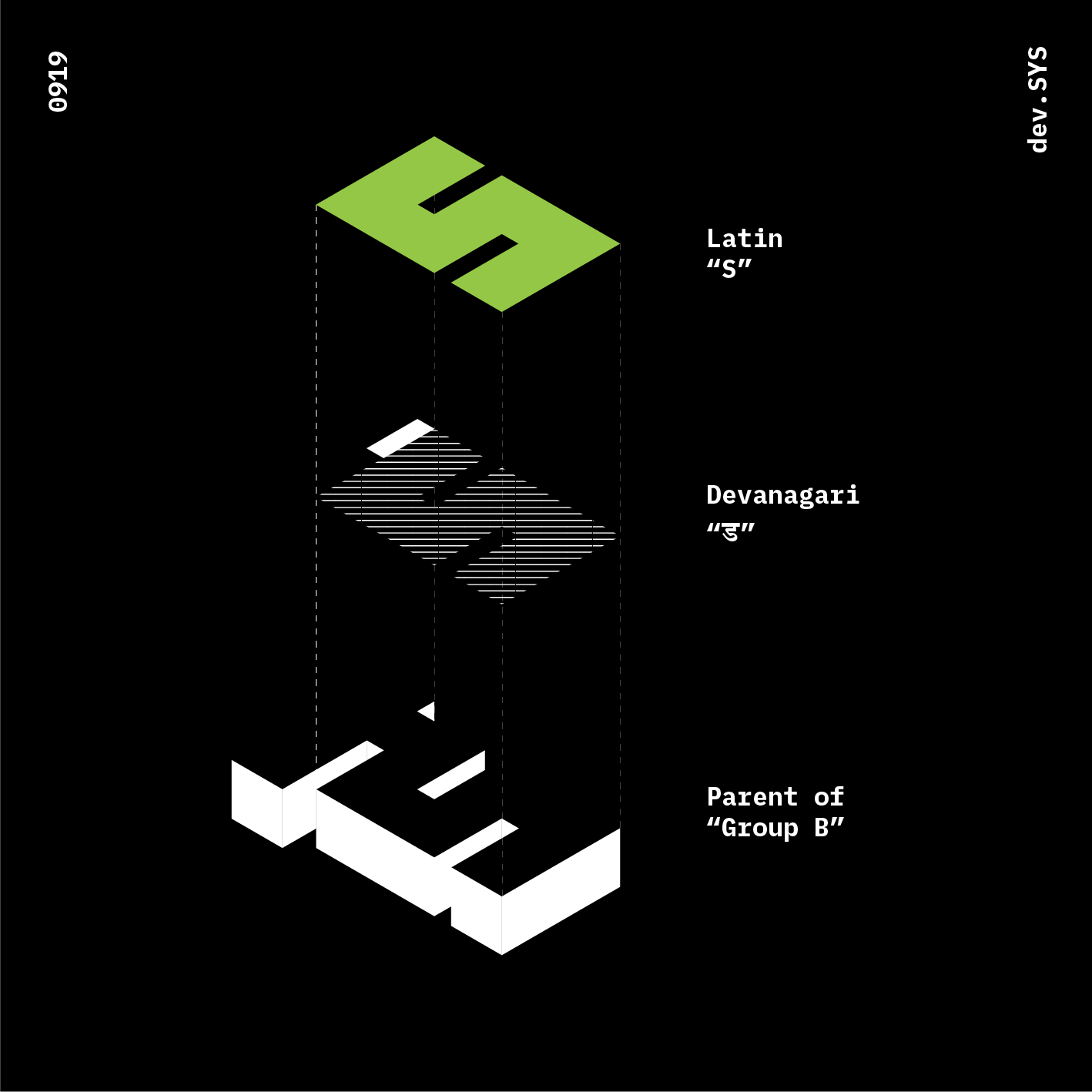
Group B
Glyphs: 6
Parent: ड
Anatomy Relation: S


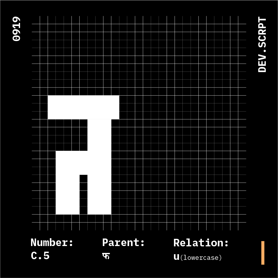
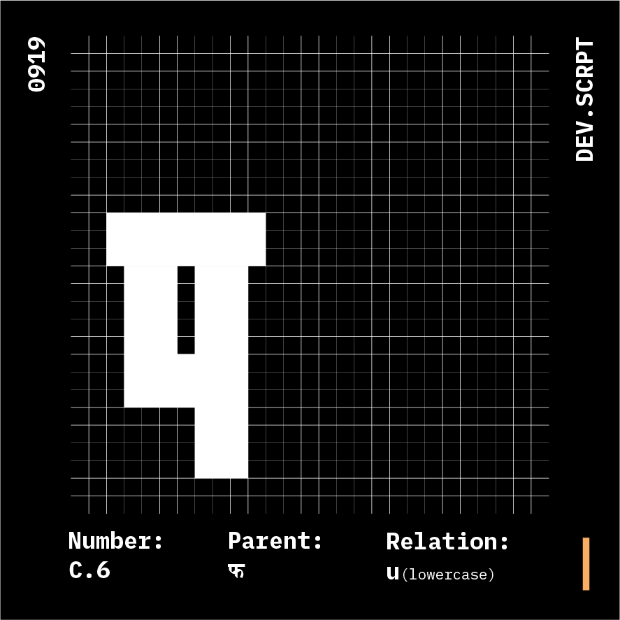

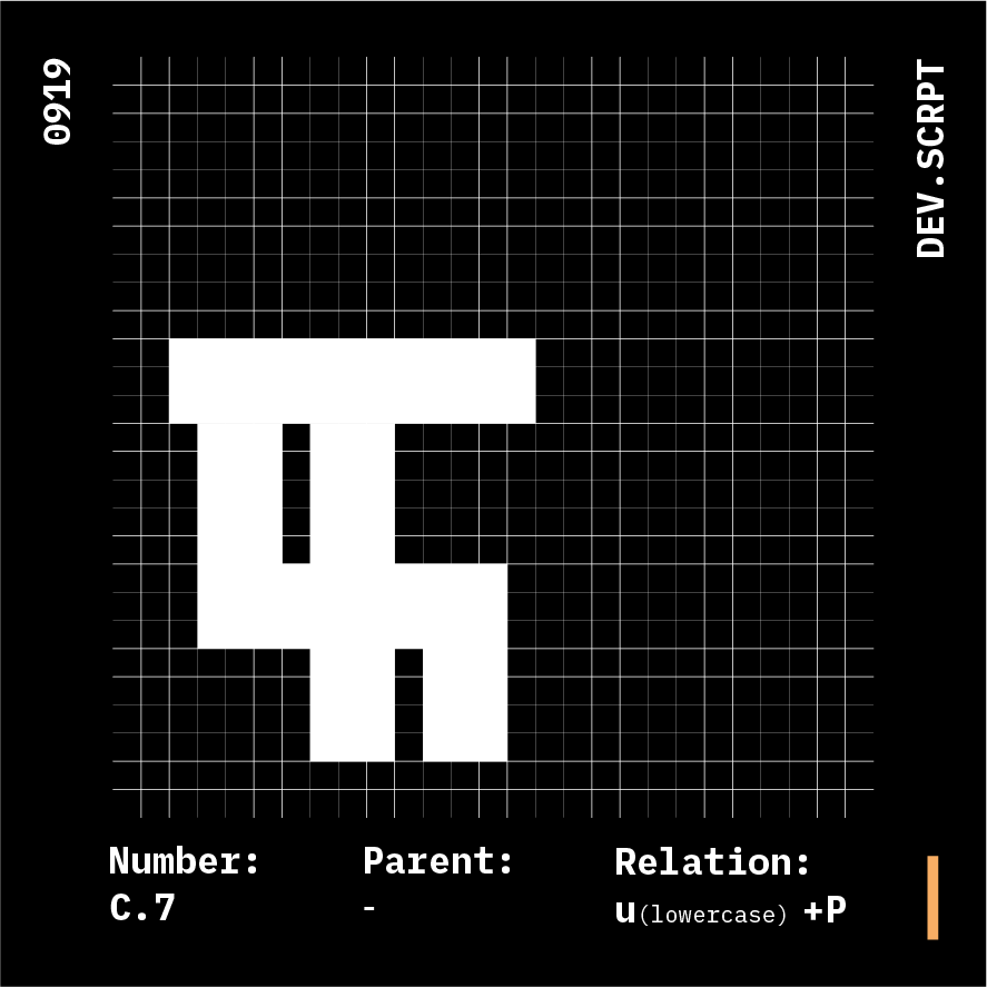
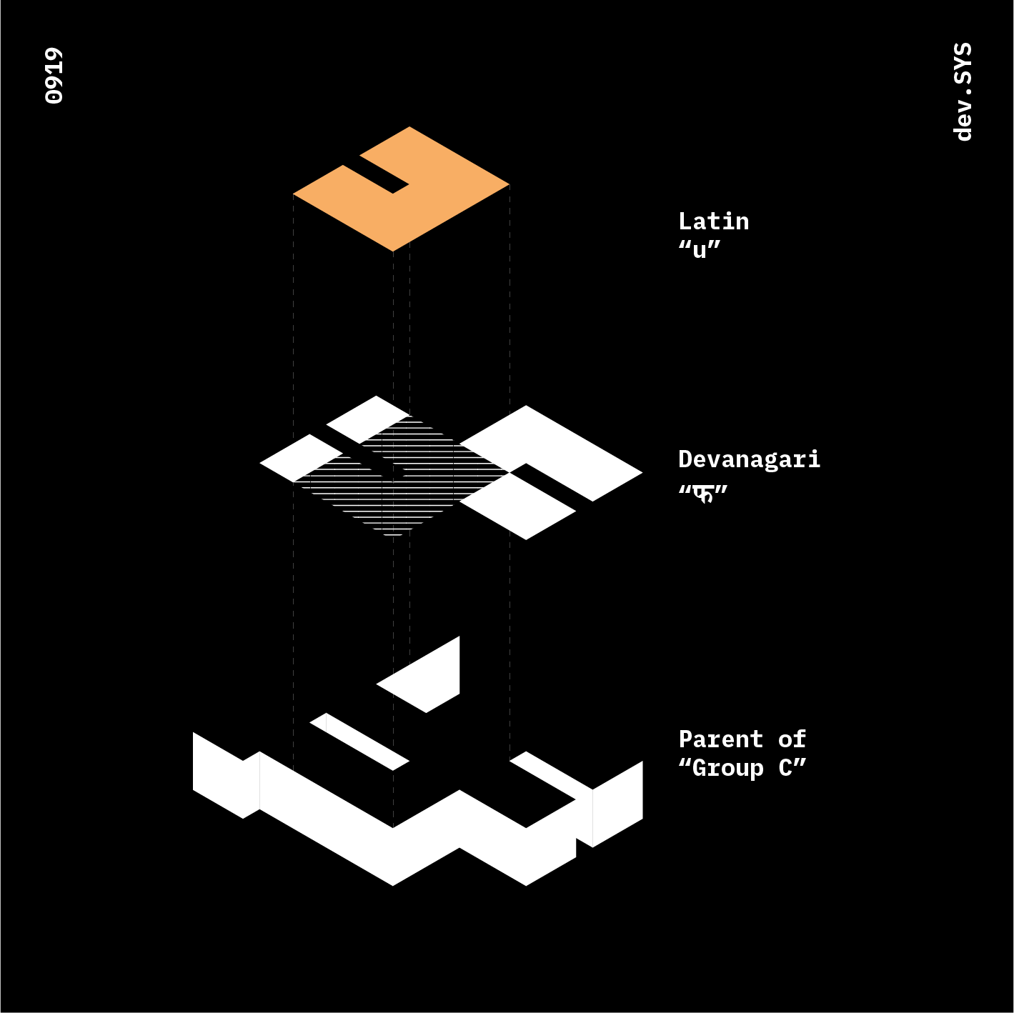
Group C
Glyphs: 6
Parent: फ
Anatomy Relation: u +P
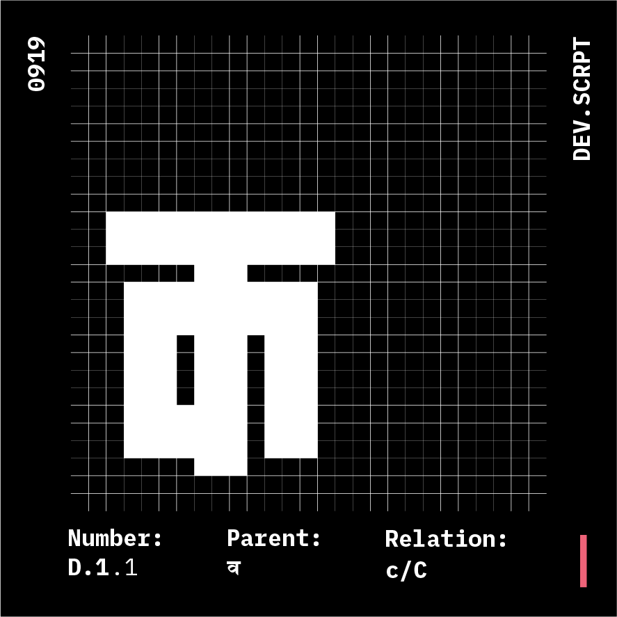
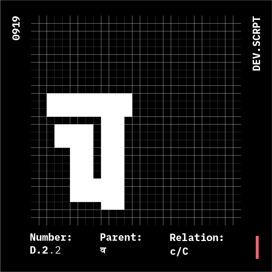

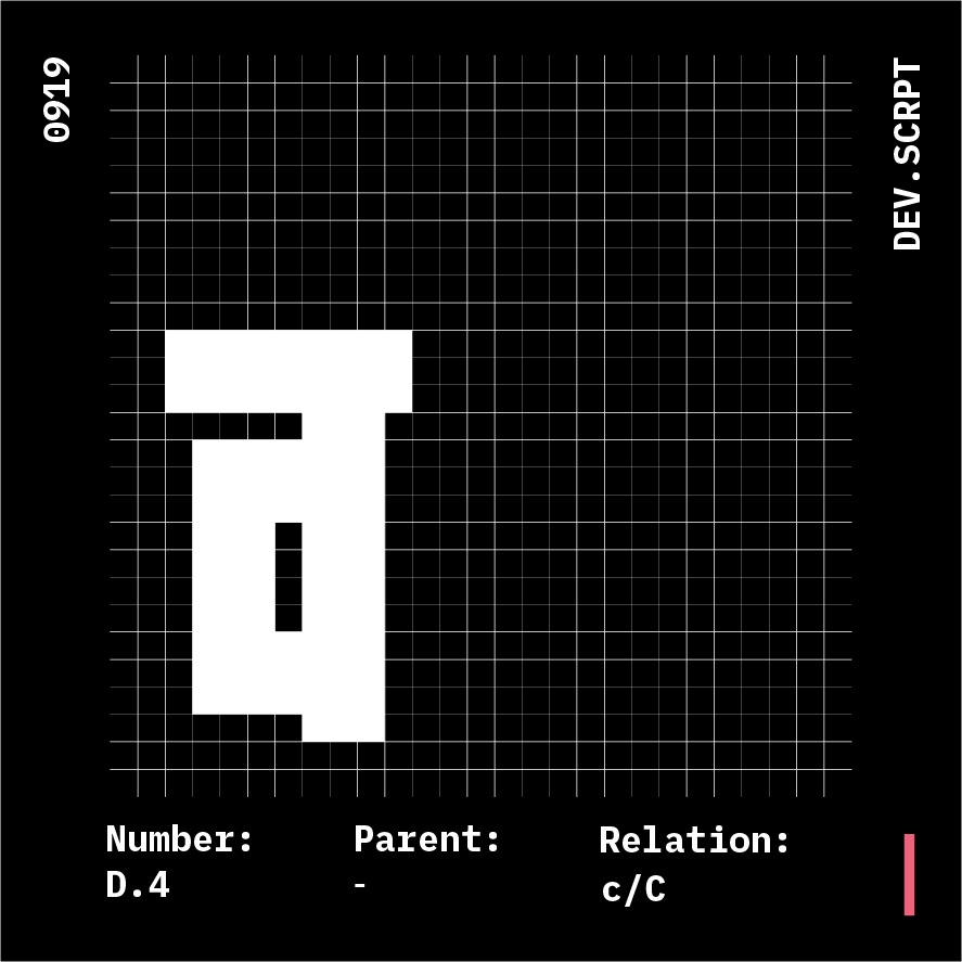
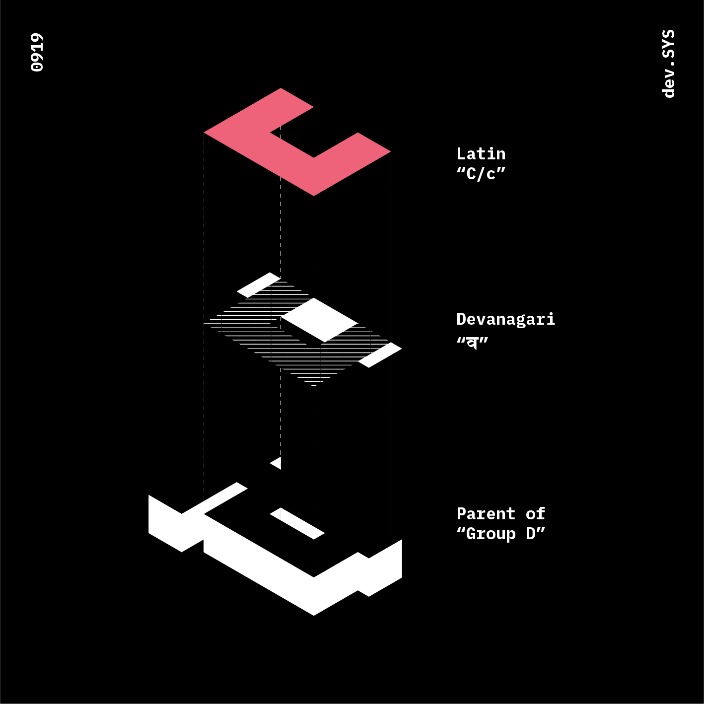
Group D
Glyphs: 4
Parent: व
Anatomy Relation: c, C
Two variants constructed out of morphed proportions of "c/C"
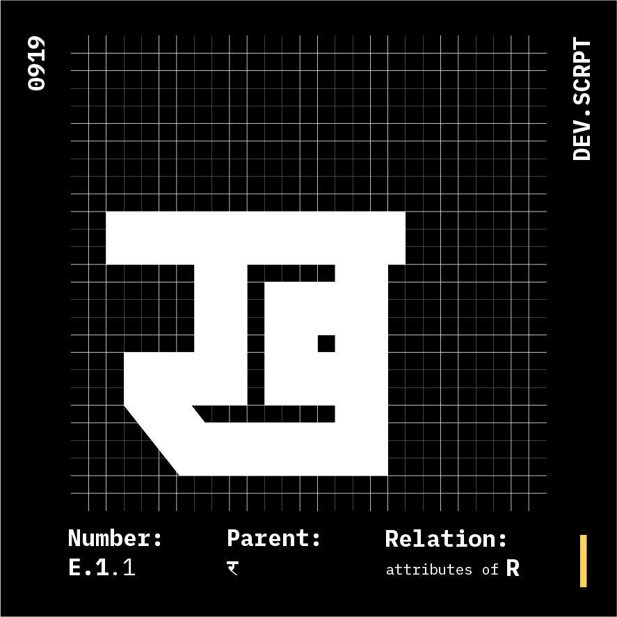
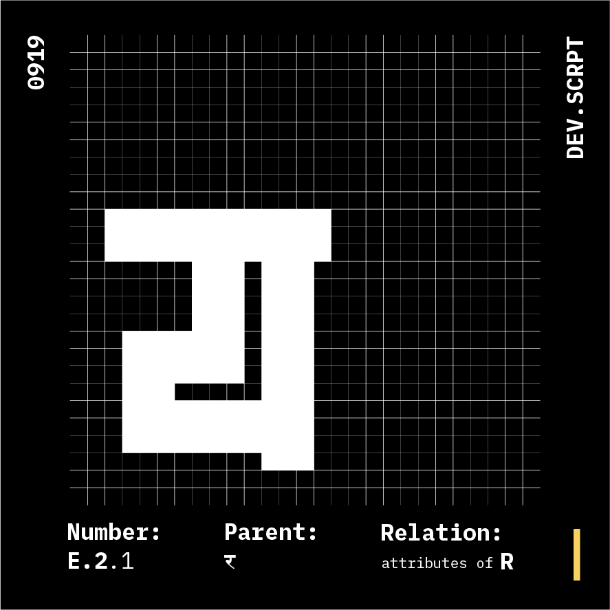
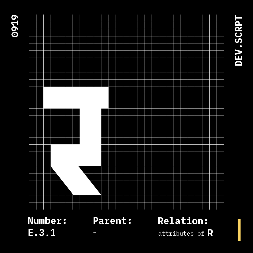
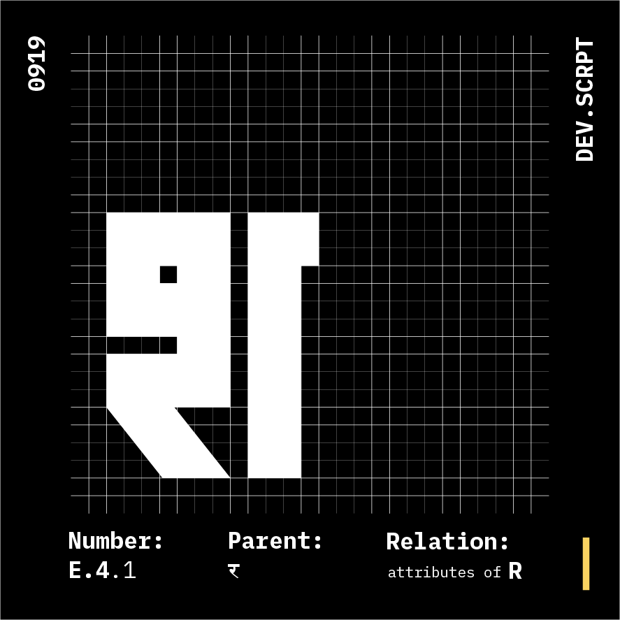
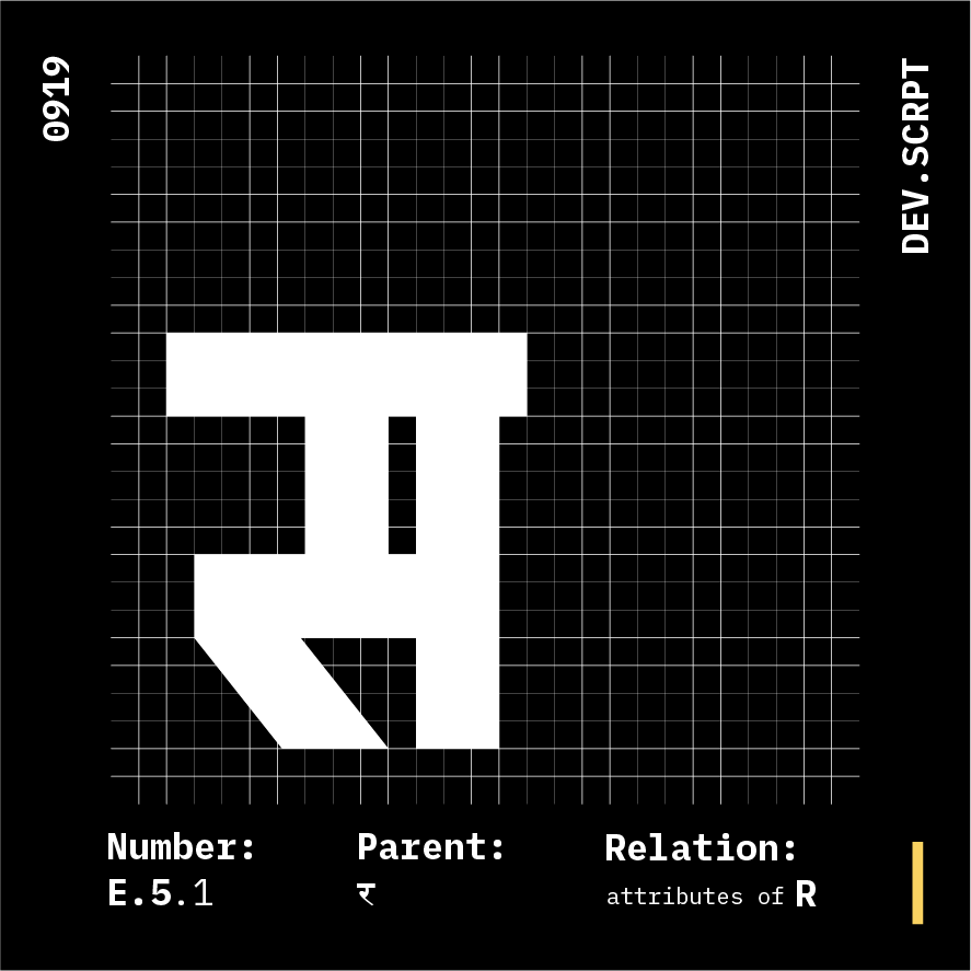
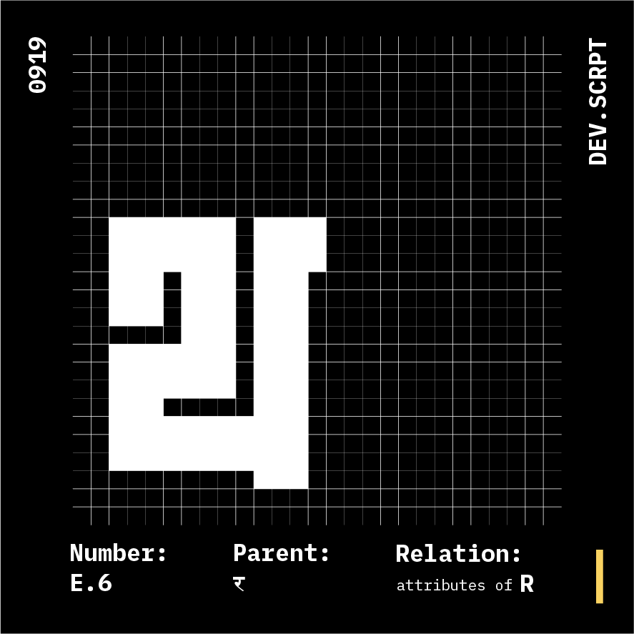
Glyphs: 6
Parent: र
Anantomy Relation: R
This case being an exception just using attributes of R
*****Chapter of Uniformity vs Legibilty
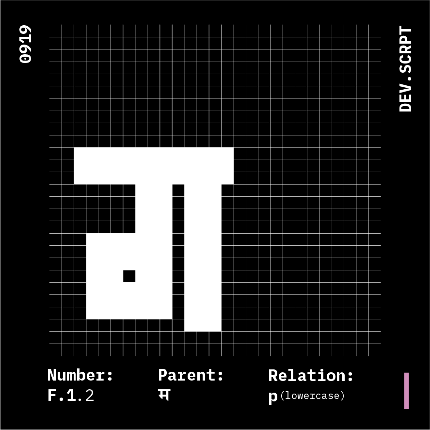
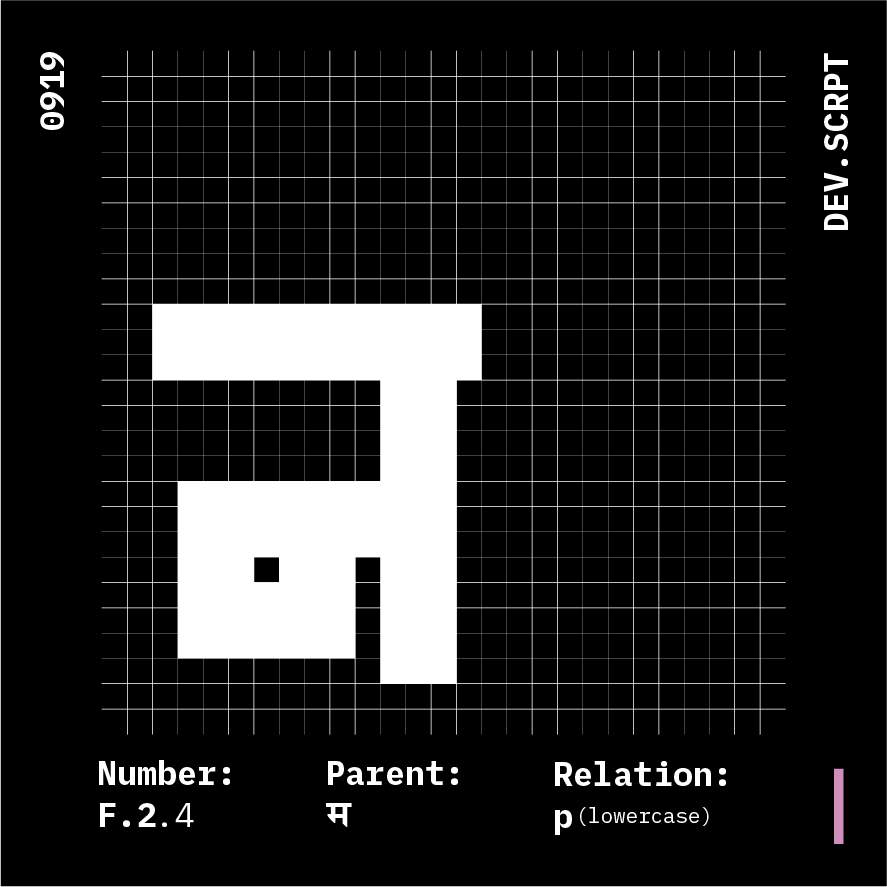
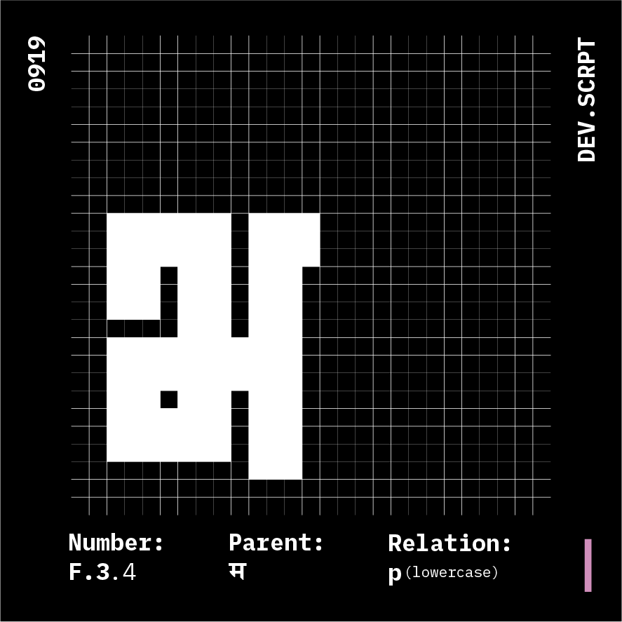
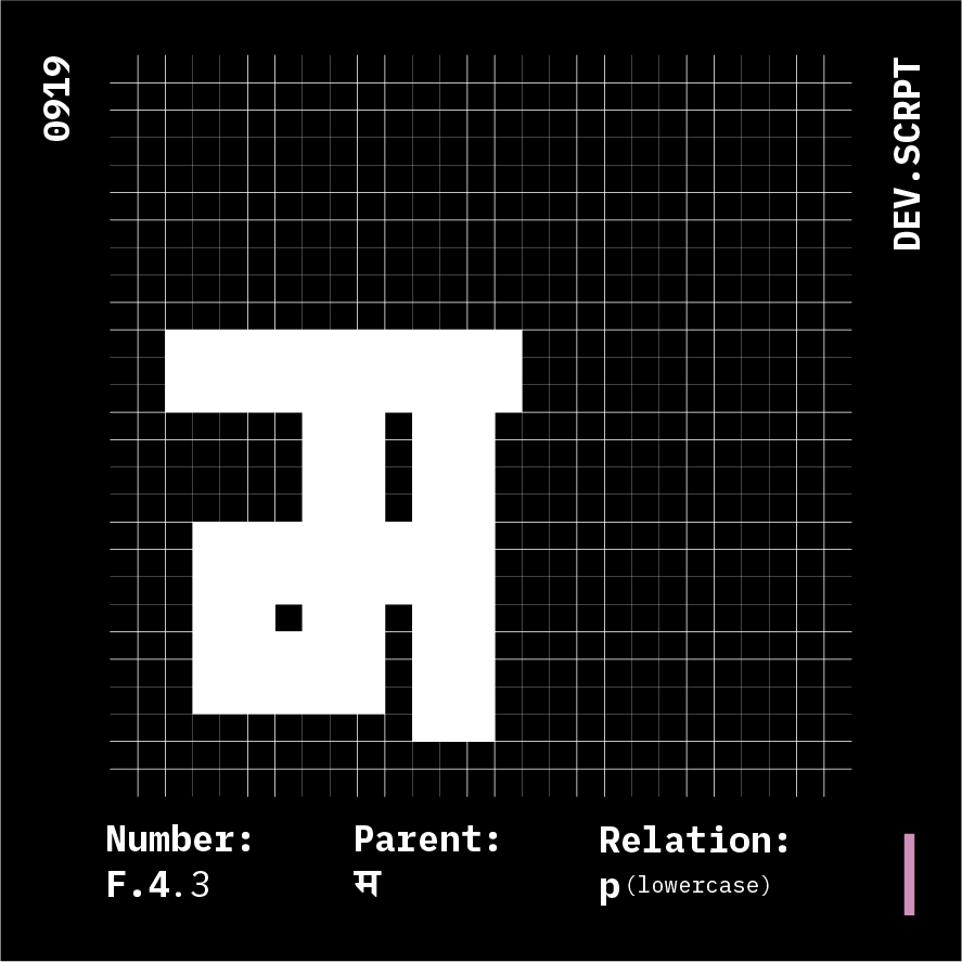
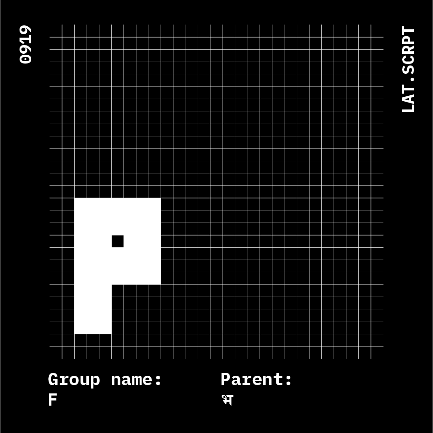
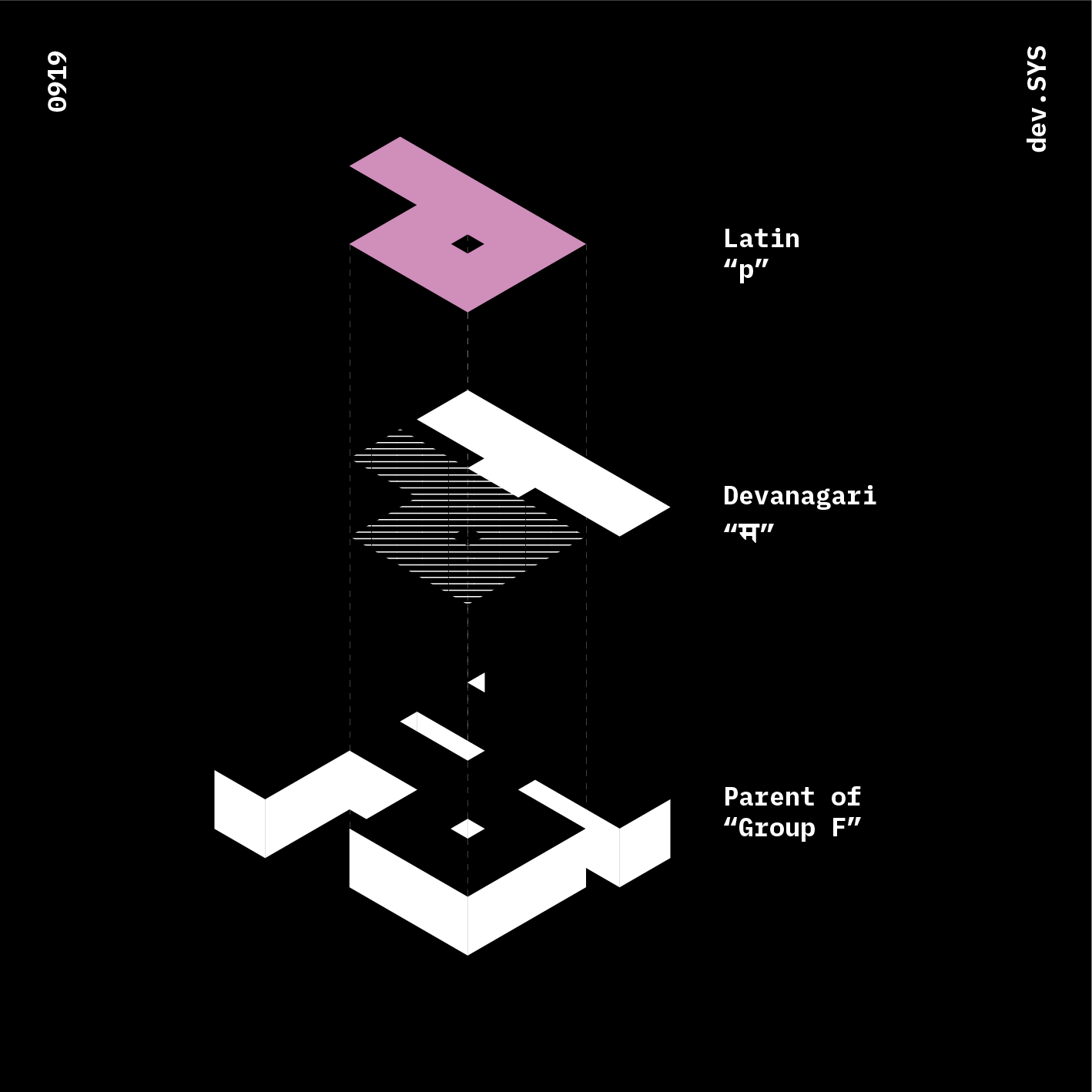
Glyphs: 4
Parent: भ
Anatomy Relation: p

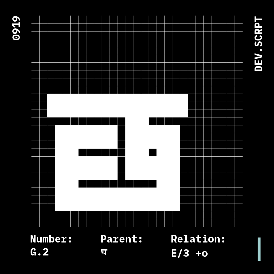
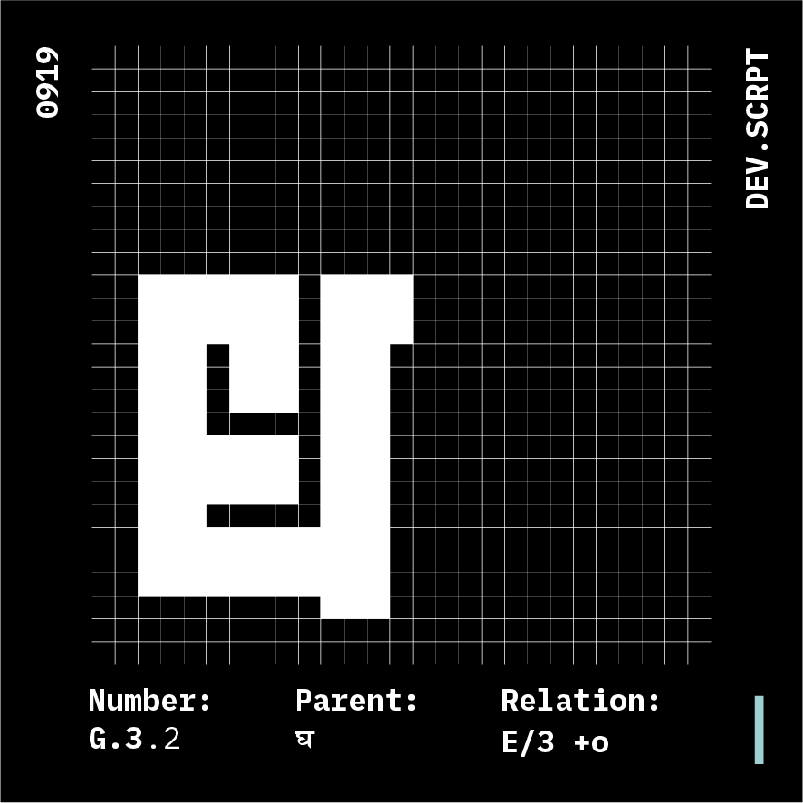
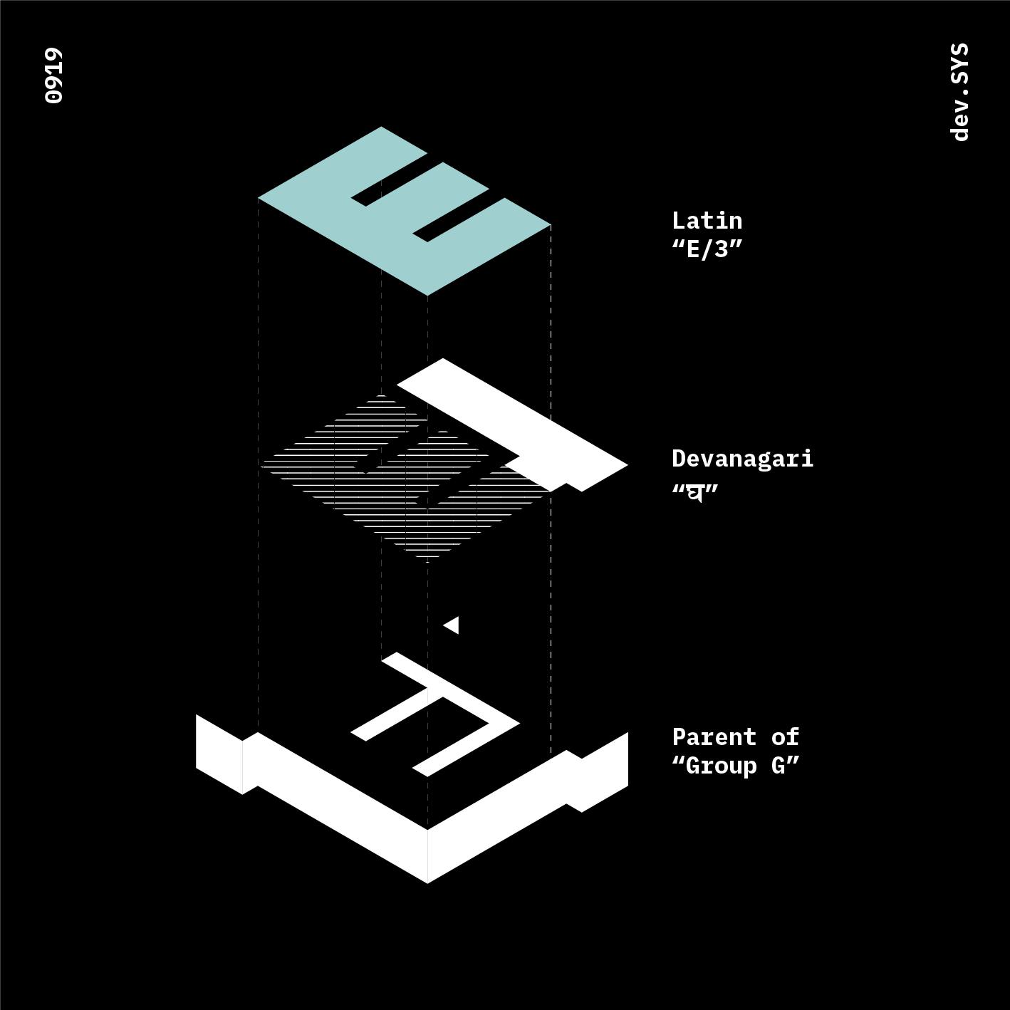
Glyphs: 3
Parent: घ
Anatomy Relation: E

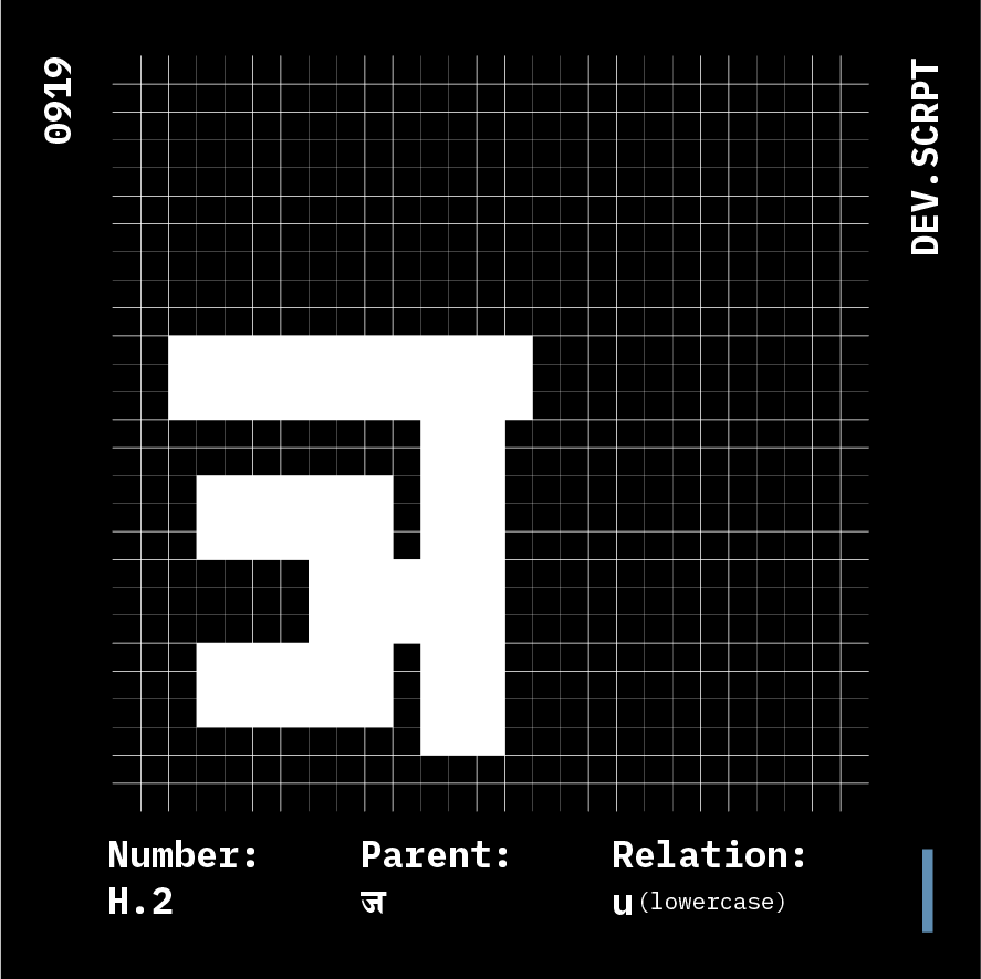

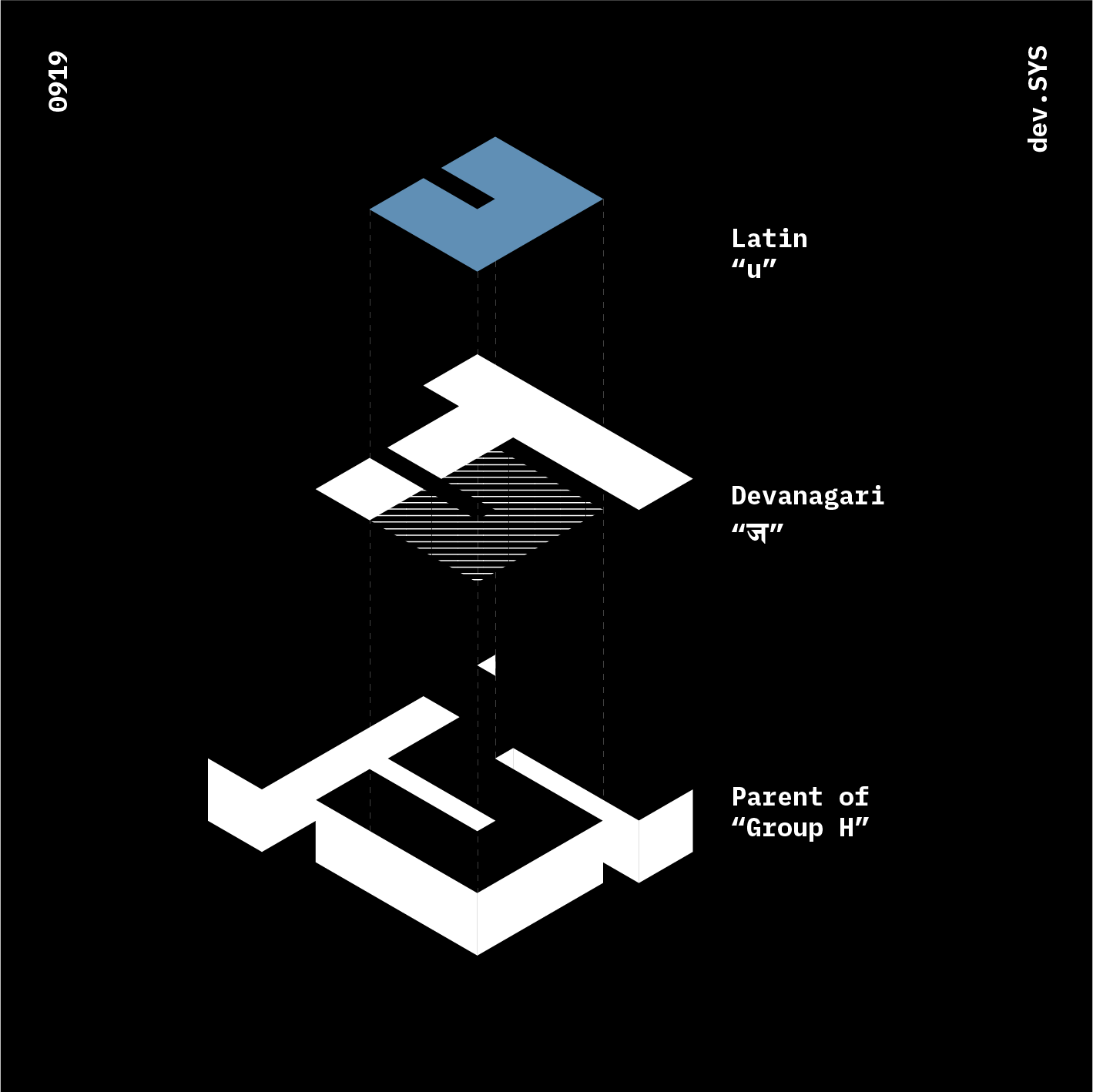
Glyphs: 3
Parent: ज
Anatomy Relation: u
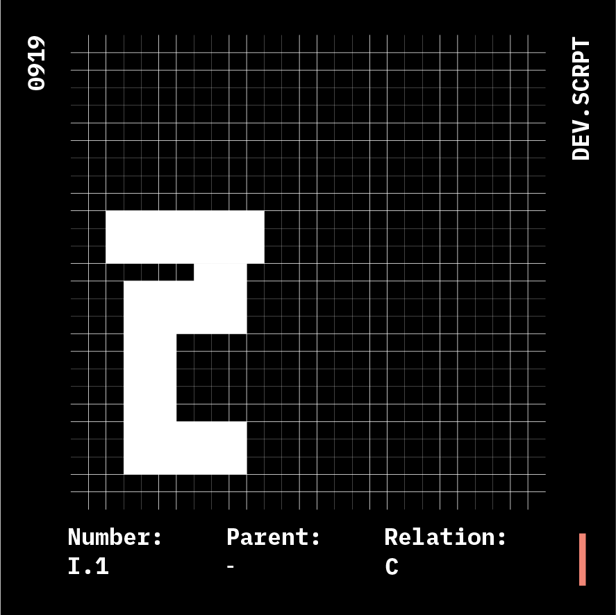
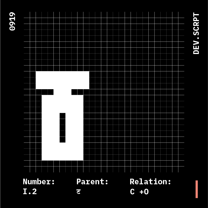
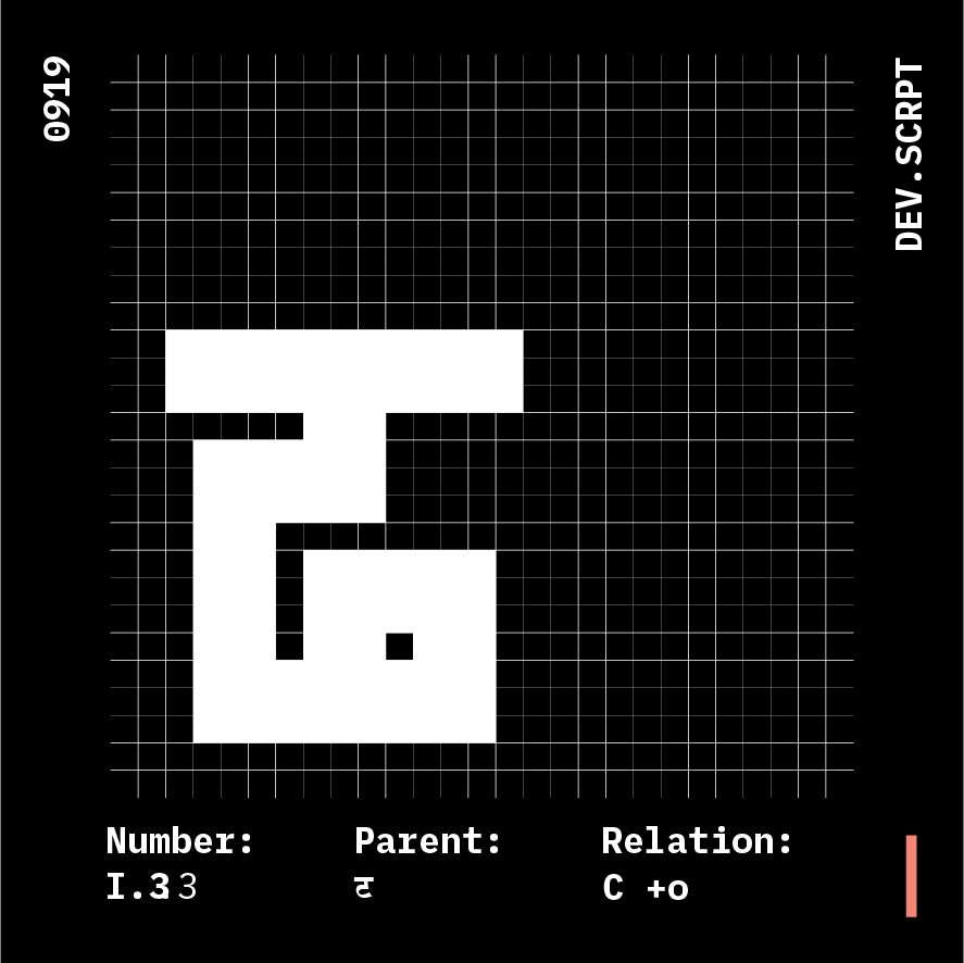
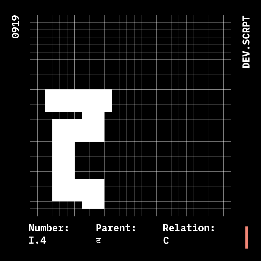
Glyphs: 5
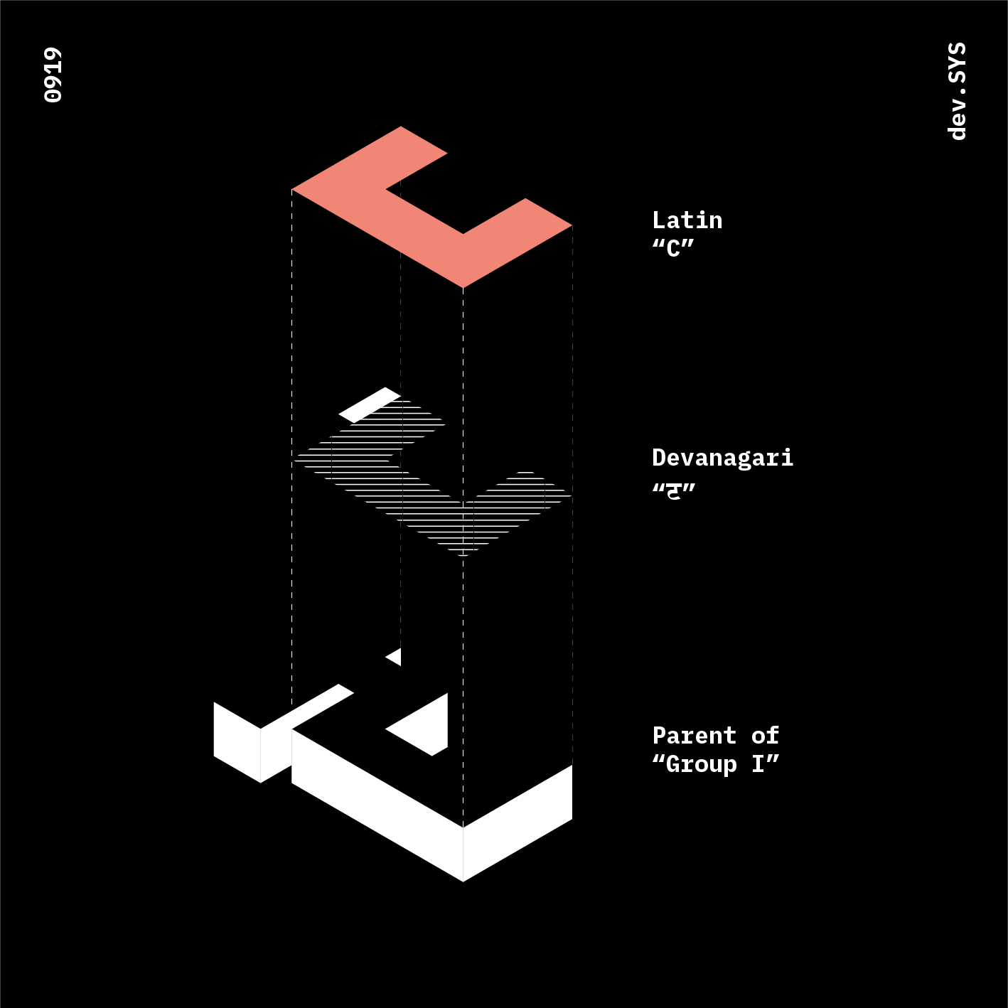
Parent: ट
Anatomy Relation: C
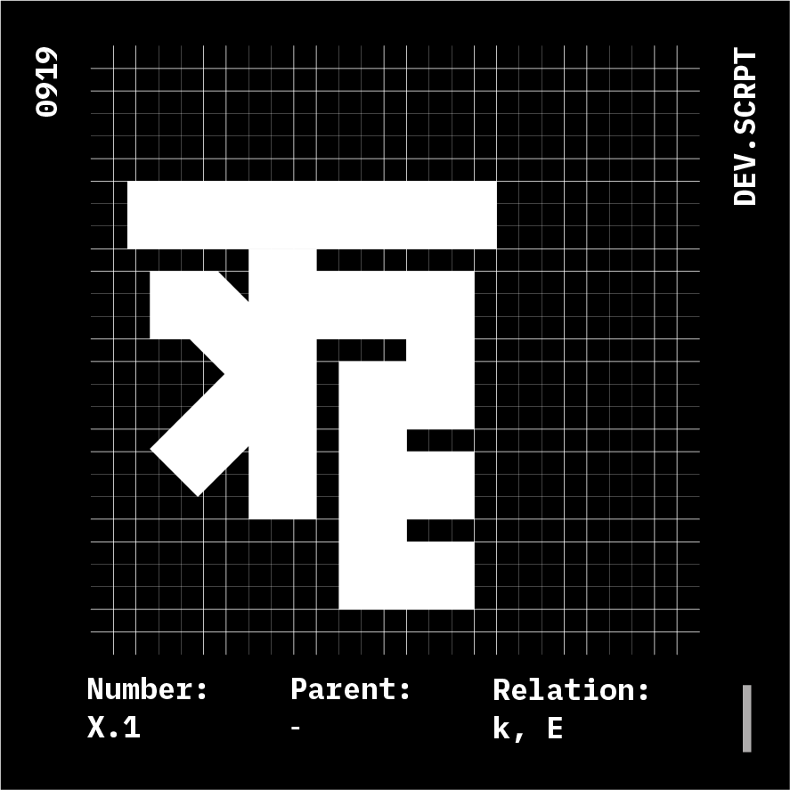

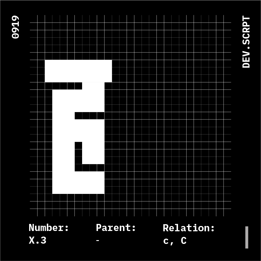
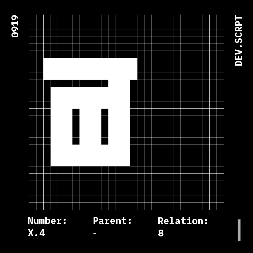
Glyphs: 4
Parent: N.A.
Anatomy Relation: Misc.
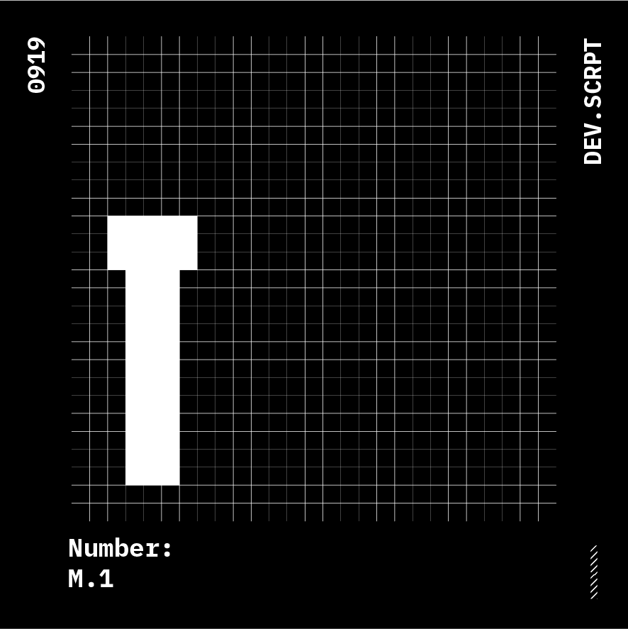


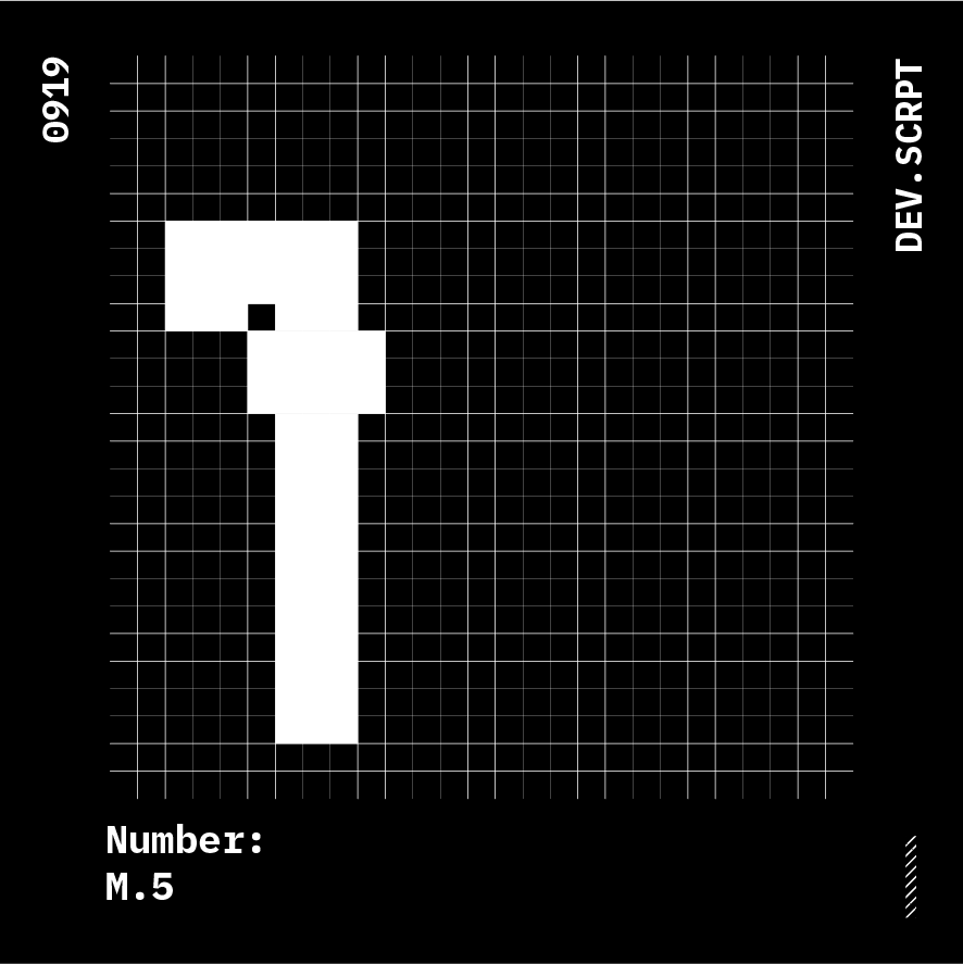
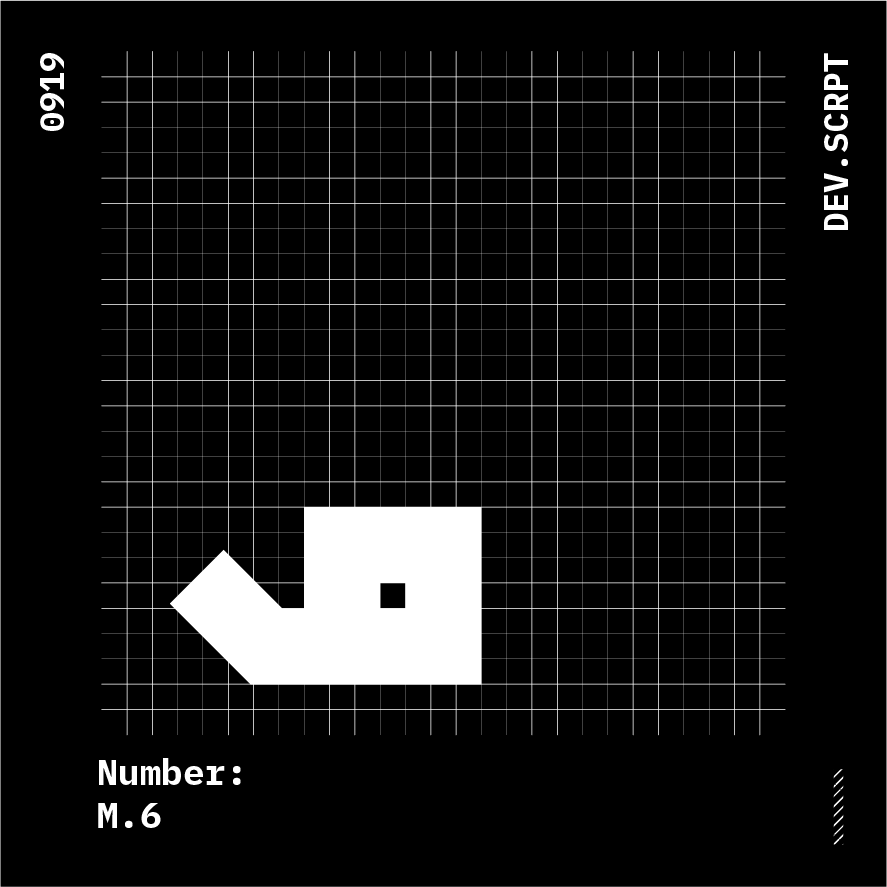
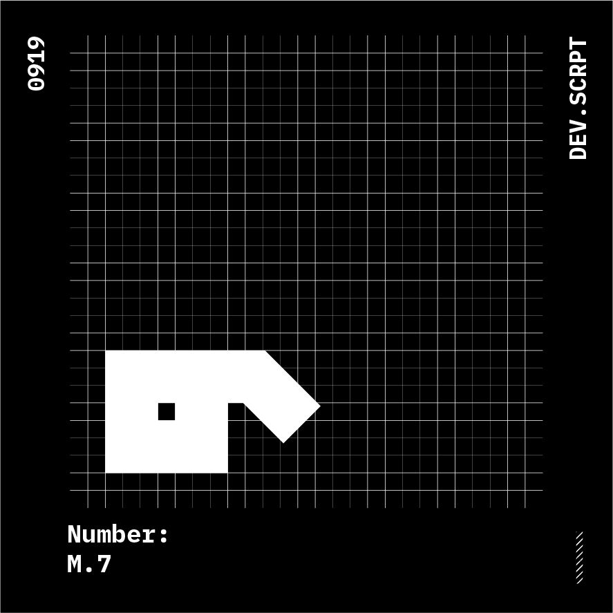
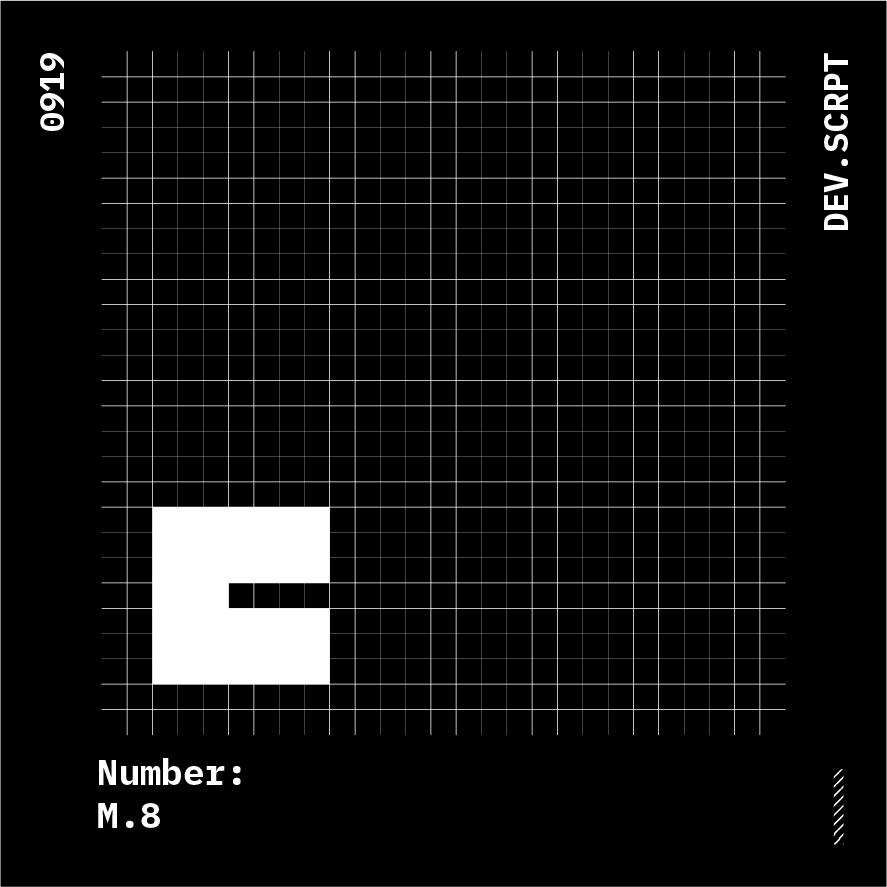
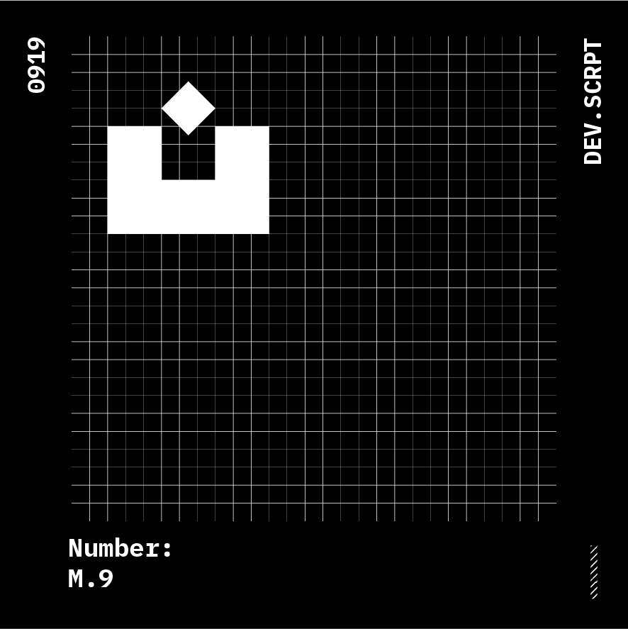
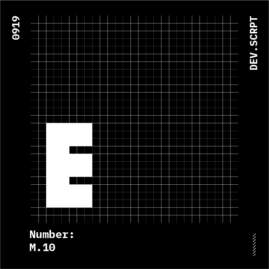
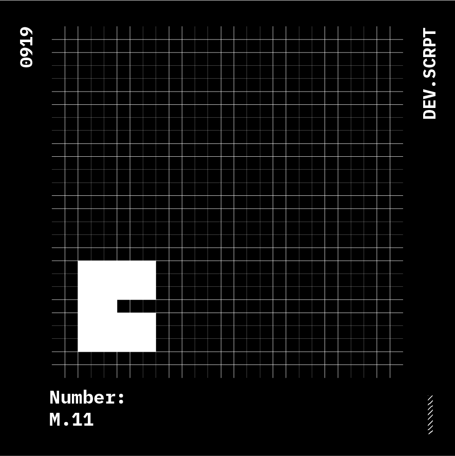
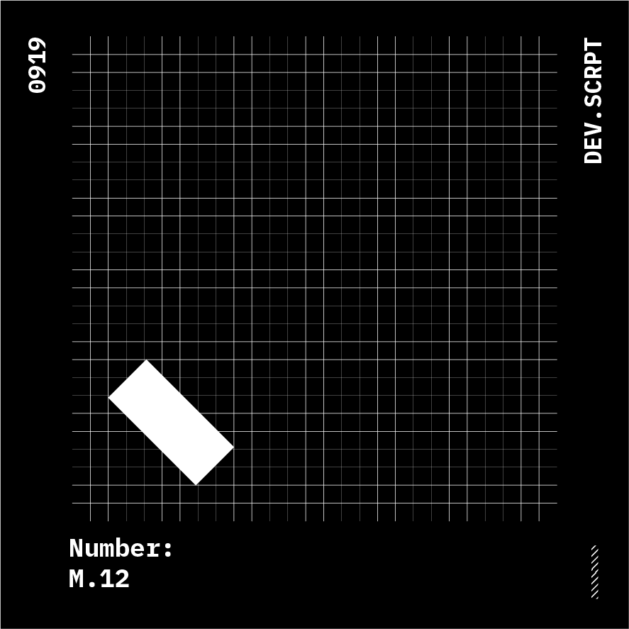
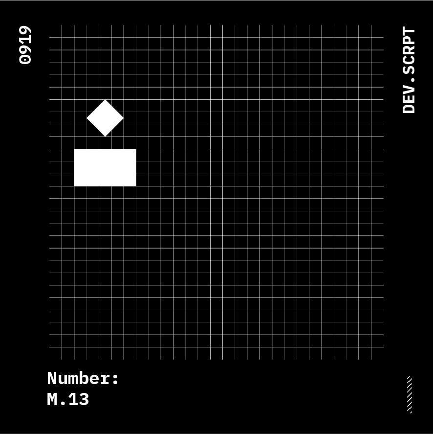
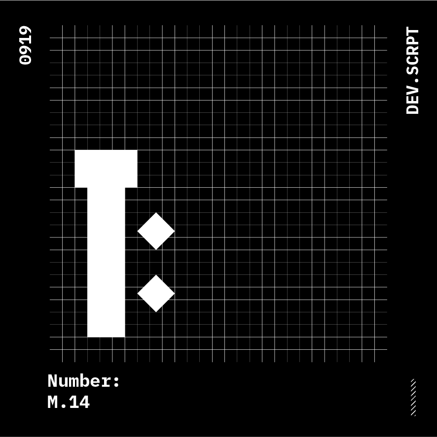
Group M
Glyphs: 14 variants
Parent: NA
Anatomy Relation: misc.
numbers coming soon....
Group N
Glyphs: 10 variants
Parent: NA
Anatomy Relation: misc.
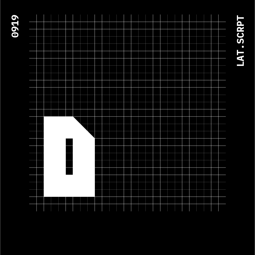
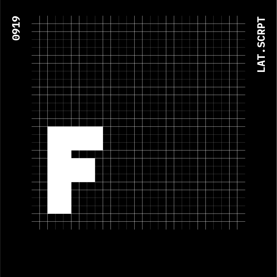
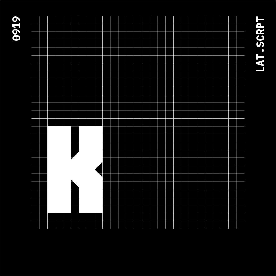
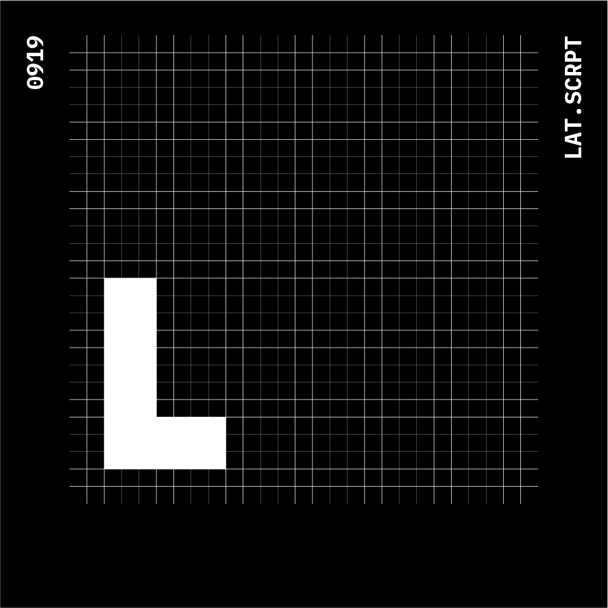
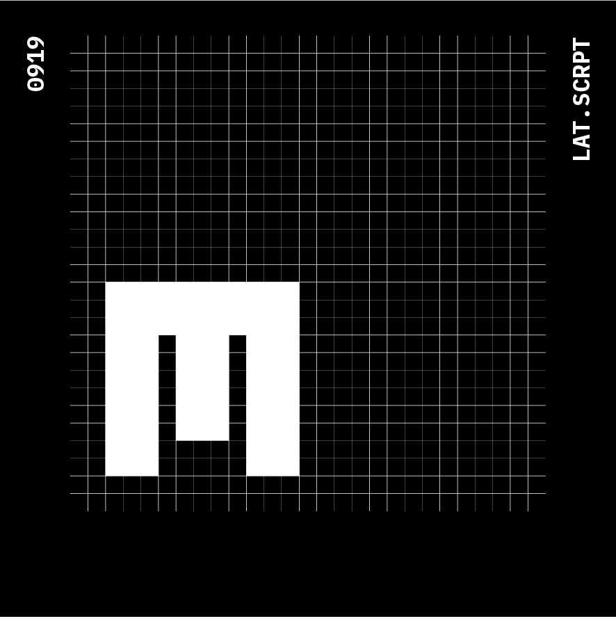
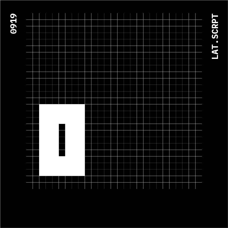
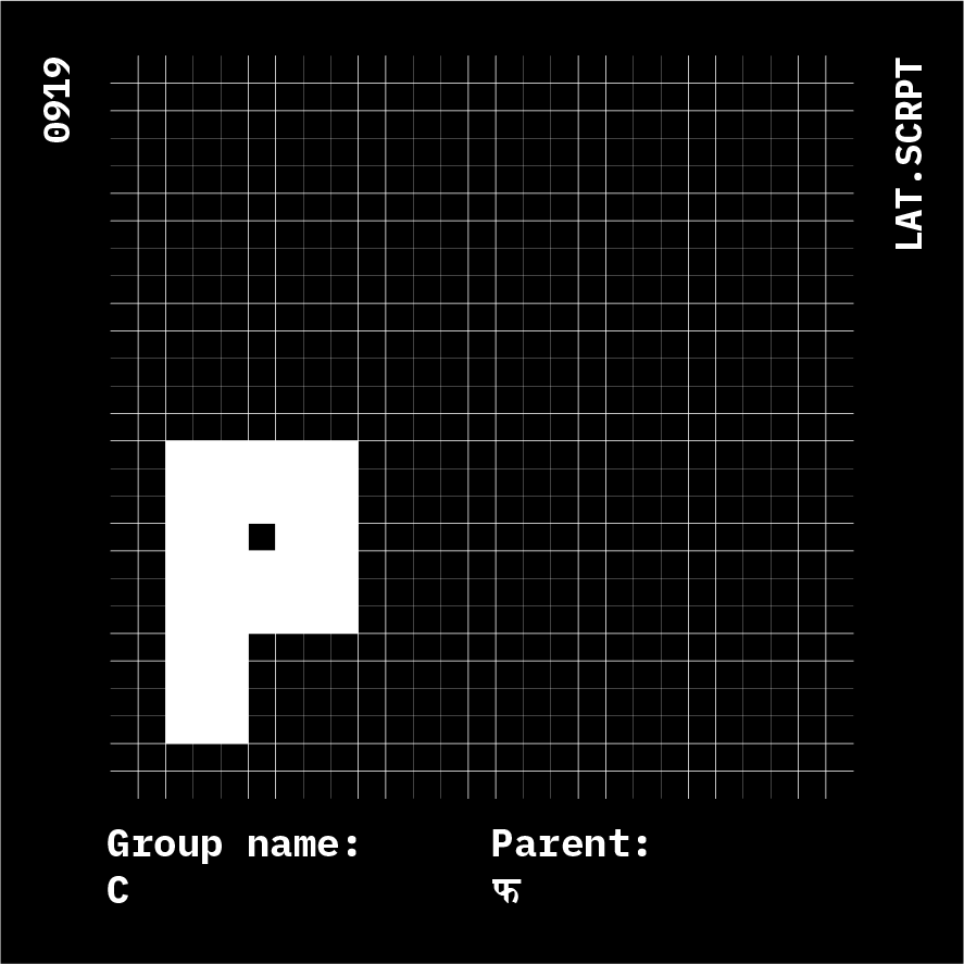
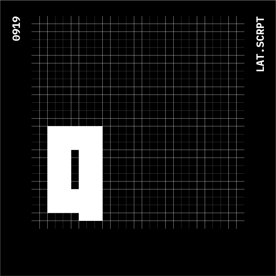
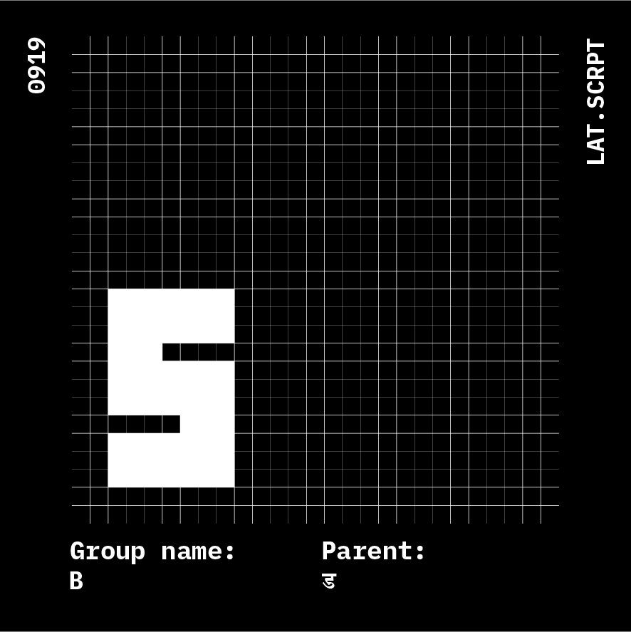
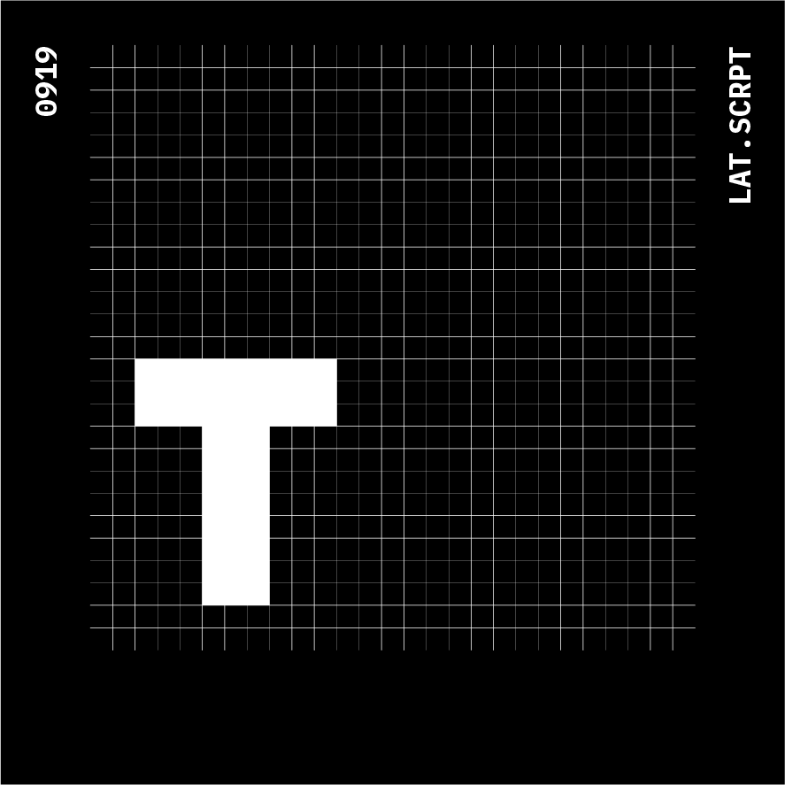
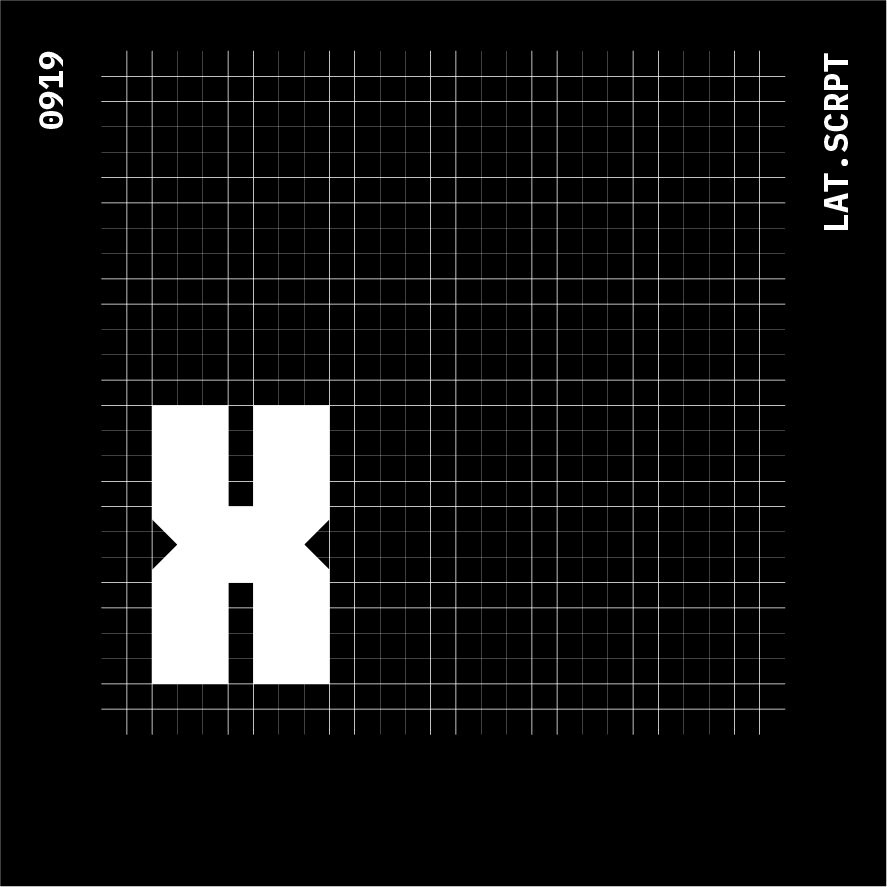
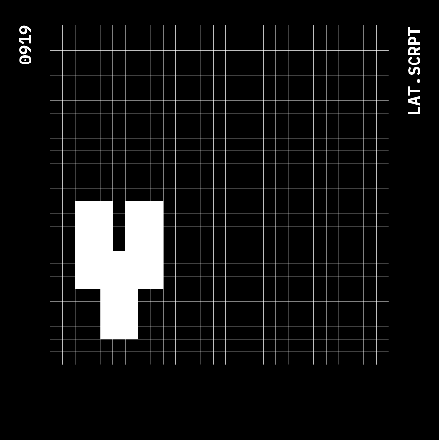
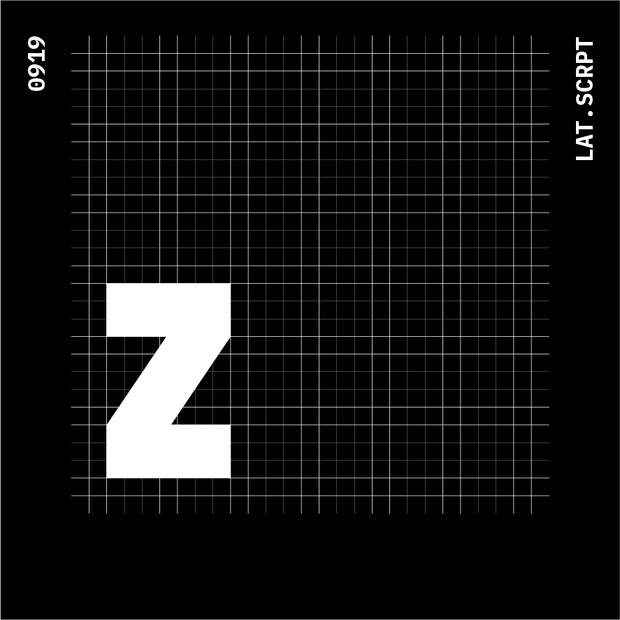
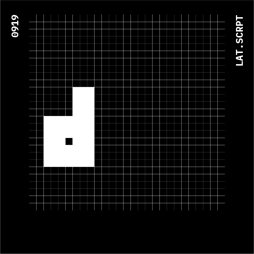
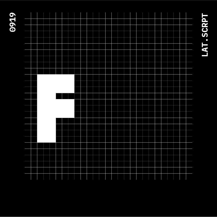
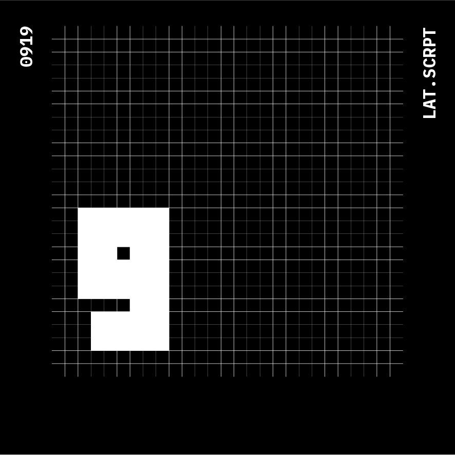
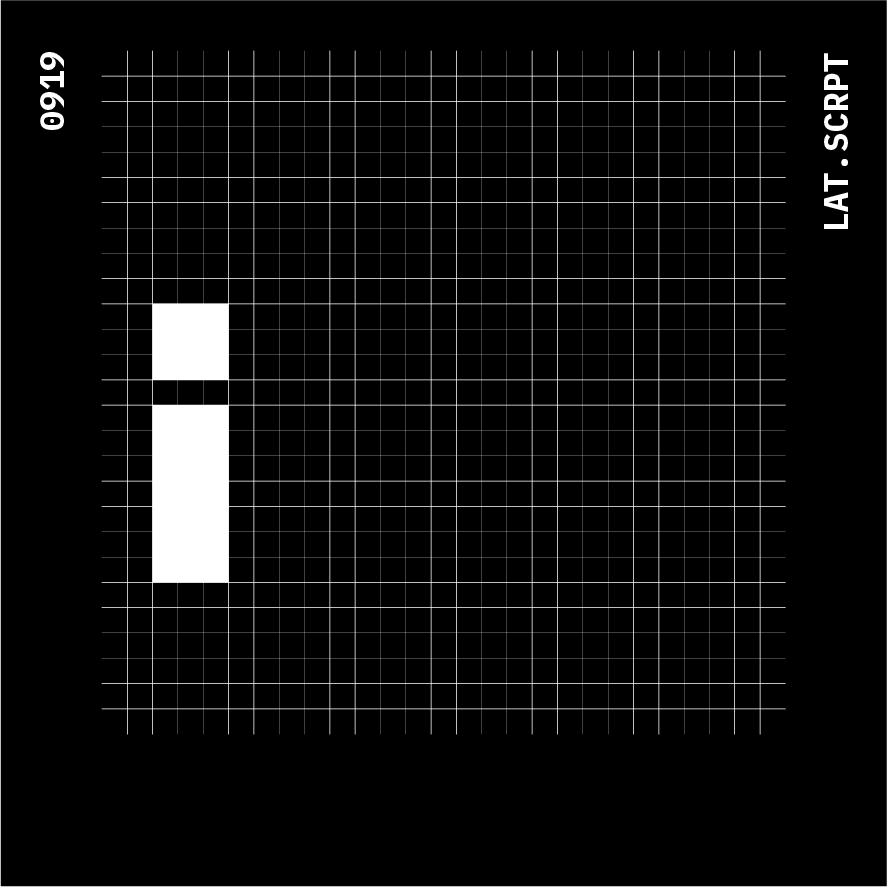
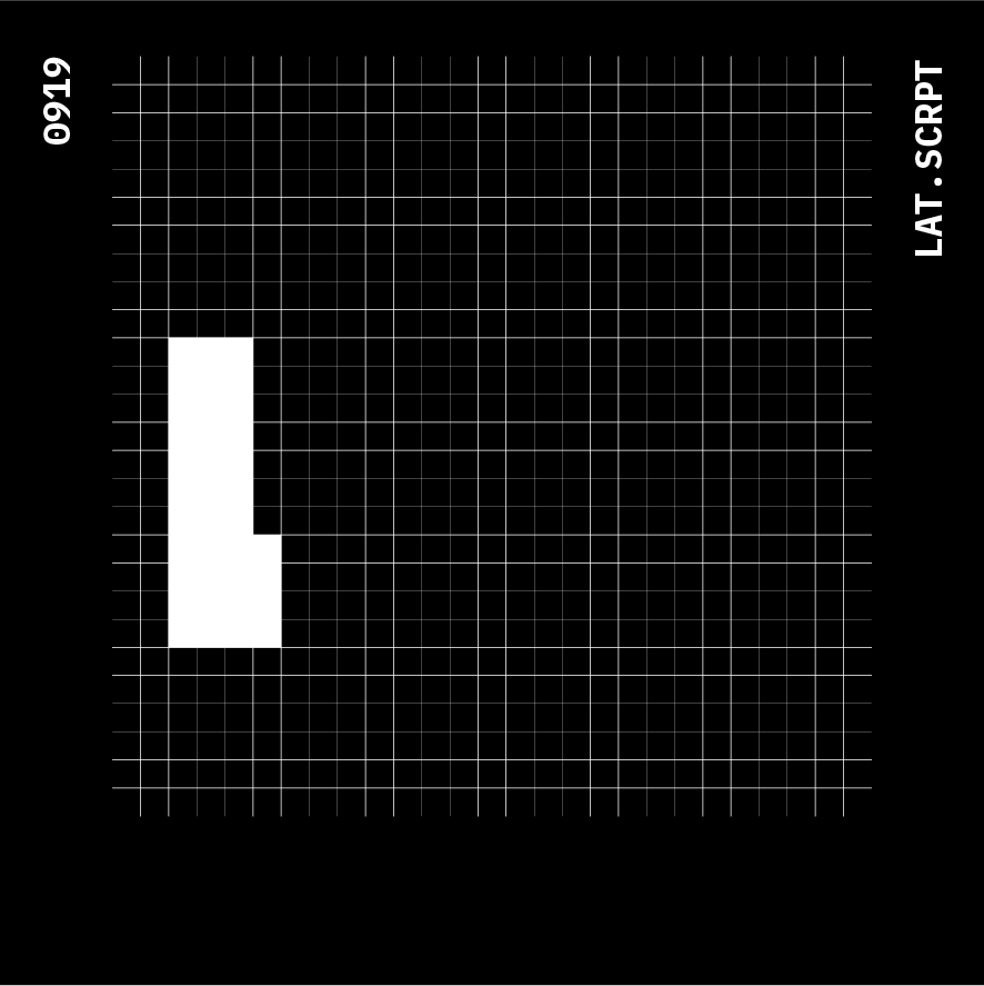
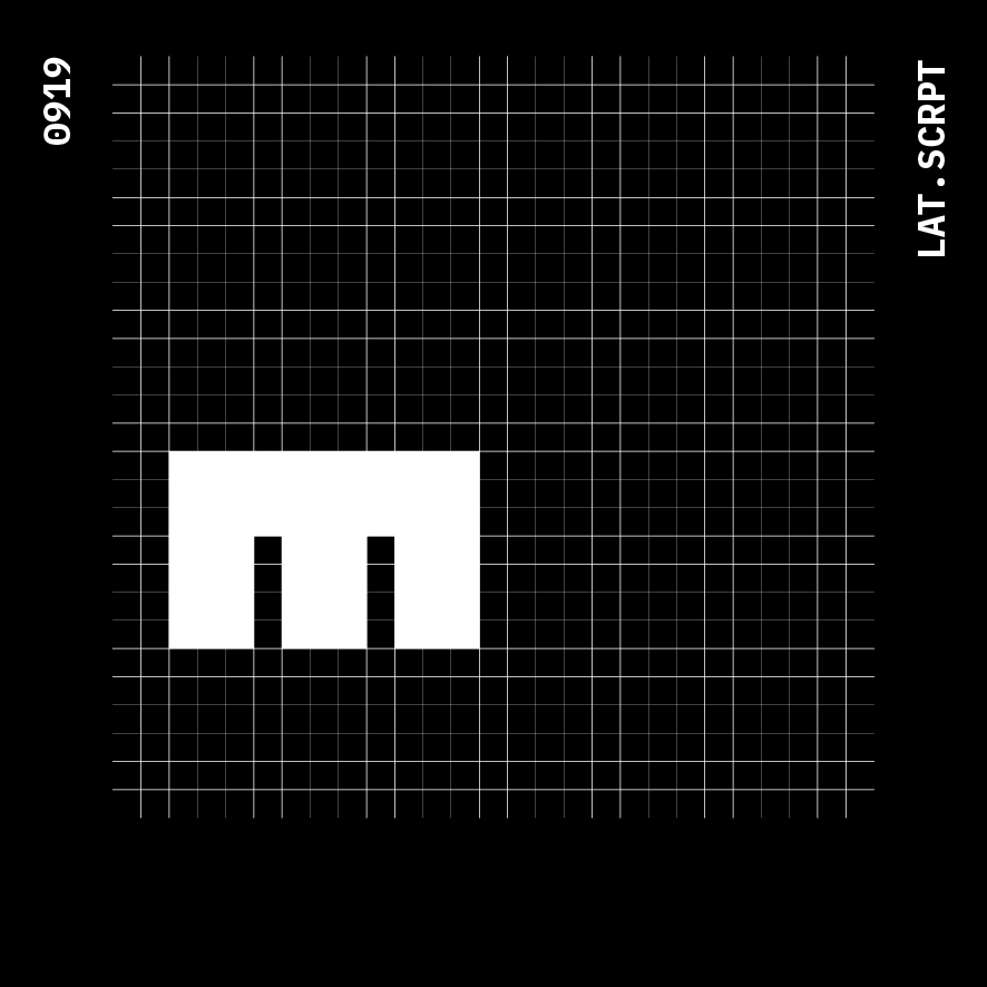
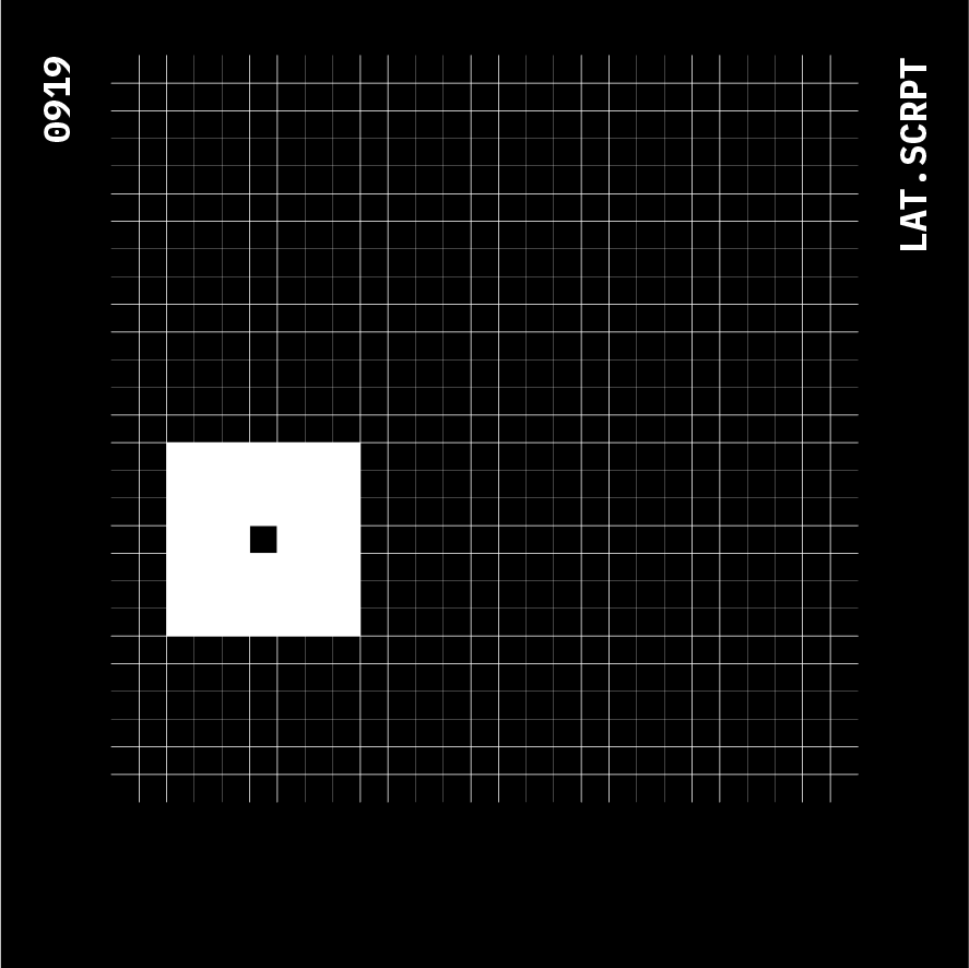
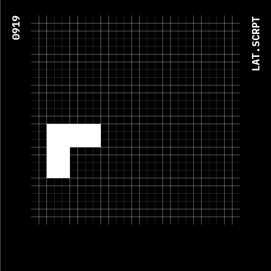
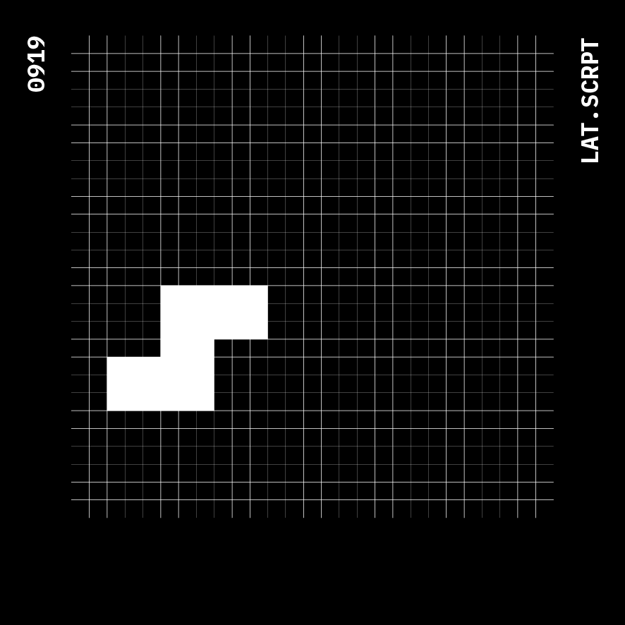
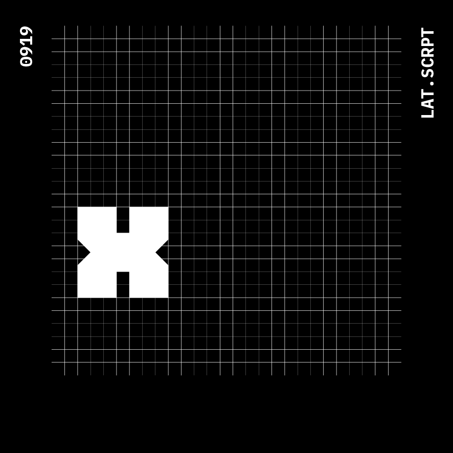
The glyphs for the latin script are also generated.




















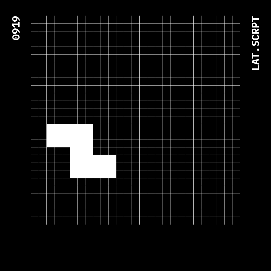
5. Correlation in the anatomy:
6. Edge and Curve Mods:



10. Graphical Representation

A few other graphical explorations;


