Viking Pizza
Client: Venture Innovations
Scope: Brand Identity, Packaging, Print design
Scope: Brand Identity, Packaging, Print design
Status: Complete
Collaborators: -
Collaborators: -

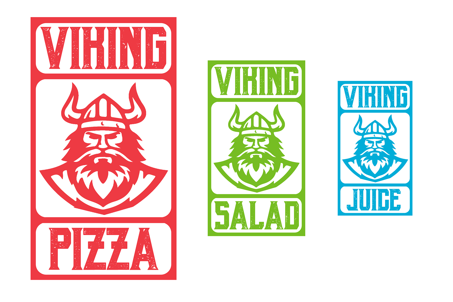
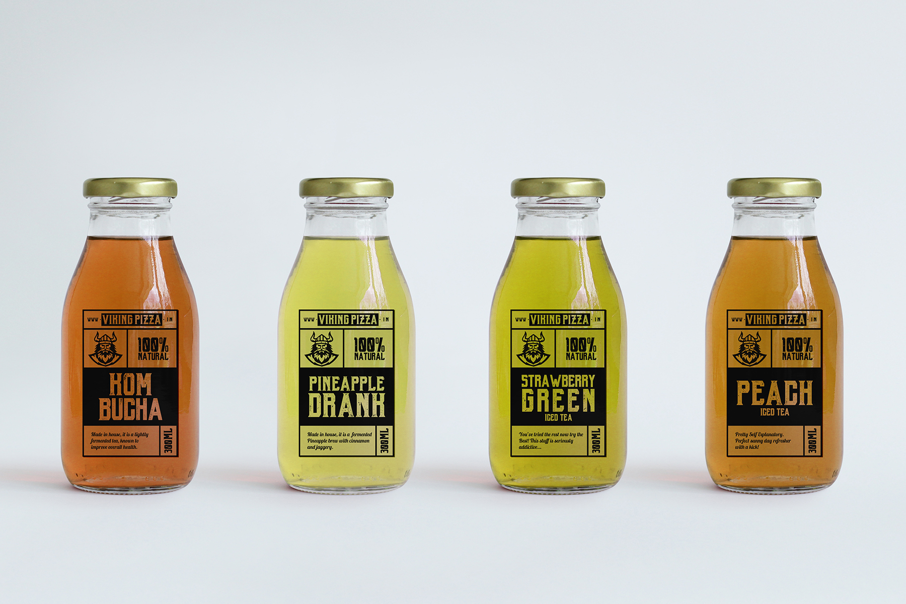
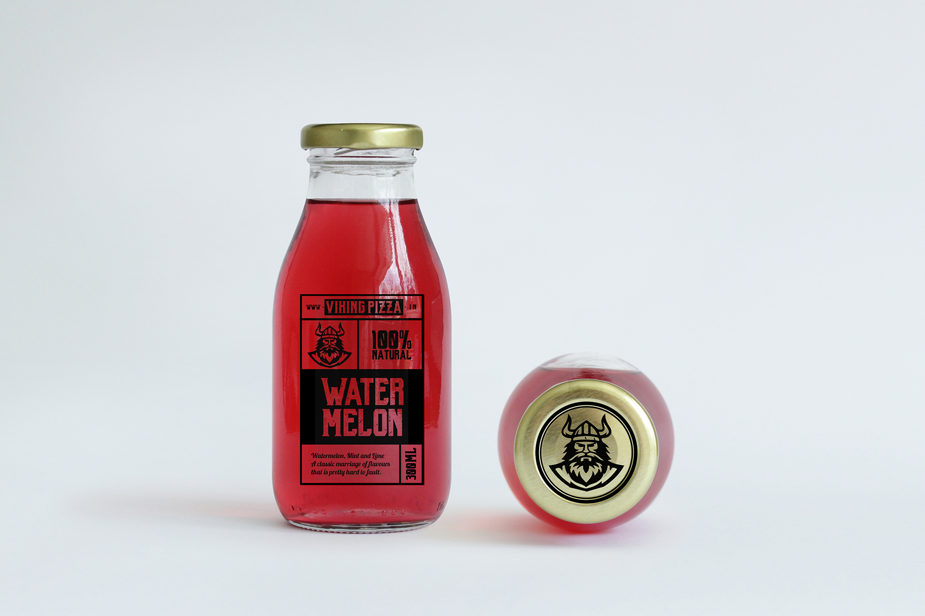
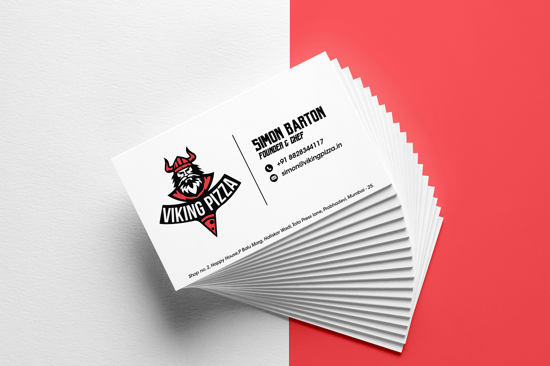
Viking is a Pizza delivery restaurant, catering a B to C service.
Originating from an attempt to stem away from the circular shape of a pizza, there was a conscious effort to design with solid defined grids. The standard bus ticket displays repetitive grids, the structure of which was taken as the base concept for the type. The primary font used was ‘Black Mask’ for its bold and heavy demeanour. A cursive and fluid font such as ‘Lobster’ perfectly complimented the weight of the primary font with a near flawless flow to the letters. The colour scheme was created by picking and combining colours from established pizza brands. The familiarity of the colours helped in recognising Viking as an established, ‘usual’ neighbourhood Pizza brand. There is a significant emotion and awareness that each tone and shade evokes. For instance, the use of red in most brands isn’t a coincidence; the colour in itself demands notice and attention. Thus, it is primarily woven into the Viking brand.
Originating from an attempt to stem away from the circular shape of a pizza, there was a conscious effort to design with solid defined grids. The standard bus ticket displays repetitive grids, the structure of which was taken as the base concept for the type. The primary font used was ‘Black Mask’ for its bold and heavy demeanour. A cursive and fluid font such as ‘Lobster’ perfectly complimented the weight of the primary font with a near flawless flow to the letters. The colour scheme was created by picking and combining colours from established pizza brands. The familiarity of the colours helped in recognising Viking as an established, ‘usual’ neighbourhood Pizza brand. There is a significant emotion and awareness that each tone and shade evokes. For instance, the use of red in most brands isn’t a coincidence; the colour in itself demands notice and attention. Thus, it is primarily woven into the Viking brand.


SEE CASE STUDIES HERE:
_OUTRBODY SYSTMS
BRAND STRATEGY & IDENTITY DESIGN | WON A BLUE ELEPHANT
BRAND STRATEGY & IDENTITY DESIGN | WON A BLUE ELEPHANT
_INBTWN
INDUSTRIAL DESIGN | WON A BLUE ELEPHANT
_URBNMNKY SYSTMS
PRODUCT DESIGN | WON A BABY BLUE ELEPHANT
_EDEN
ARCHITECTURAL & INTERIOR DESIGN | FIRST LIST