Studio Tessera
Client: Sagarika Suri
Scope: Brand Identity, Print design
Scope: Brand Identity, Print design
Status: Complete
Collaborators: -
Collaborators: -
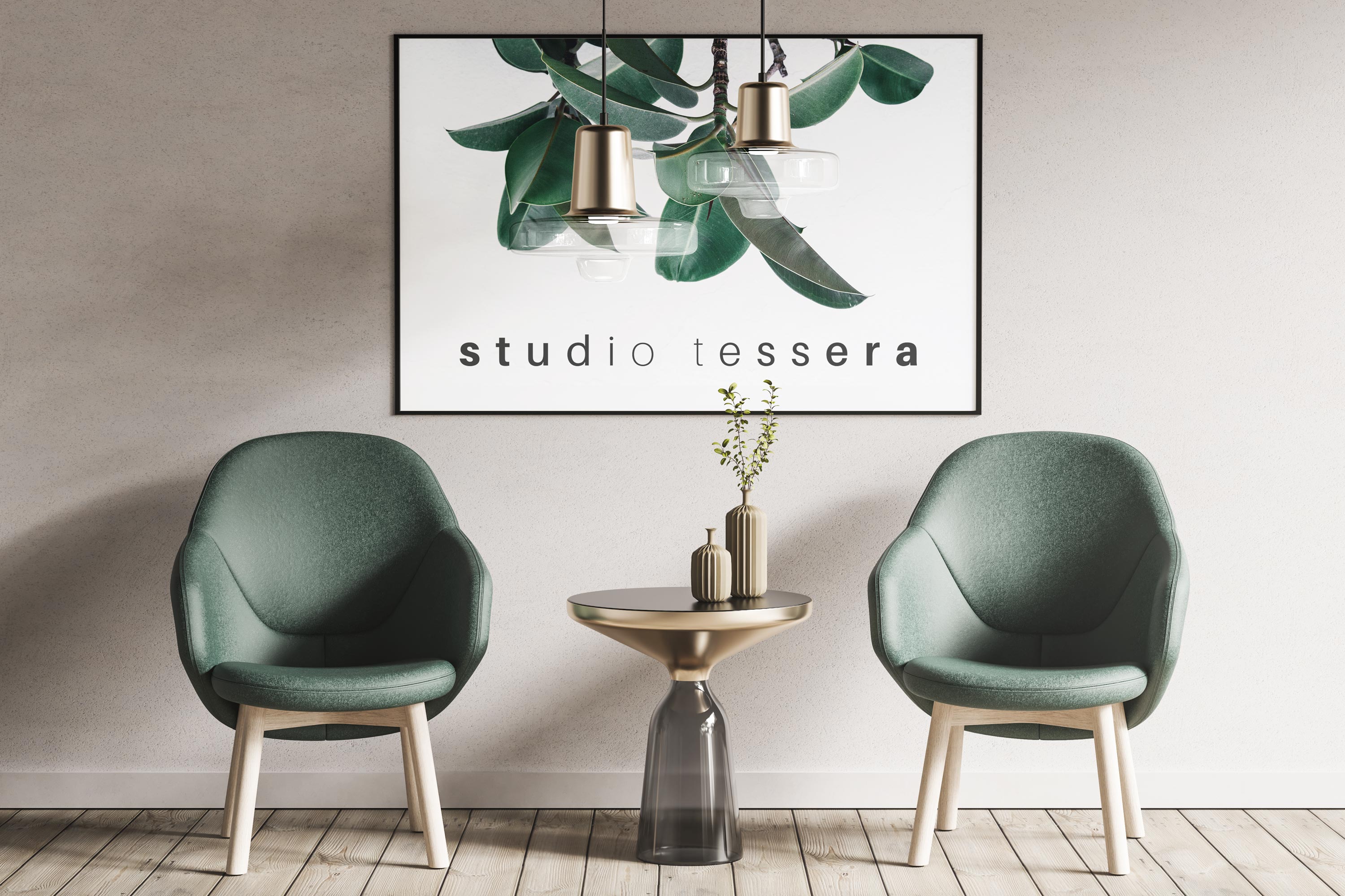
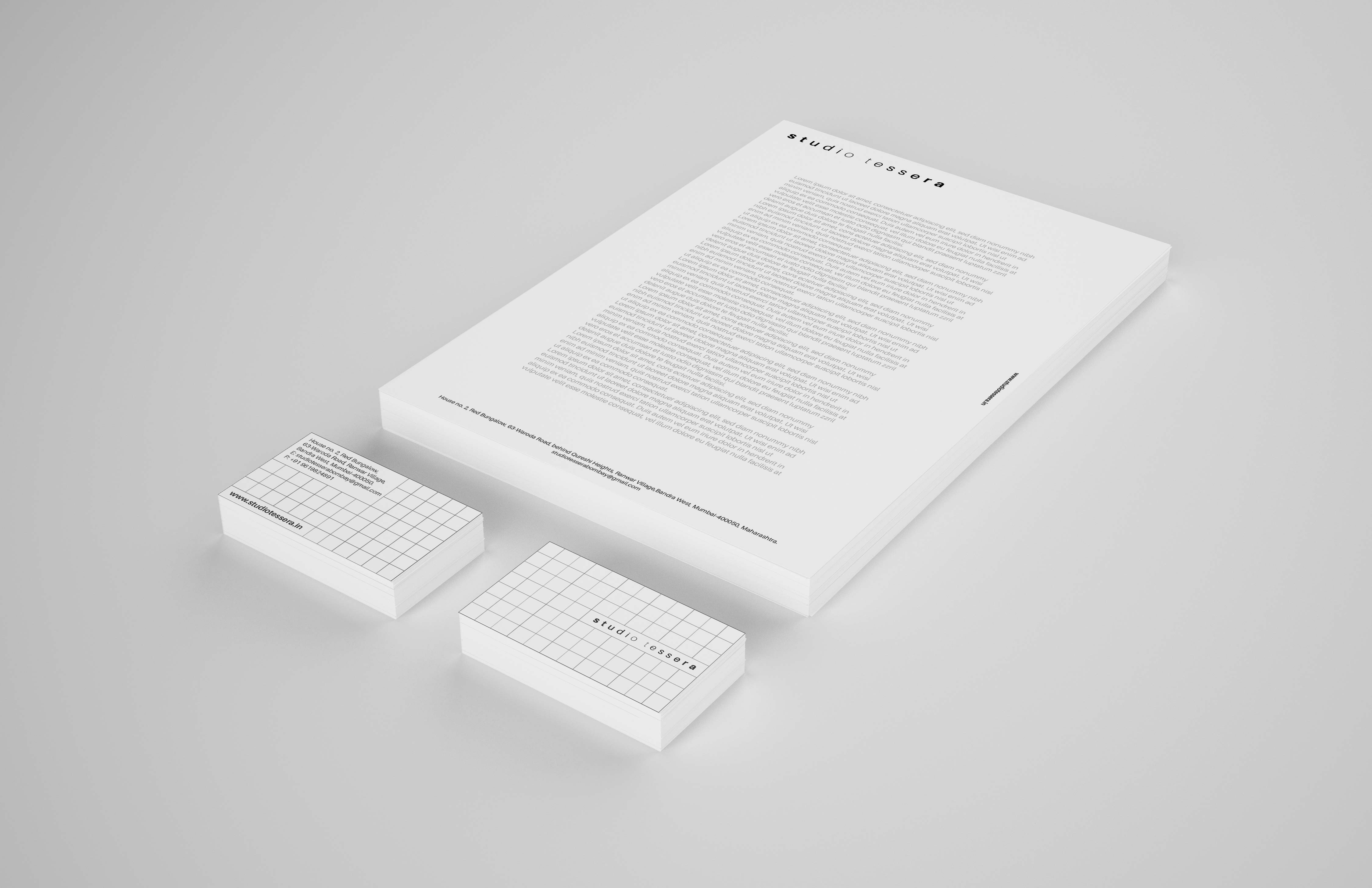
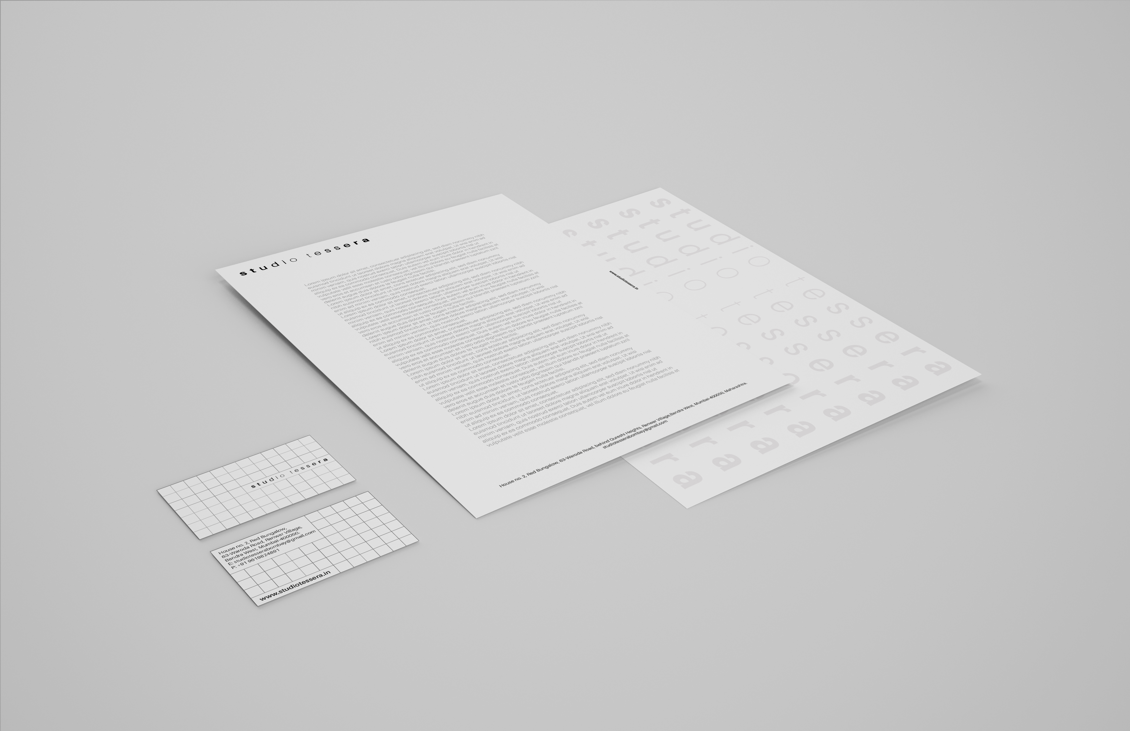
Studio tessera is a boutique design studio in Mumbai by Sagarika Suri.
The studio has been exploring architecture and interior design interventions, and recently has extended its horizons into smaller scales.
The identity of the studio is expressed through a typeface, Aileron. The elegant, geometric, and simple font has multiple weights and variants. This in turn helps establish layouts and hierarchy of type within the studios identity.
The studio believes working at several scales simultaneously enhances the project and the practise. The variating weights in the mark, symbolise attention to macro and micro detail and the gradient of the journey that lies within.


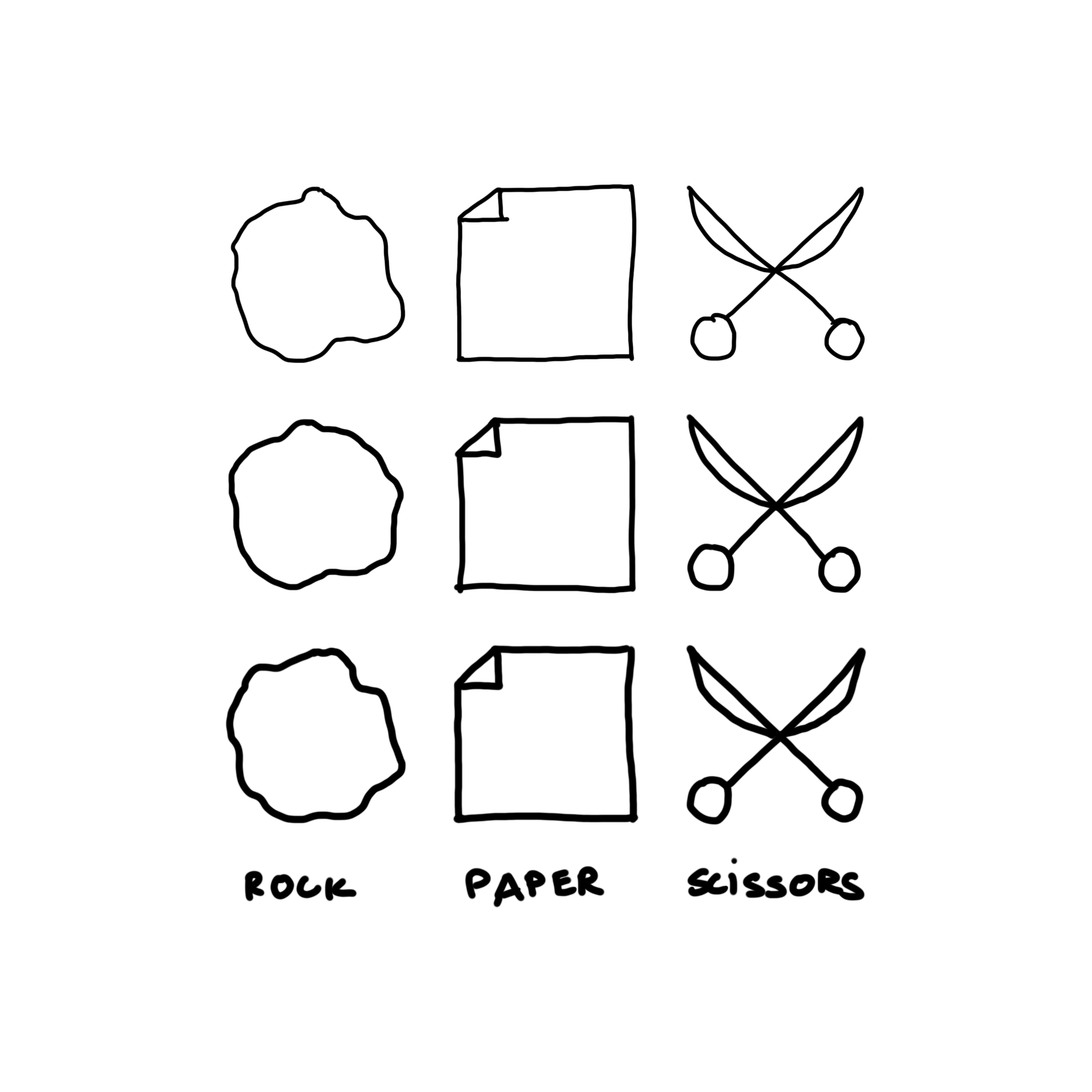
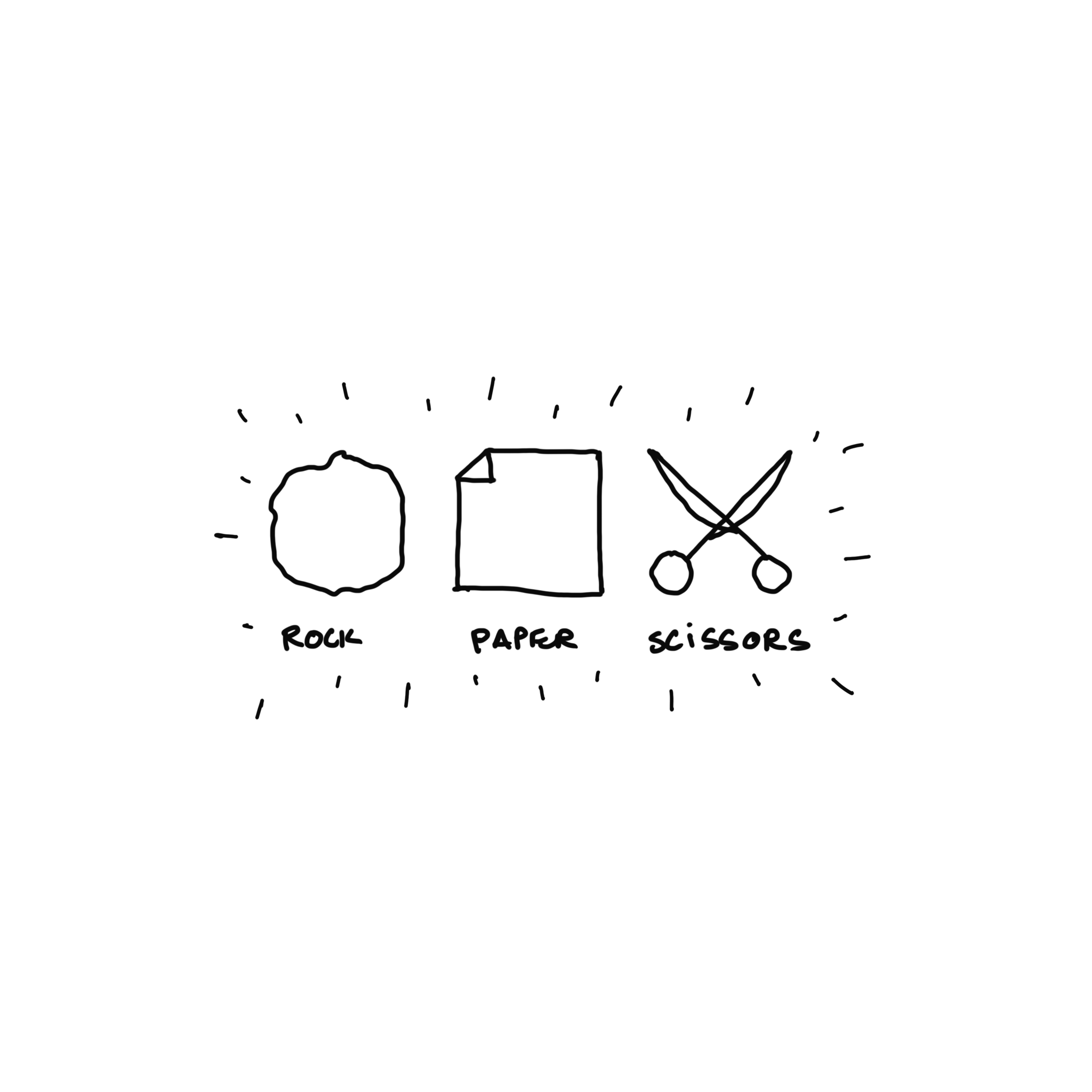
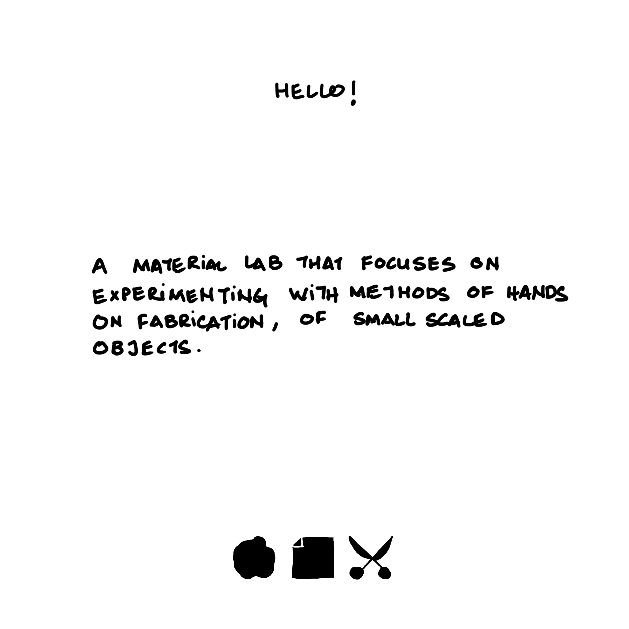
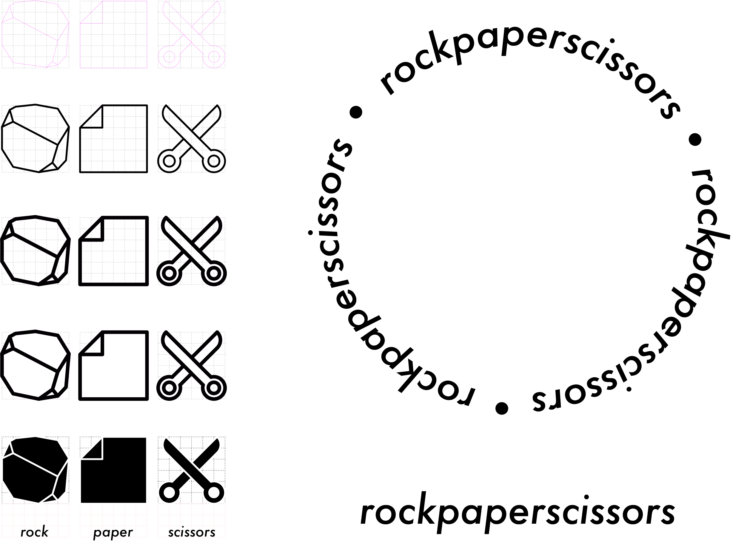
Rock paper scissors is a new material lab within the studio that experiments with methods of making at smaller scales.
The Lab’s experiments are always a “work in progress” since there is no limit to experimentation, the mark expresses the raw nature of the hands-on process through a hand-drawn format.
Rather than striving to create a singular mark, the name creates an opportunity to mould 3 different marks that symbolise each of these objects.
With FUTURA being the choice of type, inspired by the subtitles in the movie Isle of Dogs by Wes Anderson.