Osheish
Client: Osheish Distribution Pvt. Ltd.
Scope: Rebranding, Packaging, Print design
Scope: Rebranding, Packaging, Print design
Status: Complete
Collaborators: -
Collaborators: -
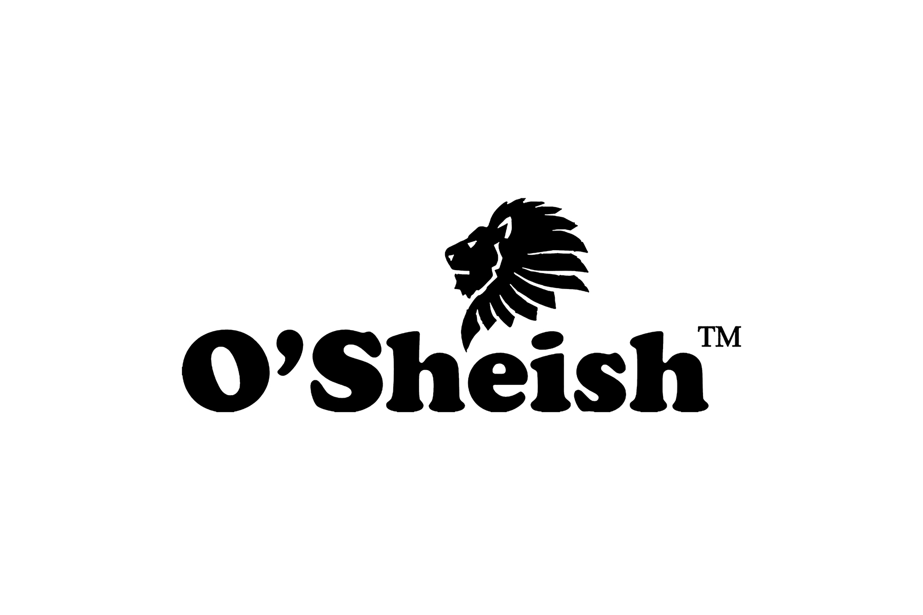
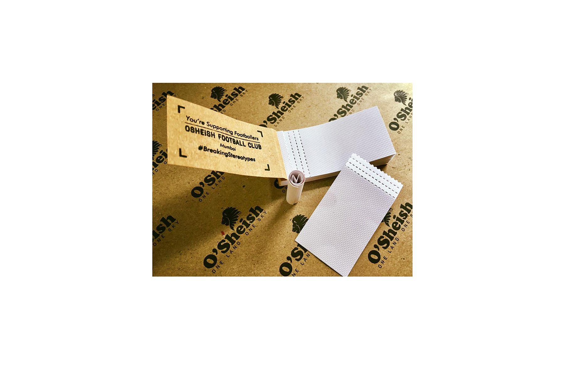
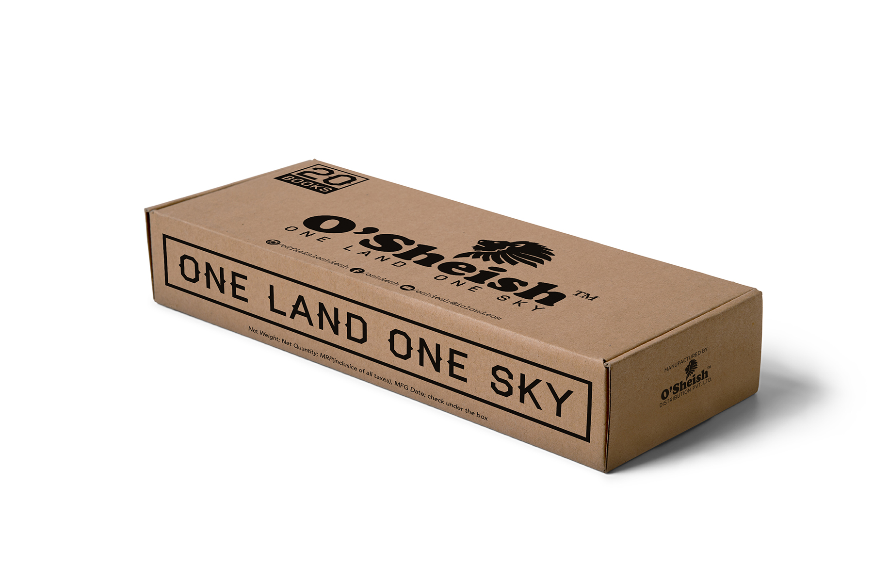
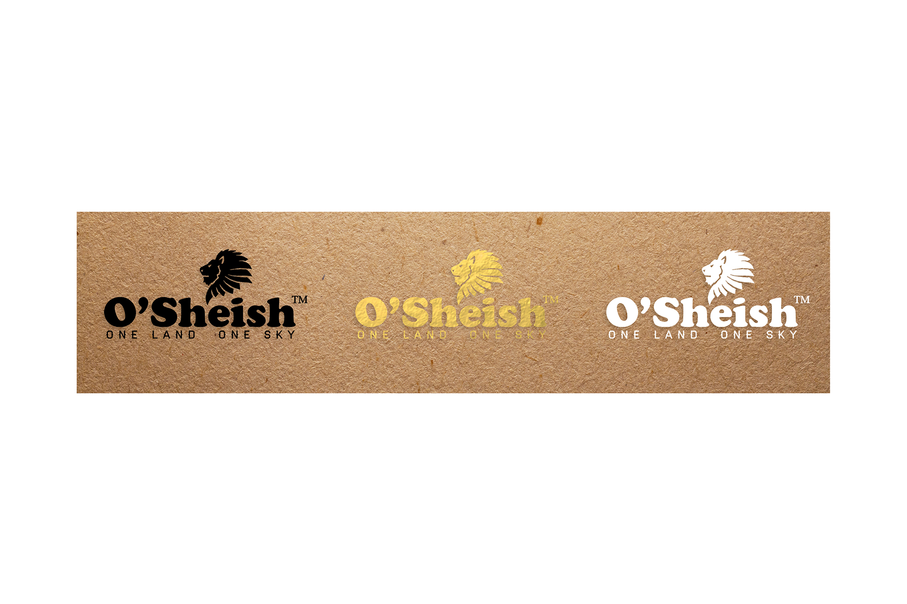
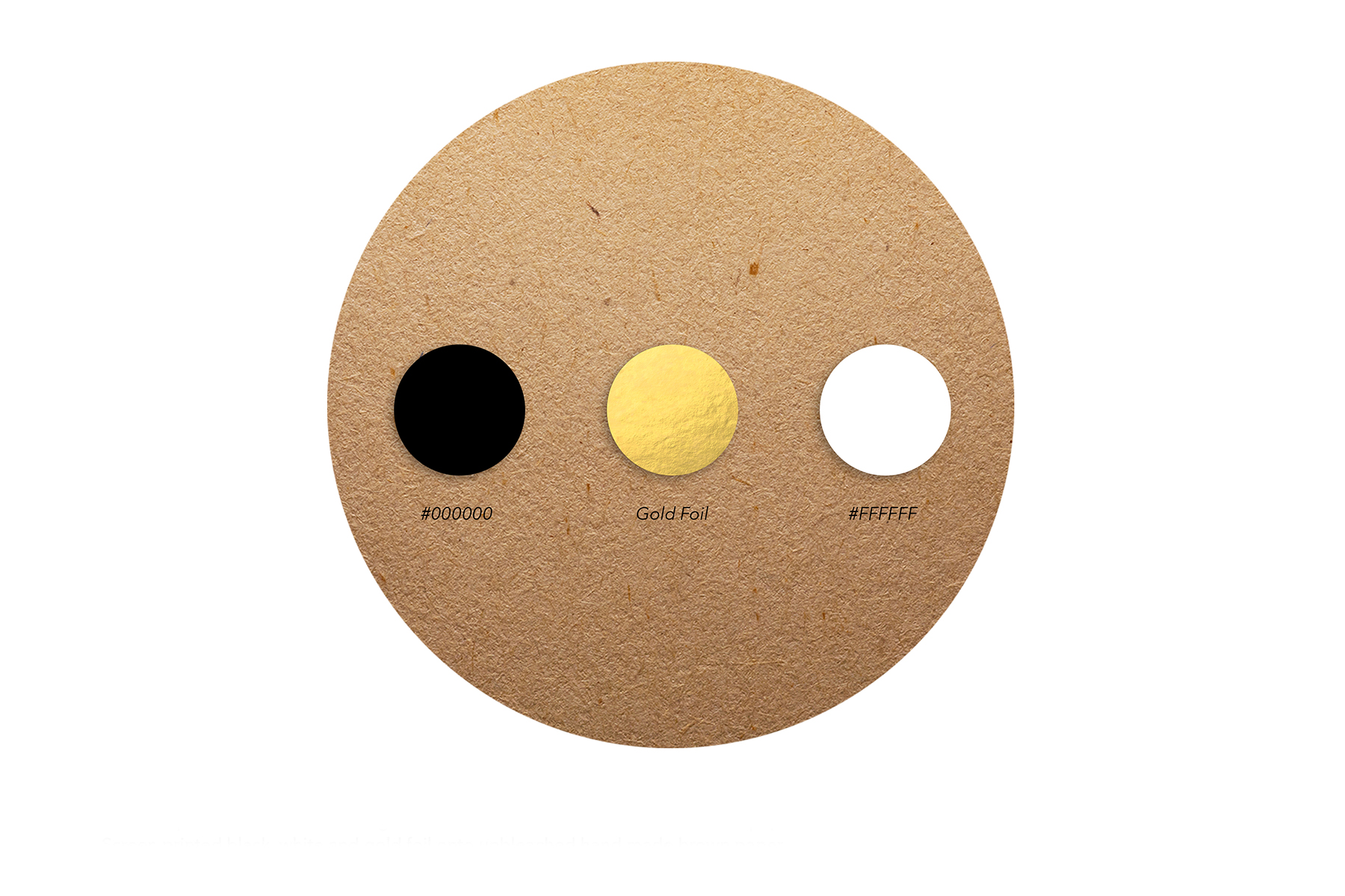
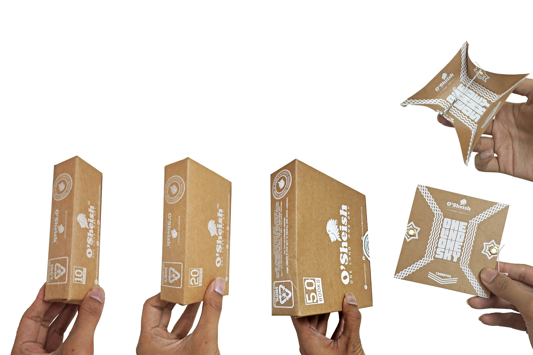
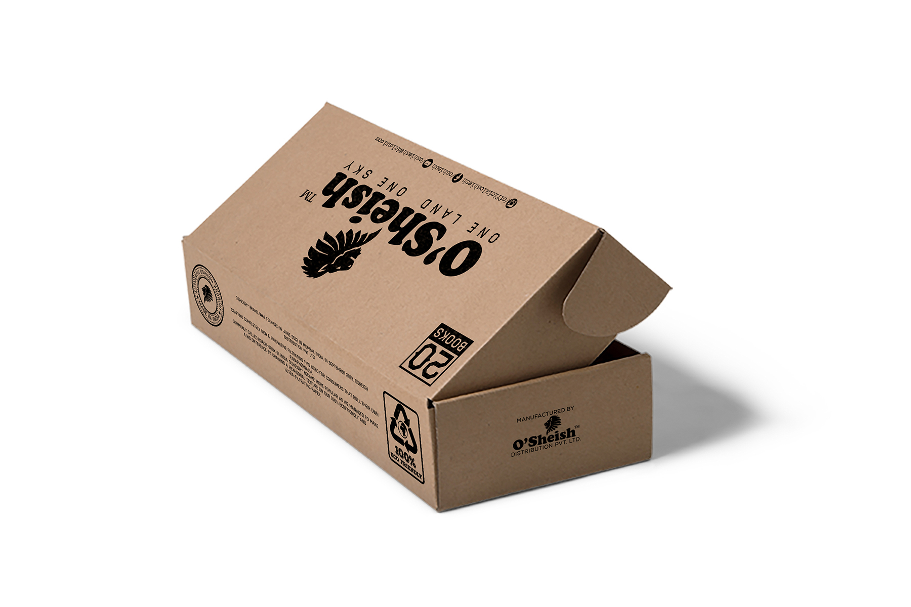
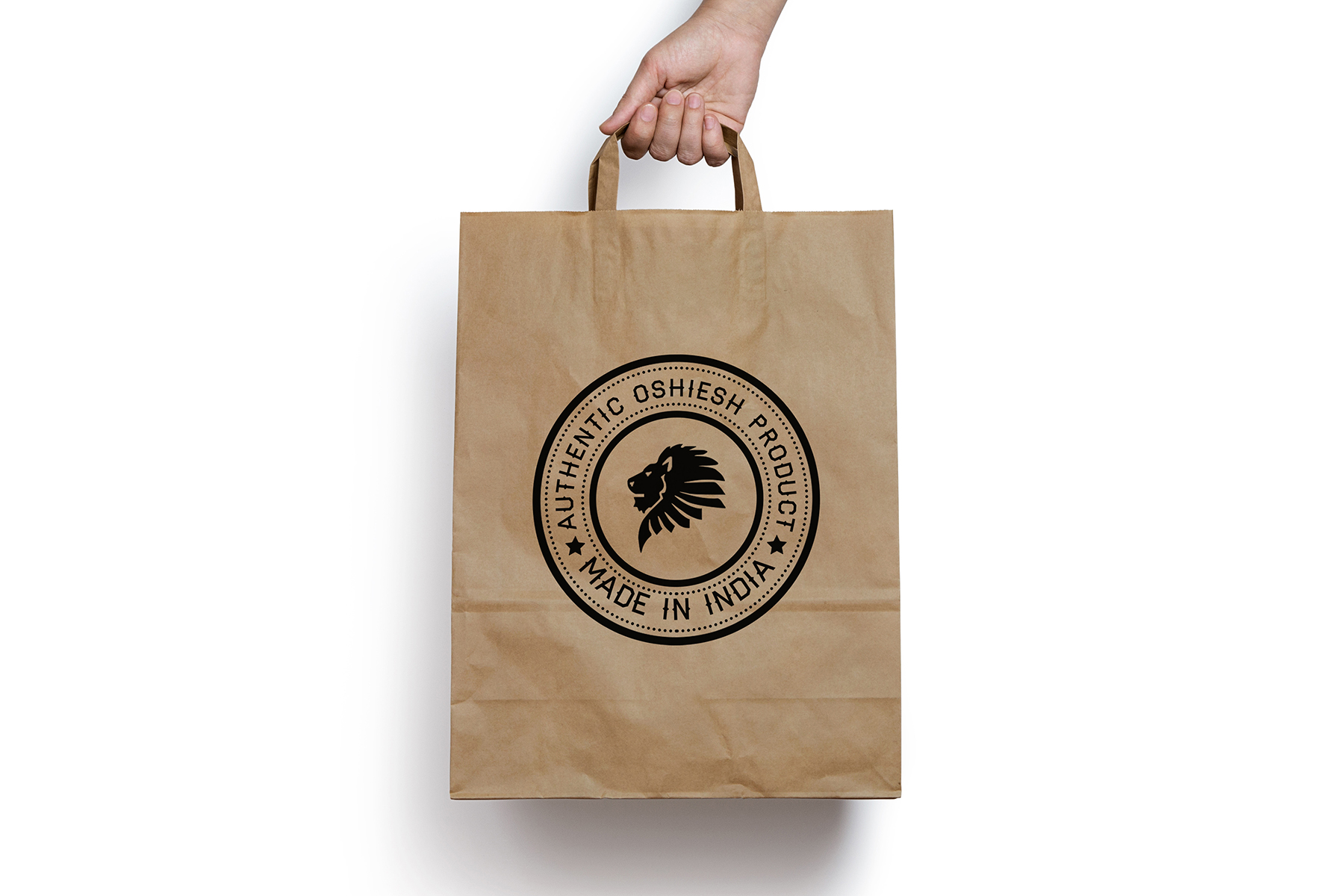
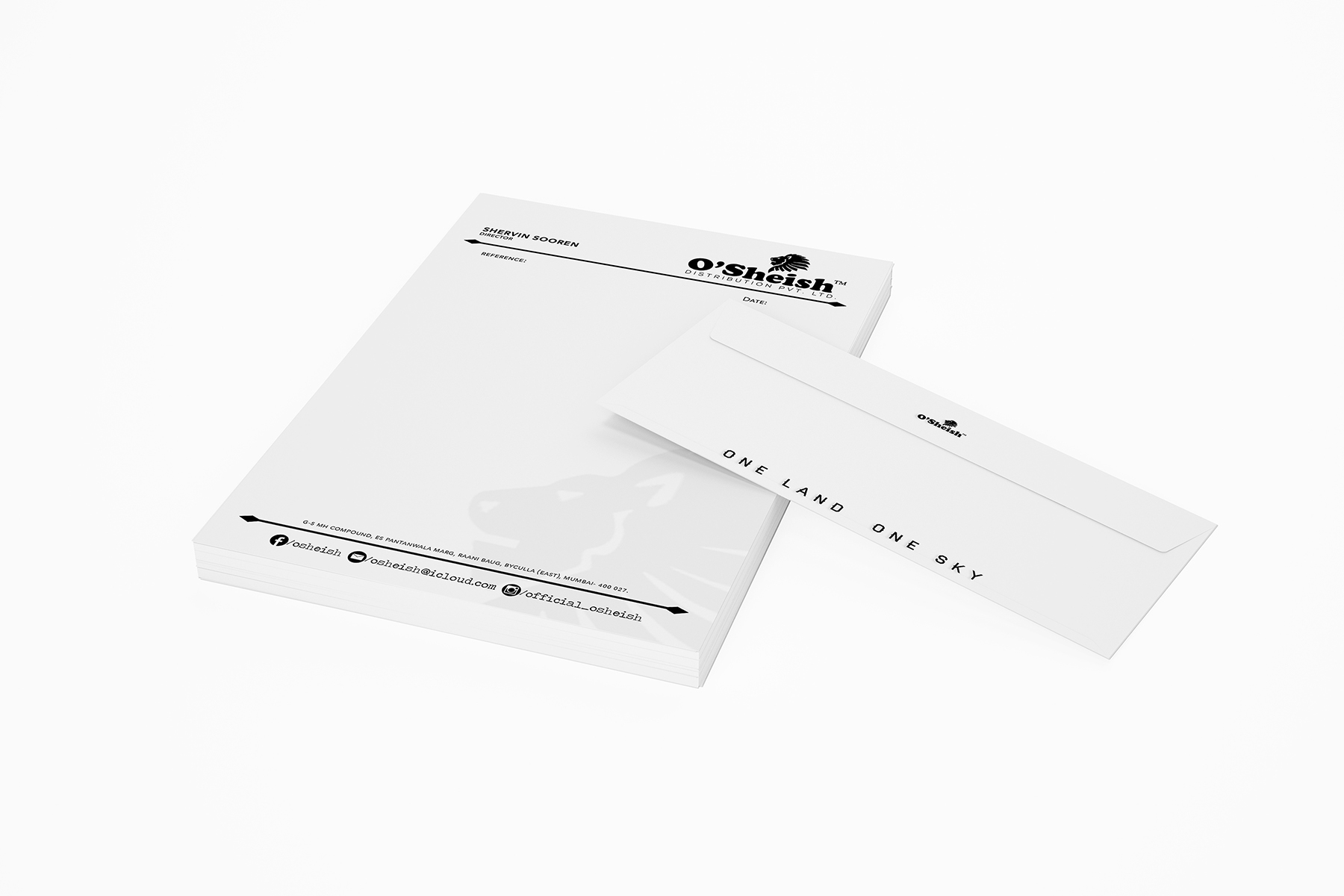
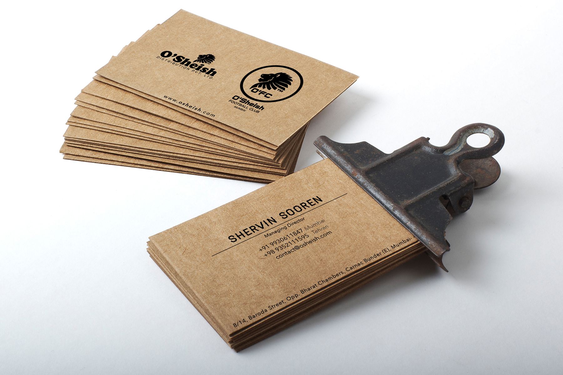
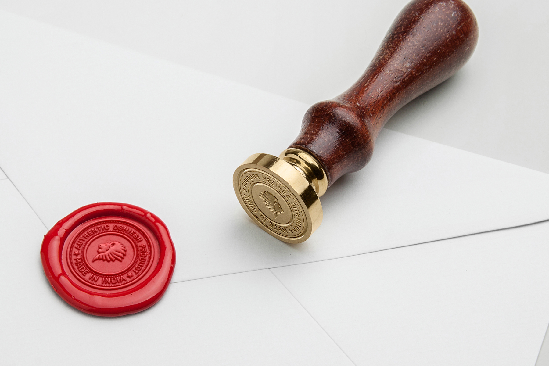
Osheish is a home grown, organic brand which sources products made of paper. The brand creates hand made products which give a unique sense of authenticity. We wanted to explore touch and exploit the personal attachment of textures, vital to the identity of the brand. The font that was decided on for the branding of Osheish was ‘Haymaker’ for its refined yet rugged and raw appeal which fully resonated with the substance and identity of the brand itself. The primary colour used throughout is brown which not only mirrors the major produce of the brand but also is a colour which in itself experiences various texturing and visual properties.


SEE CASE STUDIES HERE:
_OUTRBODY SYSTMS
BRAND STRATEGY & IDENTITY DESIGN | WON A BLUE ELEPHANT
BRAND STRATEGY & IDENTITY DESIGN | WON A BLUE ELEPHANT
_INBTWN
INDUSTRIAL DESIGN | WON A BLUE ELEPHANT
_URBNMNKY SYSTMS
PRODUCT DESIGN | WON A BABY BLUE ELEPHANT
_EDEN
ARCHITECTURAL & INTERIOR DESIGN | FIRST LIST