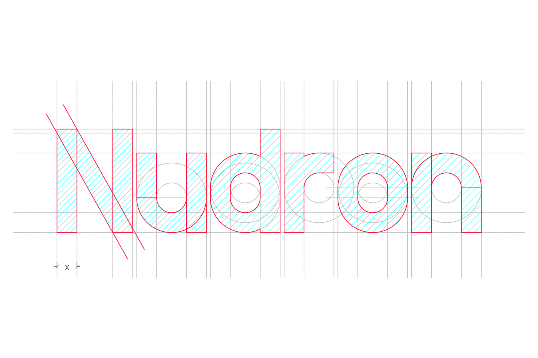
Nudron
Client: Nudron IOT Solutions LLP
Scope: Brand Identity, with emphasis on Logo Design
Scope: Brand Identity, with emphasis on Logo Design
Status: Complete
Collaborators: -
Collaborators: -
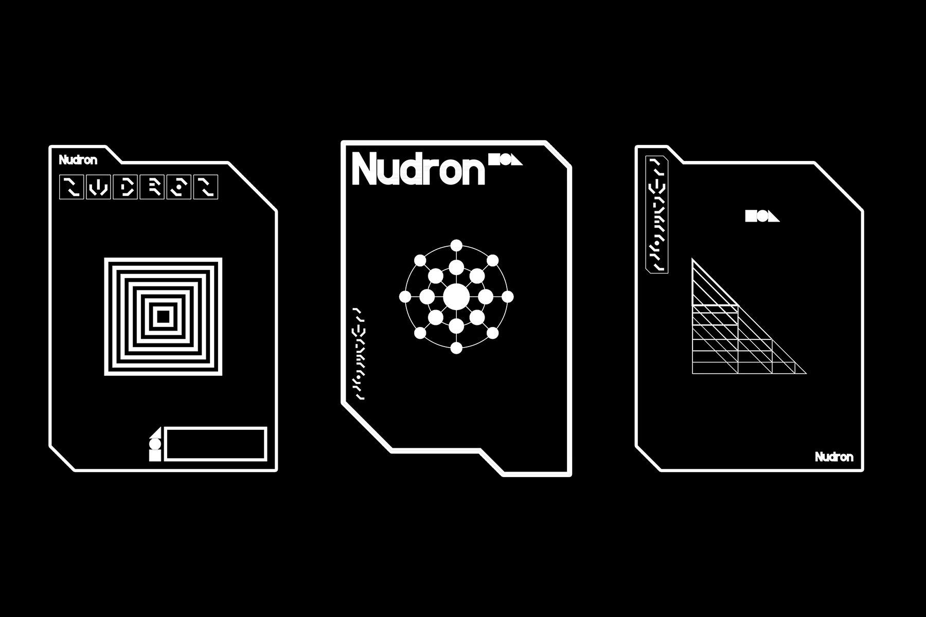
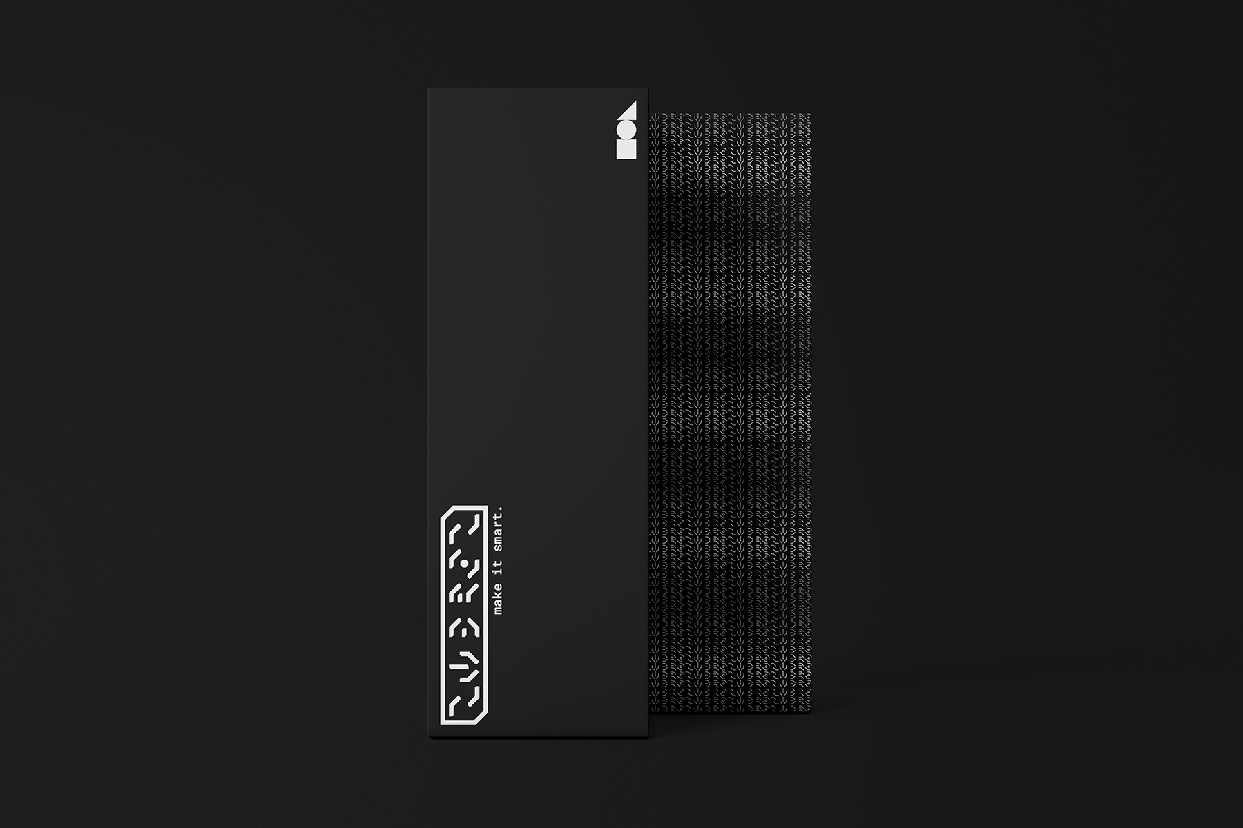
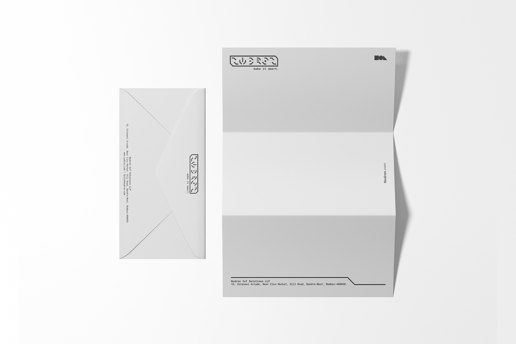
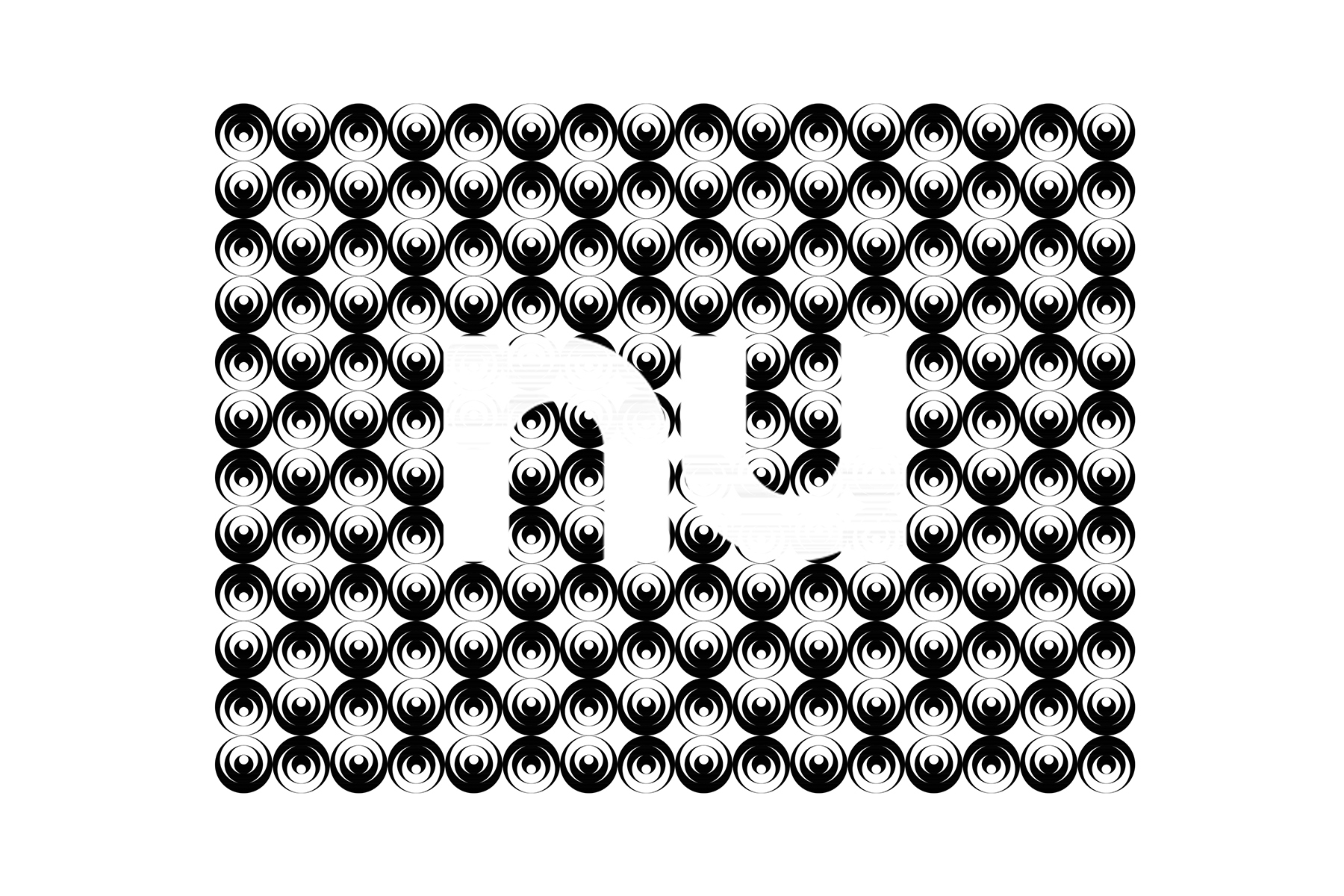
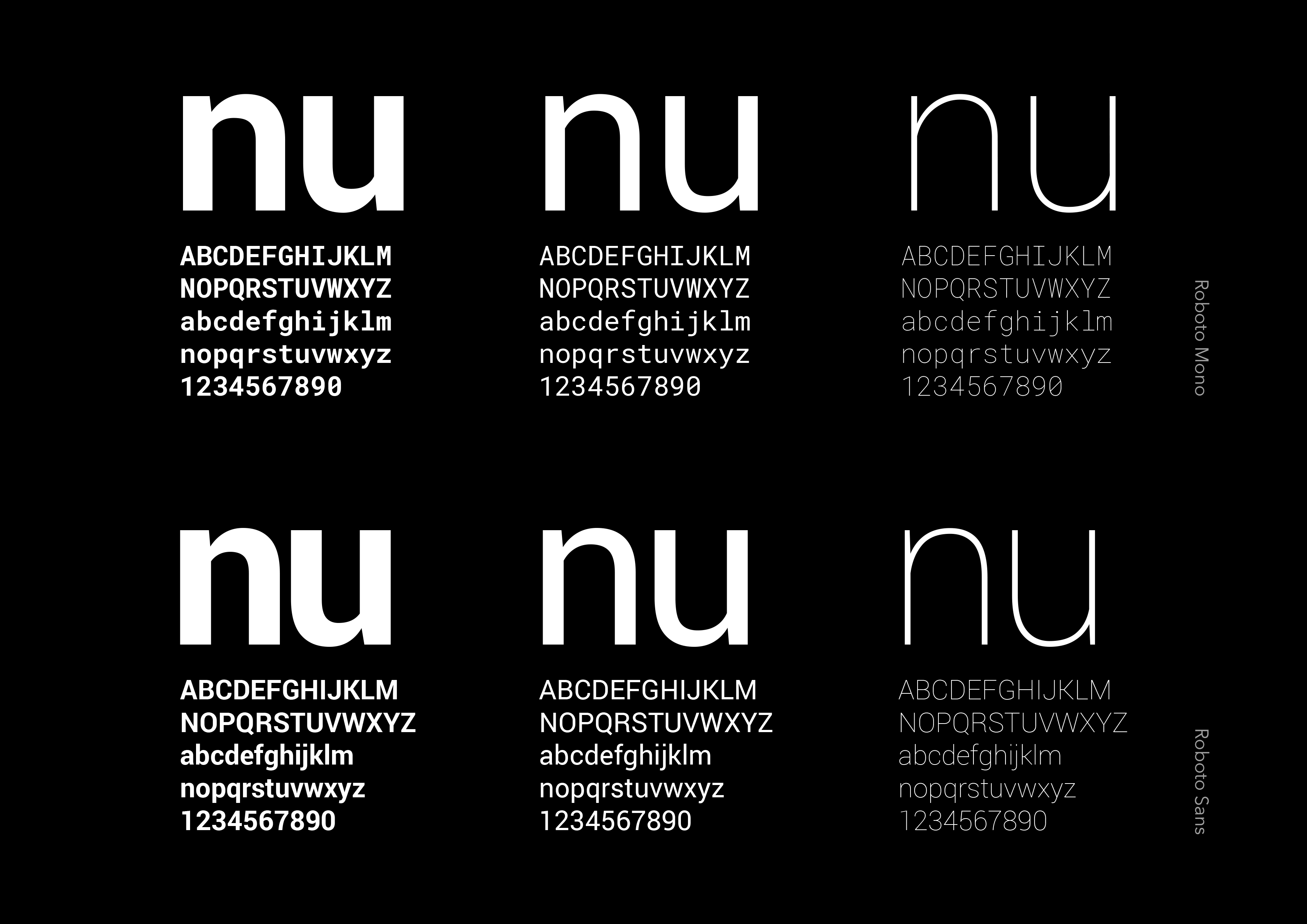
Nudron is a Mumbai based start-up providing IOT (internet of things) based solutins by developing custom hardware and software.
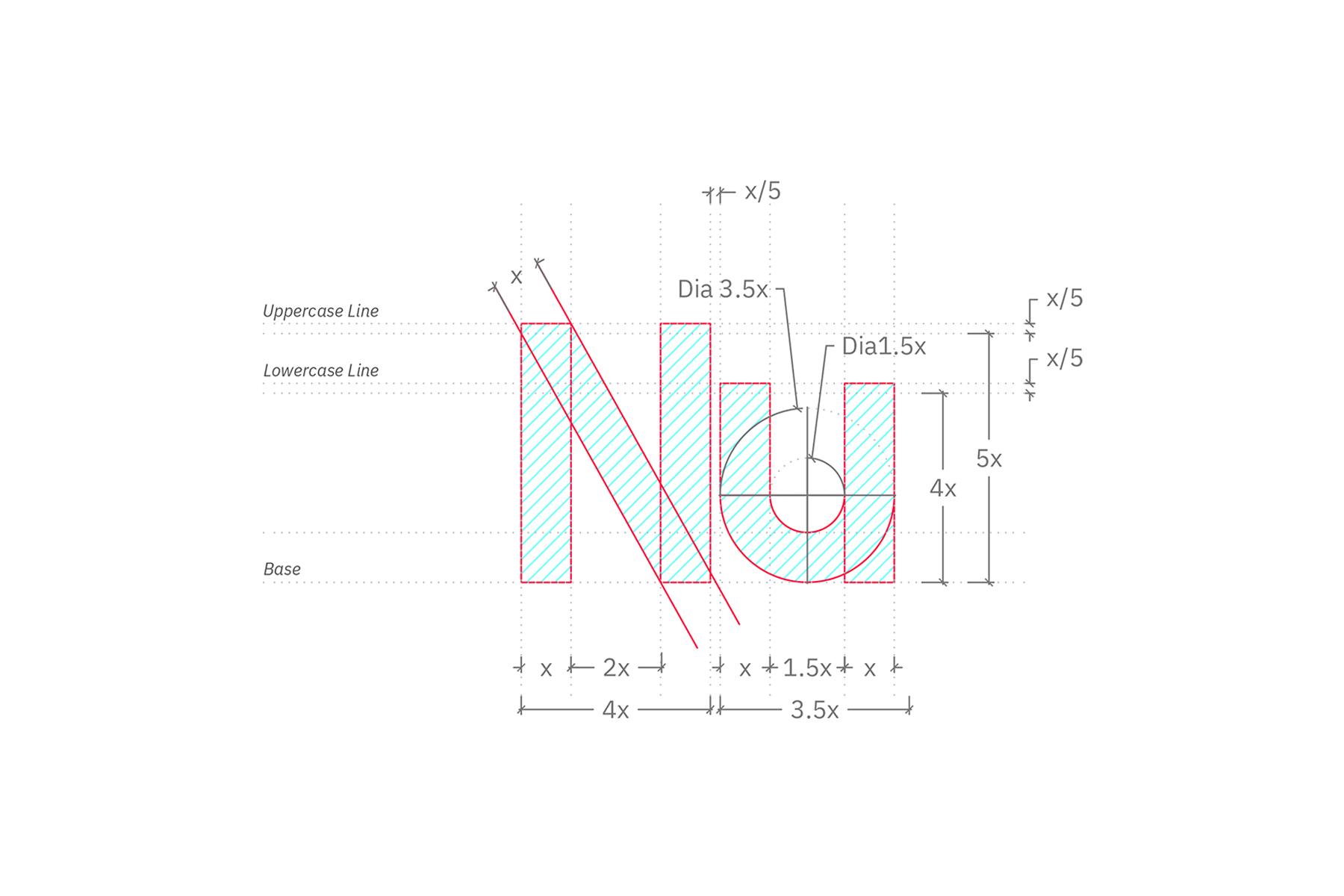
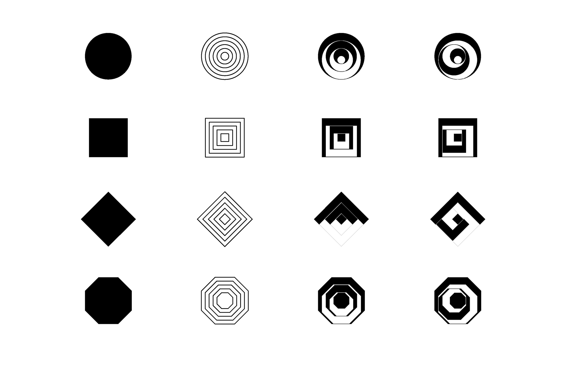
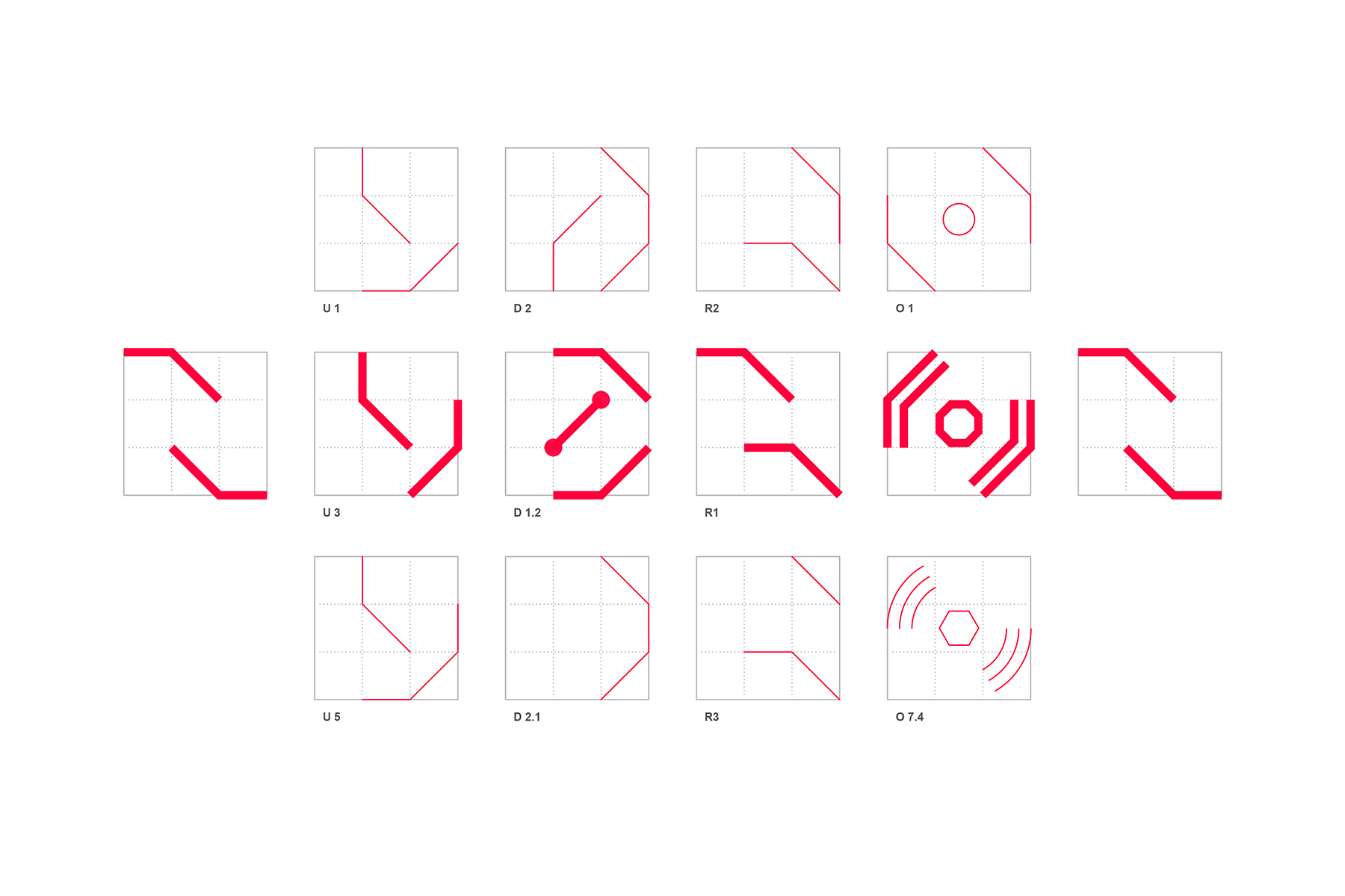
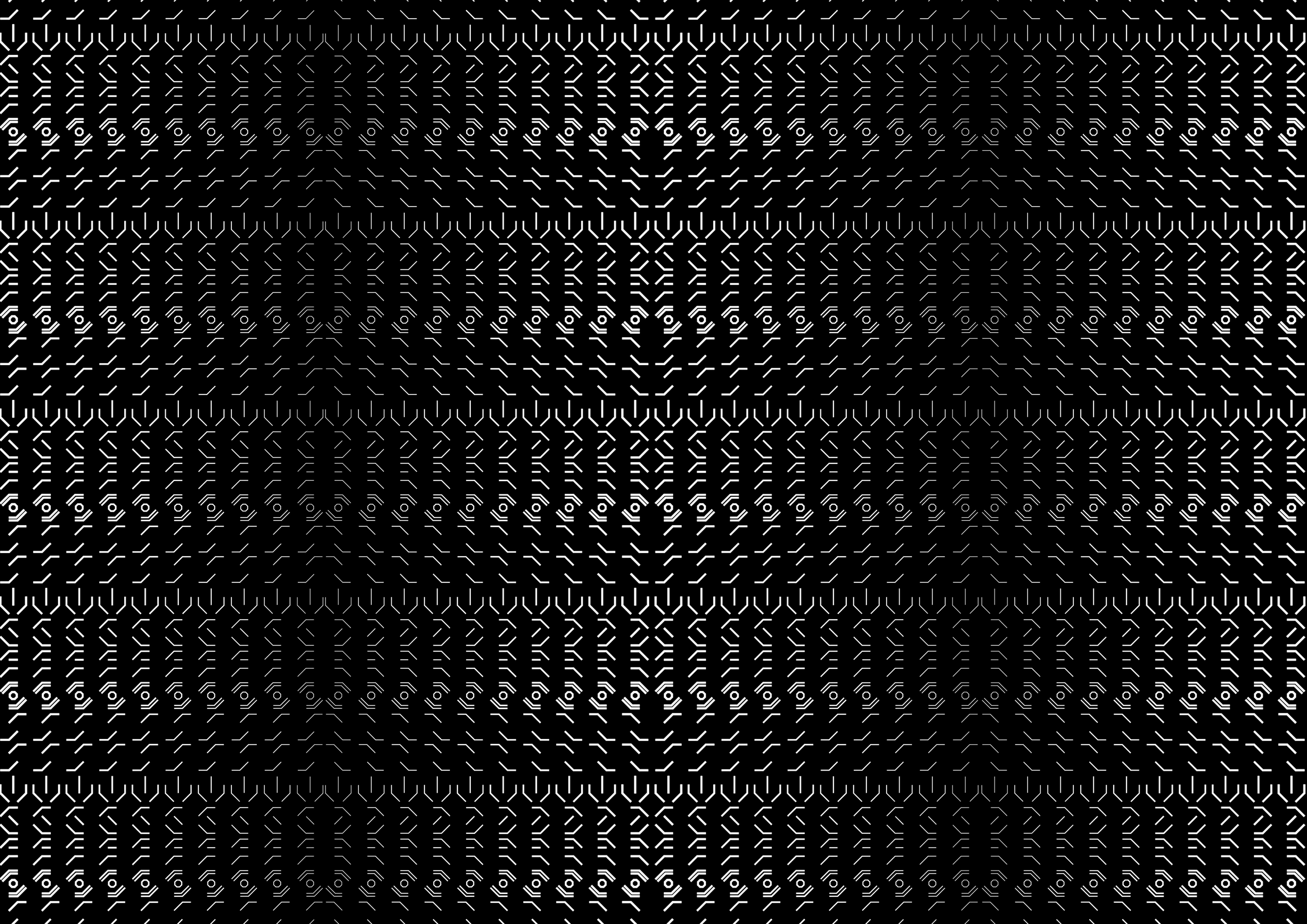
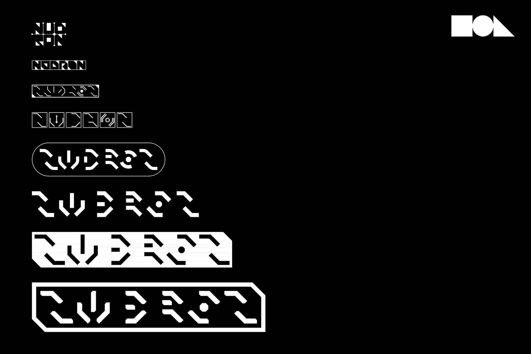
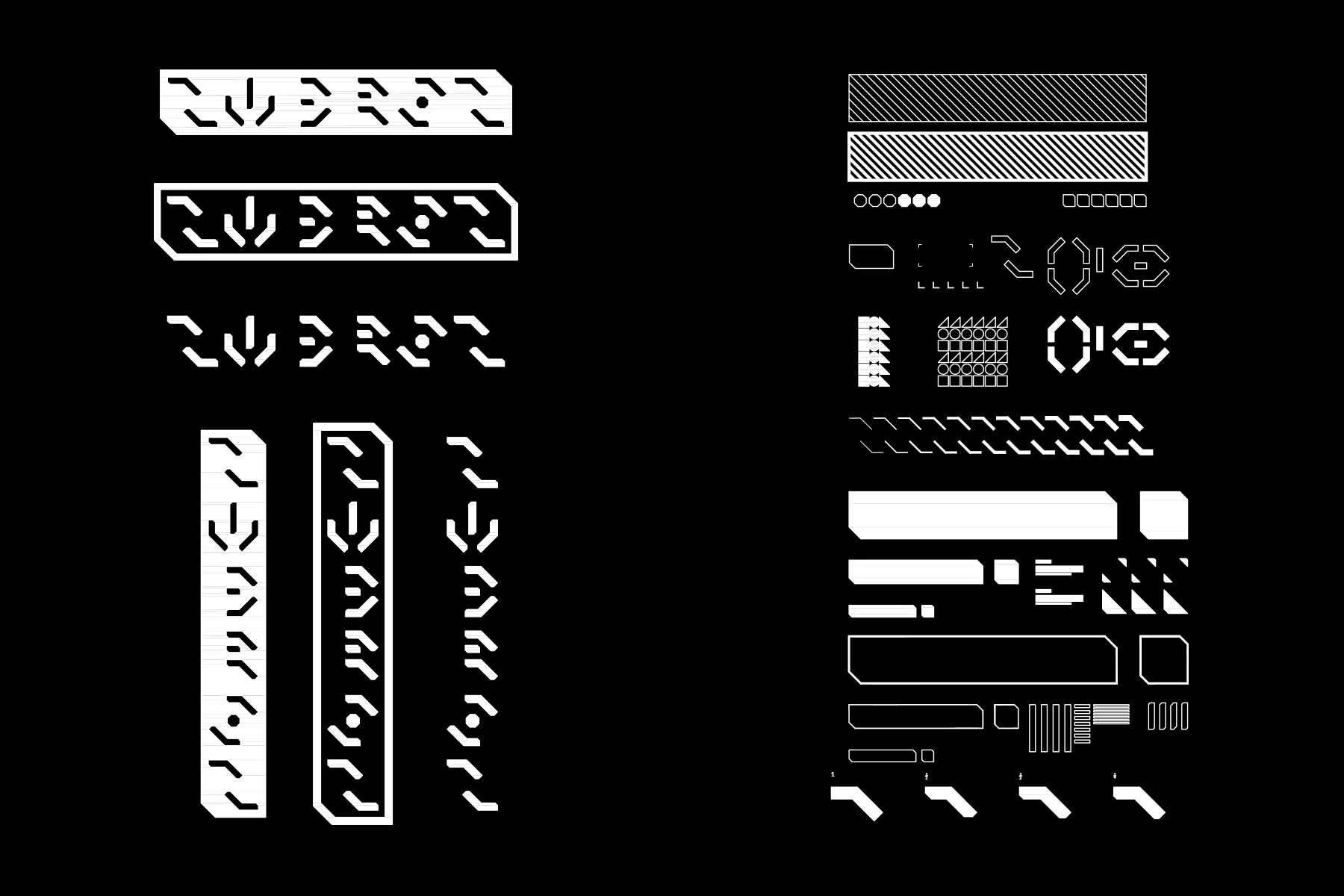
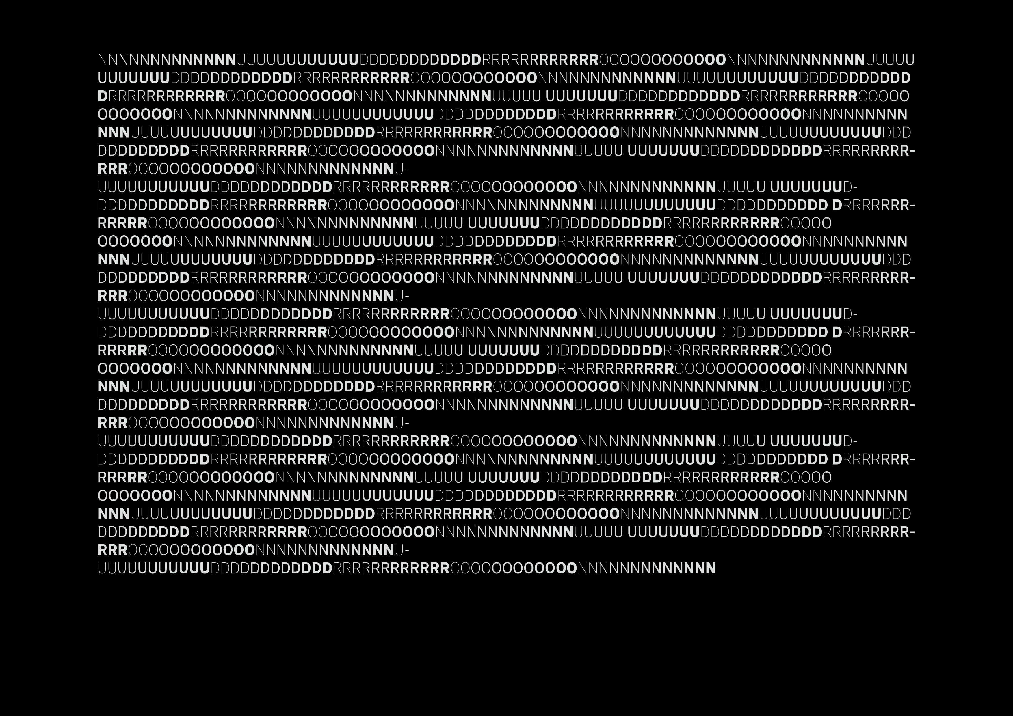
In order to multiply the range of potentialities in a mark, this expression accepts the fusion between graphics and type as its primary component (the periodic denial of which proving vain) and proceeds with trial and error. Rather than striving to identify a singular mark, it searchs as many directions as possible which can be isolated at a multitude of marks intended to differ from each other yet open to sync. In its layout the present expression reproduces the graphic layout of a language. Not unlike the way a plurality of syllabaries cross each other in japanese writing, several levels of character complexity are here juxtaposed with a quasi-absence of punctuation. Each entry is allocated the same amount of paper space (basically a monospaced square), wether extremely complicated (like chinese ideograms), simply curvy (like hiragana) or bluntly straight (like katakana). The parallel can be stretched to the reading experience itself, which can be carried out horizontally as well as vertically, and almost invariablly from left to right or the reverse. Image slide down
In order to multiply the range of potentialities in a mark, this expression accepts the fusion between graphics and type as its primary component (the periodic denial of which proving vain) and proceeds with trial and error. Rather than striving to identify a singular mark, it searchs as many directions as possible which can be isolated at a multitude of marks intended to differ from each other yet open to sync. In its layout the present expression reproduces the graphic layout of a language. Not unlike the way a plurality of syllabaries cross each other in japanese writing, several levels of character complexity are here juxtaposed with a quasi-absence of punctuation. Each entry is allocated the same amount of paper space (basically a monospaced square), wether extremely complicated (like chinese ideograms), simply curvy (like hiragana) or bluntly straight (like katakana). The parallel can be stretched to the reading experience itself, which can be carried out horizontally as well as vertically, and almost invariablly from left to right or the reverse. Image slide down


SEE CASE STUDIES HERE:
_OUTRBODY SYSTMS
BRAND STRATEGY & IDENTITY DESIGN | WON A BLUE ELEPHANT
BRAND STRATEGY & IDENTITY DESIGN | WON A BLUE ELEPHANT
_INBTWN
INDUSTRIAL DESIGN | WON A BLUE ELEPHANT
_URBNMNKY SYSTMS
PRODUCT DESIGN | WON A BABY BLUE ELEPHANT
_EDEN
ARCHITECTURAL & INTERIOR DESIGN | FIRST LIST