L00P
Client:
Urban Monkey India
Scope: Product Design and Communication
Scope: Product Design and Communication
Status:
Complete
Date Posted: 18.04.23
Date Posted: 18.04.23
ABOUT
Many people frequently claim they lack time. Yet, as humans, time is our most abundant resource.
Everything we hold dear - our family, friends, bank accounts, and opportunities - can be jeopardized or vanish.
Time, however, endures. Only in death does time truly cease to exist; until that moment, we possess an abundance of it.
L00P represents the present tense.
It represents the NOW.
It reminds users to zoom out into the universe,
And accept the minute glitches in life.
It reminds us to LOVE.
CONCEPT NOTE
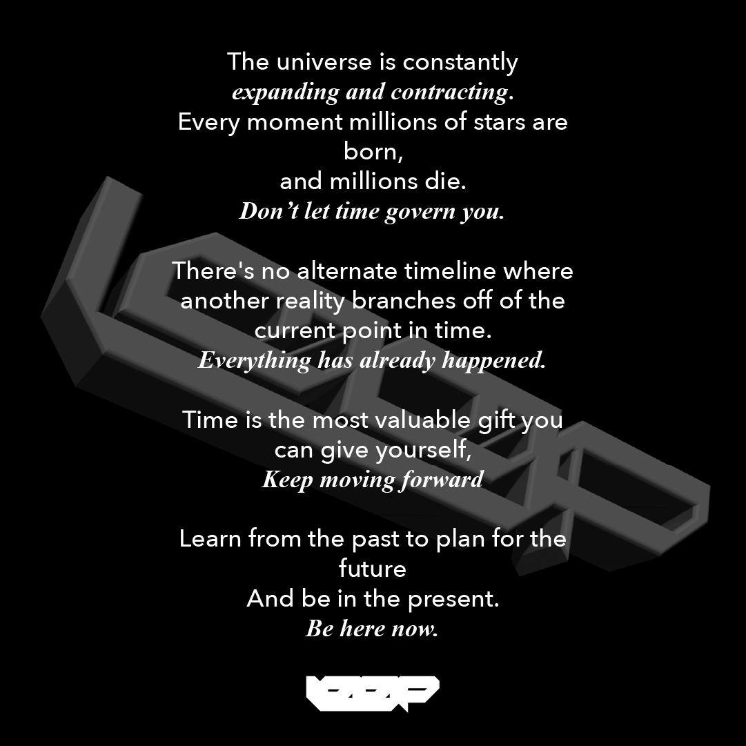
The universe is constantly expanding and contracting. Every moment, millions of stars are born, and millions die.
Don't let time govern you.
There's no alternate timeline where another reality branches off from the current point in time.
Everything has already happened.
Time is the most valuable gift you can give yourself,
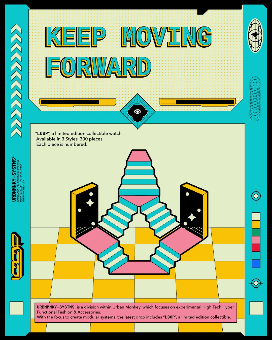
Keep moving forward,
Learn from the past to plan for the future,
And be in the present.
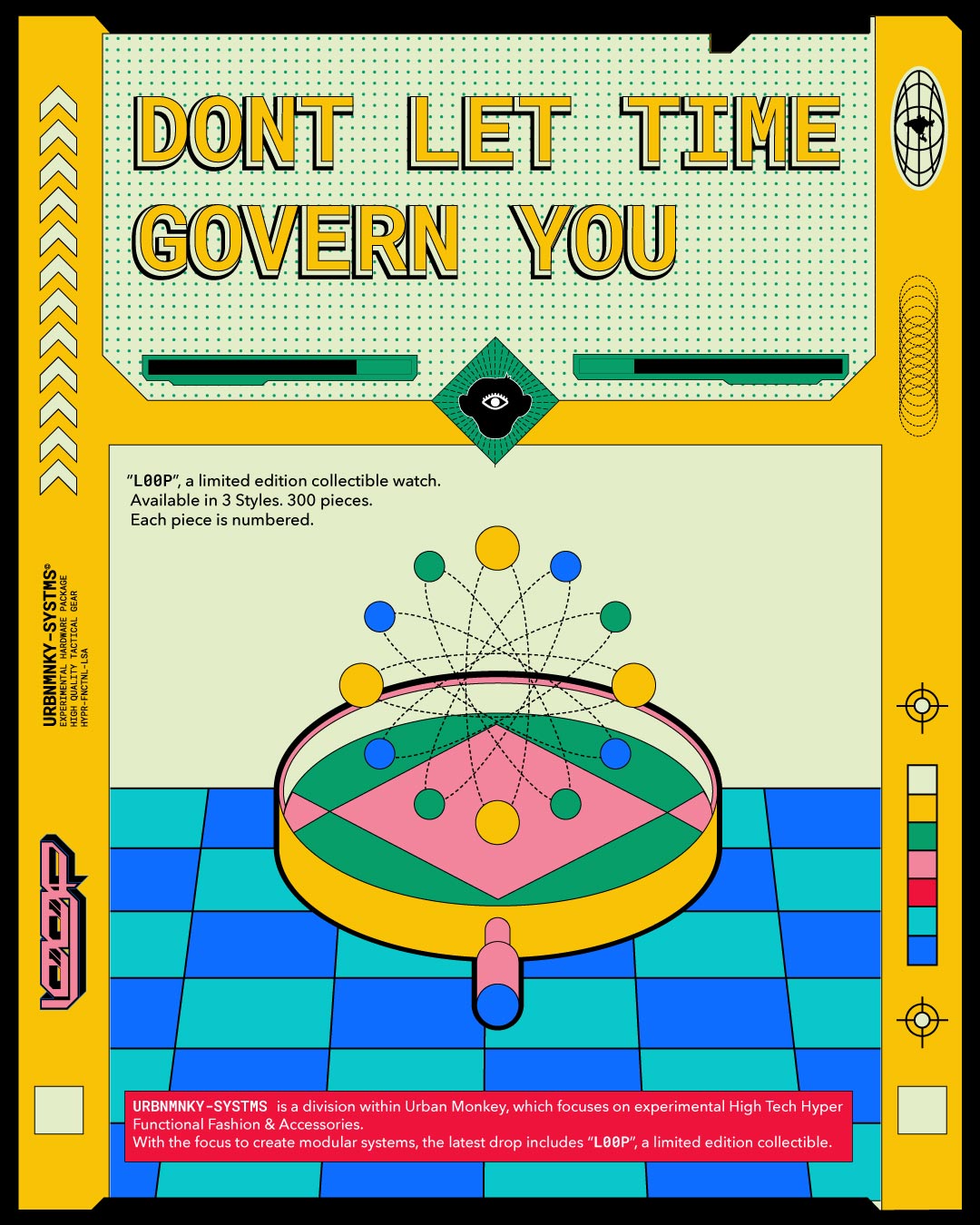
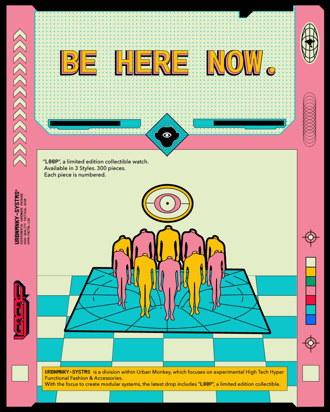
Be Here Now.
The universe is constantly expanding and contracting. Every moment, millions of stars are born, and millions die.
Don't let time govern you.
There's no alternate timeline where another reality branches off from the current point in time.
Everything has already happened.
Time is the most valuable gift you can give yourself,
Keep moving forward,
Learn from the past to plan for the future,
And be in the present.
Be Here Now.
DESCRIPTION
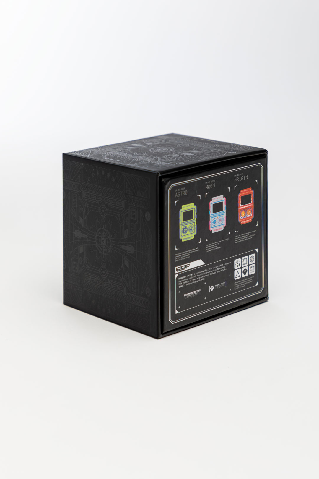
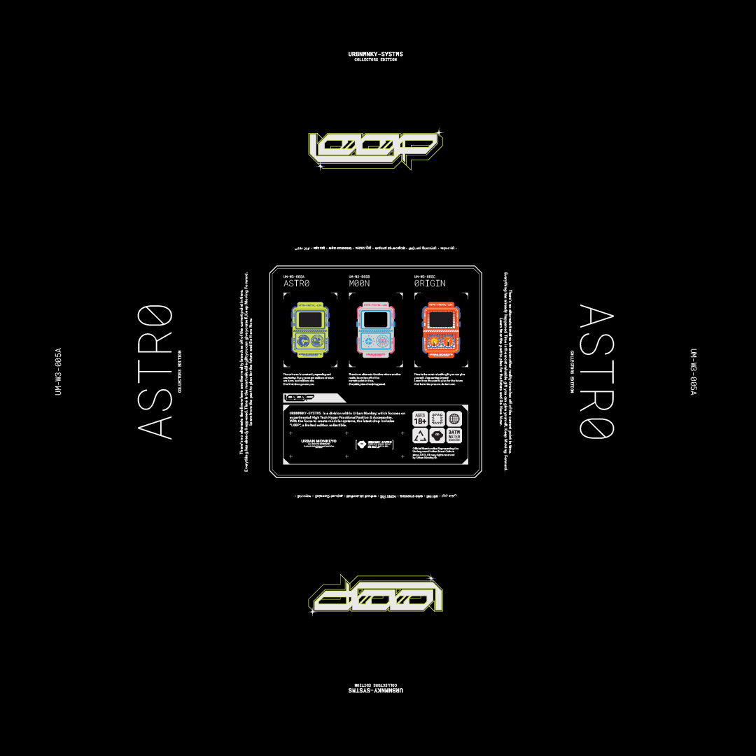
URBNMNKY-SYSTMS is a division within Urban Monkey that focuses on
experimental high-tech, hyper-functional fashion, and accessories. With
an emphasis on creating modular systems, the latest drop includes
"L00P", a limited-edition collectible.
URBNMNKY-SYSTMS is a division within Urban Monkey that focuses on
experimental high-tech, hyper-functional fashion, and accessories. With
an emphasis on creating modular systems, the latest drop includes
"L00P", a limited-edition collectible.


The process has been documented in form of a case study.
//1
PRELUDE
Exploring a new category within an e-commerce business can take two approaches:
One is led by design, in which you explore, experiment, and create a unique identity for the new category that aligns with the brand.
The other is led by the market, in which you adhere to market standards, and ongoing trends, white label the category, quickly understand purchase psychology and supply chain, familiarize customers with the category and create tangible, profitable business systems around it.
The design-led option is more time-consuming and risky but has long-term benefits of standing out and becoming something significant. This approach allows for a solid foundation for the future. Experimenting, exploring, and failing is part of the process. It's part of growth, and that's what leads to innovation.
On the other hand, the market-led option offers less scope for innovation and experimentation to minimize risk and calibrate the business around the new category. This approach facilitates the expansion of the category into multiple variations and SKUs and works the fastest to make conversions. Why create when you can curate?
There is no right or wrong approach.
The secret sauce lies in identifying the intersection between these two approaches to create an ideal scenario.
Similarly, for the watch category, the initial brief from Um was to curate existing market-standard watches, make them unique by curating colorways, and identify branding opportunities. Although this was a safer bet, we convinced the brand to go with the design-led process and provide communication strategies that would benefit the business' commercial growth.
//2
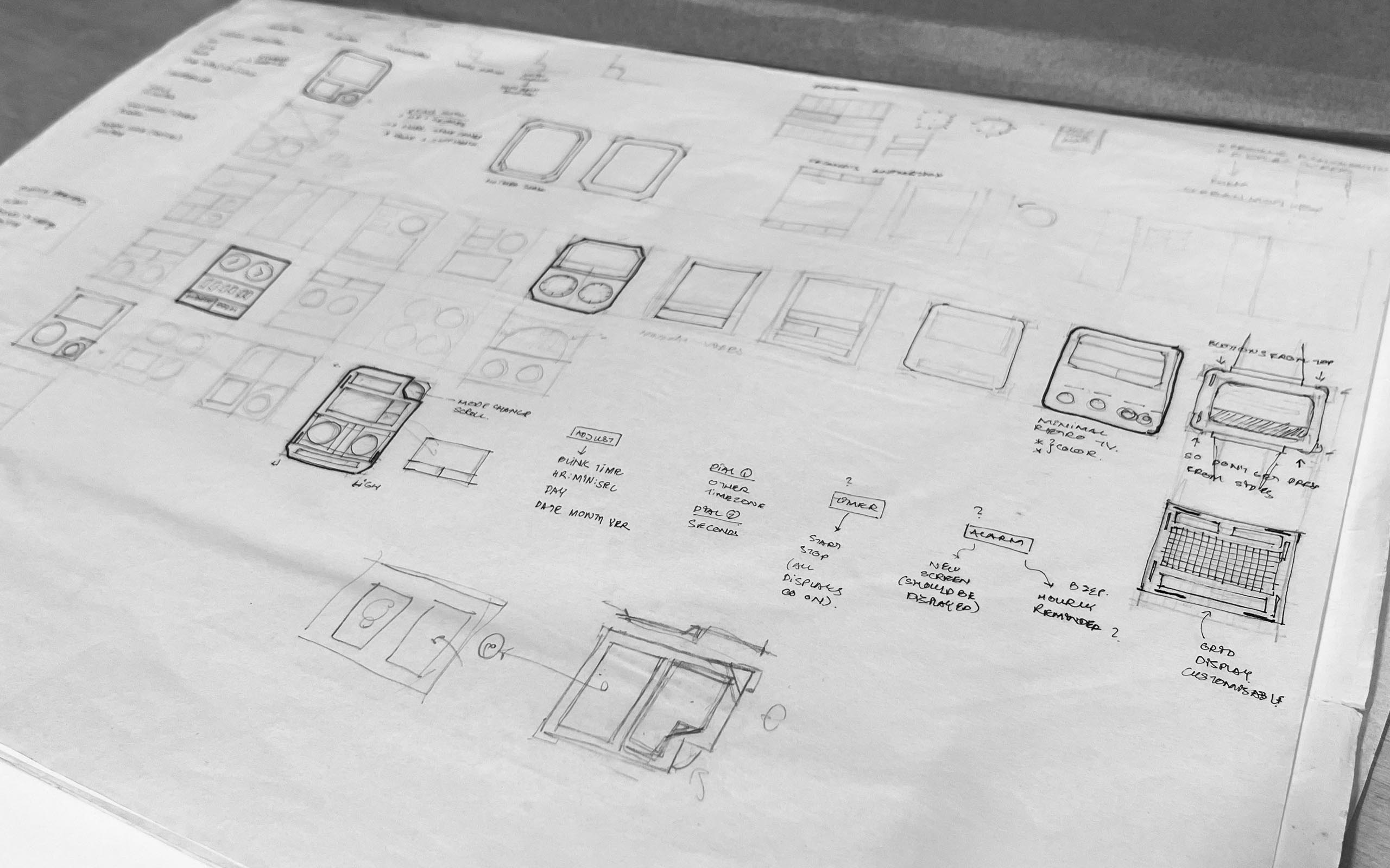
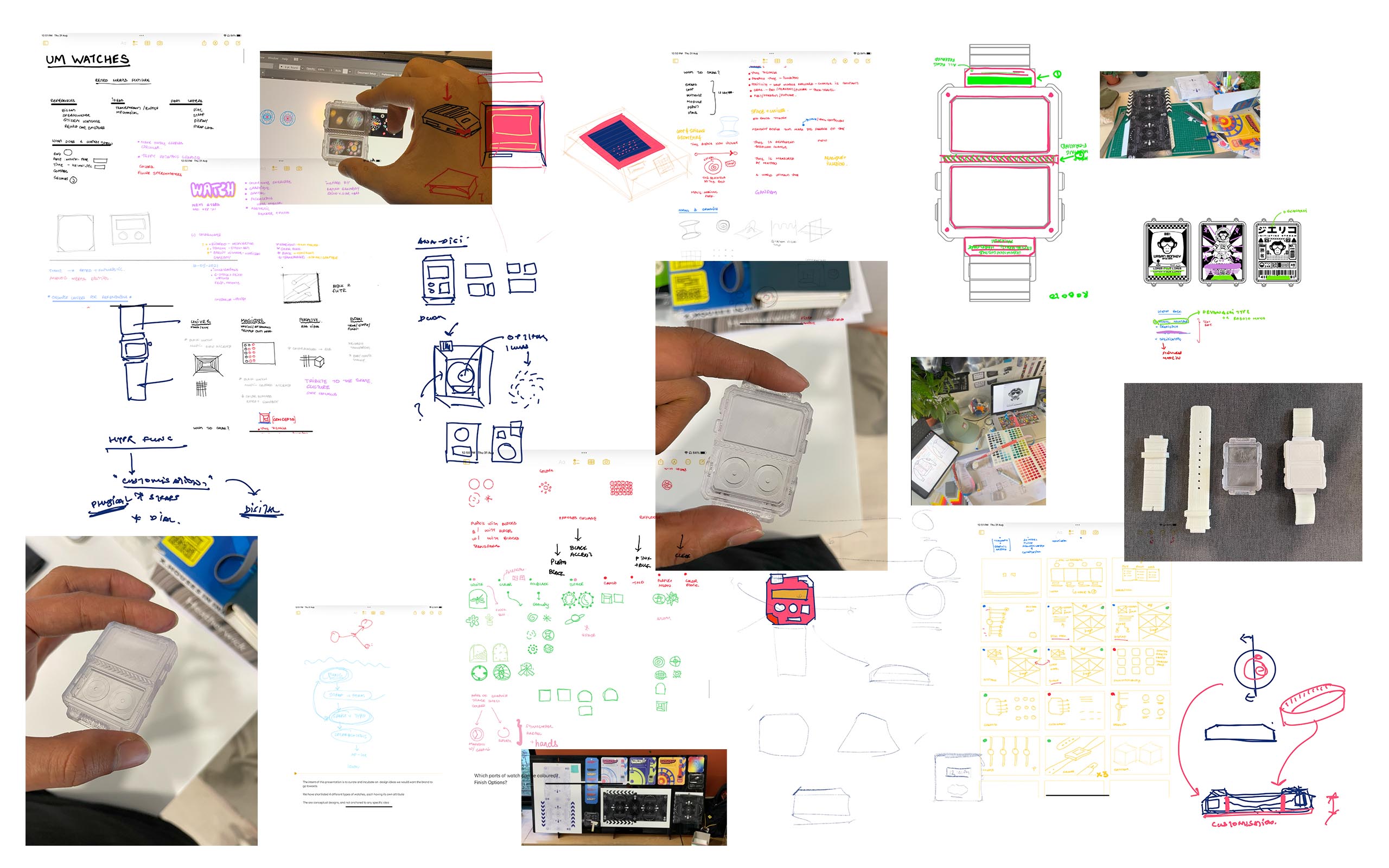
INITIAL EXPLORATION

In today's day and age, watches have become synonymous with smart wearables. Unique tech-based innovations have made these devices extraordinarily elaborate and highly functional. However, to stand out in this saturated market will require a strategy apart from tech-based functionality.
We had to lay our foundation extremely strong. We started by creating four varying conceptual watches, each representing a specific attribute. The attributes are:

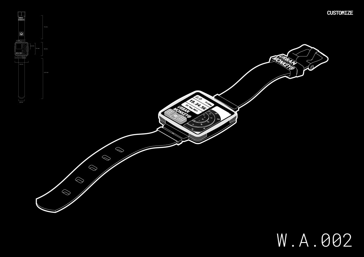
A watch with analog and digital time display formats allows one to view time from multiple time zones.

Customise:
A watch with plug-in straps and an experimental dial that rotates on a central pivot axis.
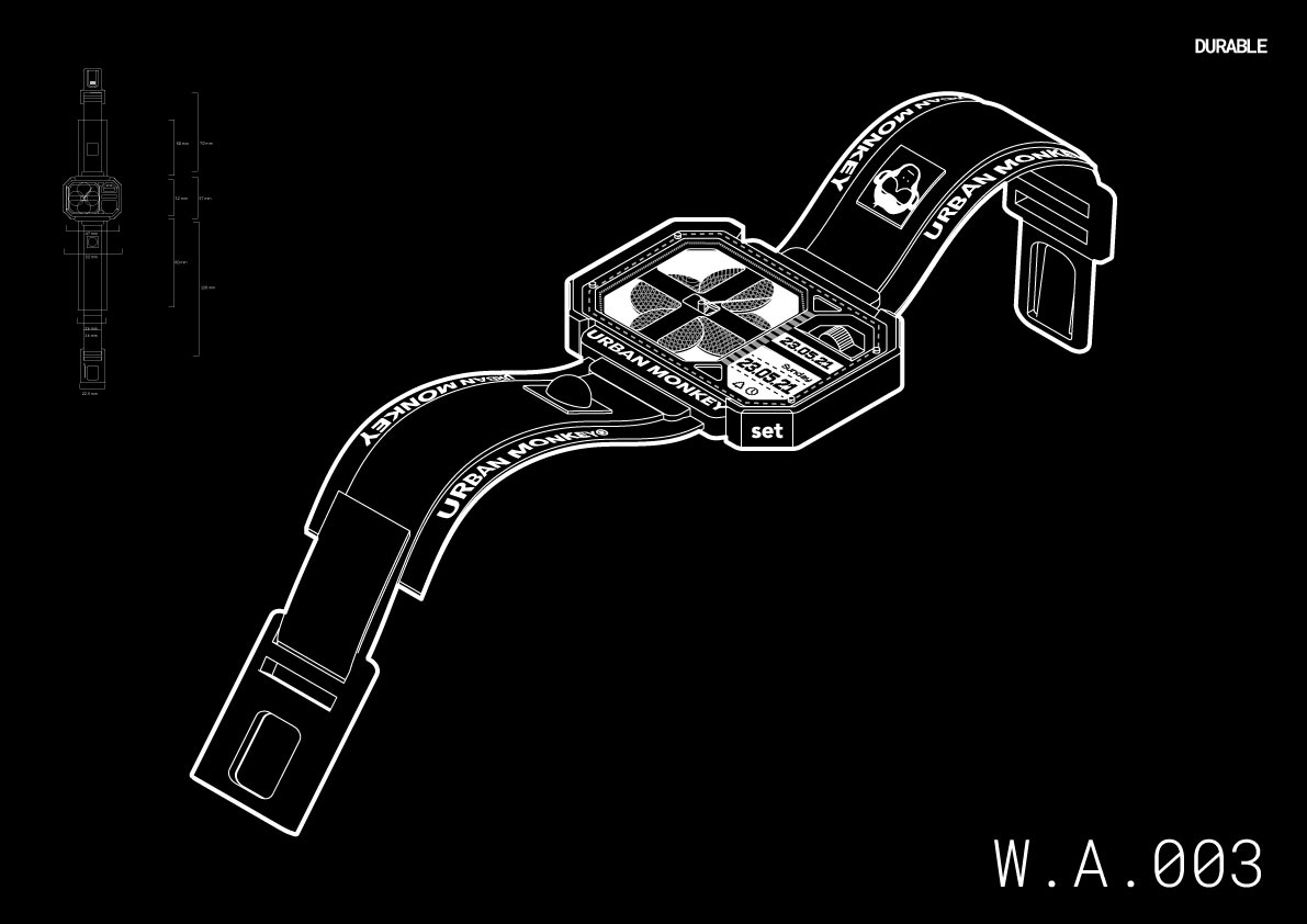
Durable:
A watch with a bold and bulky silhouette and chamfered edges to minimize damage.
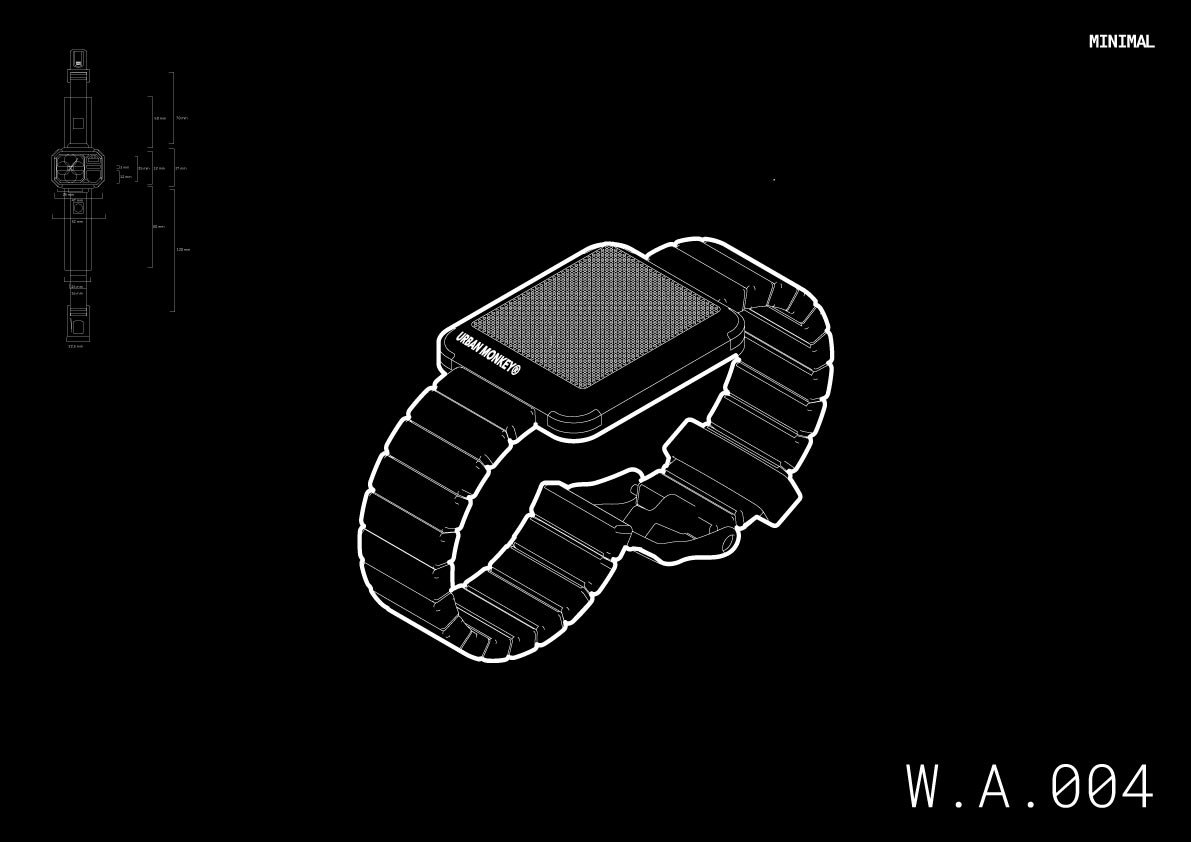
Minimal:
A mono-material watch where the display camouflages within the dial and appears as basic LED lights.
One common thing in all the explorations was displaying time in unique ways possible. The lack of technical knowledge allowed us to explore more of the form as opposed to features and functionality.
For us, the primary function of a watch is to show time, and that's it. Therefore, we delved into questions such as:
What is time?
How is it being perceived?
What are its effects on human life and nature?
These questions gave our watch more PURPOSE than any other watch present in the market.
//3
OUR APPROACH
Watch enthusiasts are similar to a sneaker, streetwear, or stamp enthusiasts. There is an entire community of collectors around these interests. For collectors, it's the uniqueness or the fascination with the design and fabrication of the product that creates enthusiasm.
In our design process, the intent is vital. Our intent had now matured to create a collectible, an art piece that preaches good values as reminders for our users to cherish. (And not just a new category of a watch, but an incredibly relevant story about time through a watch)
This is how L00P was born.
//4
INSPIRATIONS
 Time theories have been best explored in Christopher Nolan's movies and the German TV show Dark. These works put things into perspective by presenting theories of time as non-linear and looped and the notion that the present is a result of the past and the future coming together.
The values that teach us to navigate time and life come from Kid Cudi and S.N. Goenka. The minimal and tasteful product design approach is inspired by Casio, Seiko, and Dieter Rams.
//5
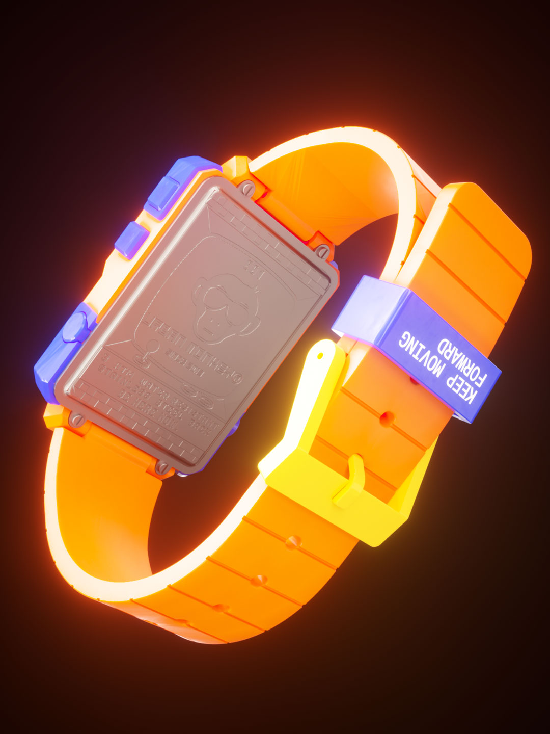
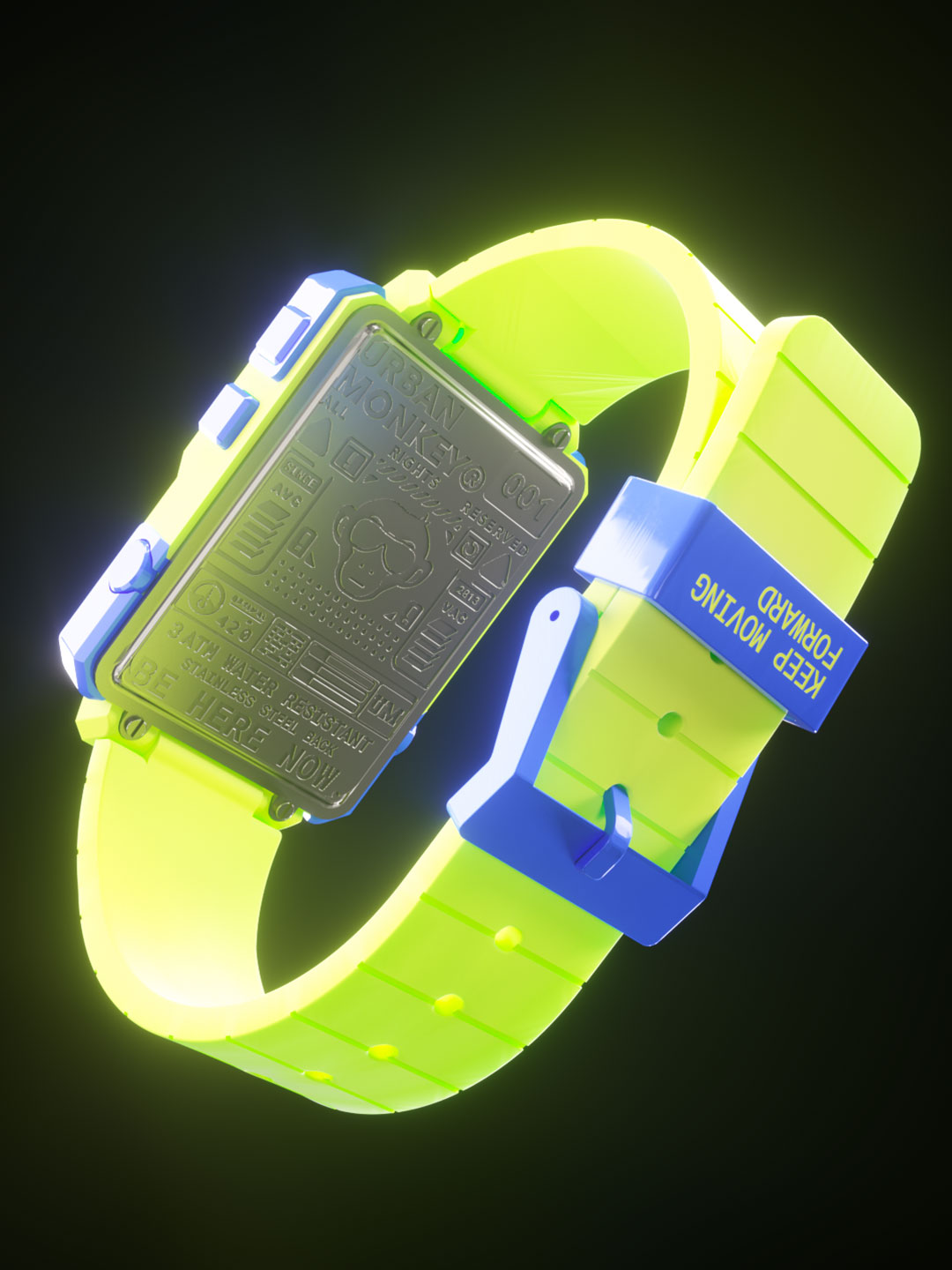
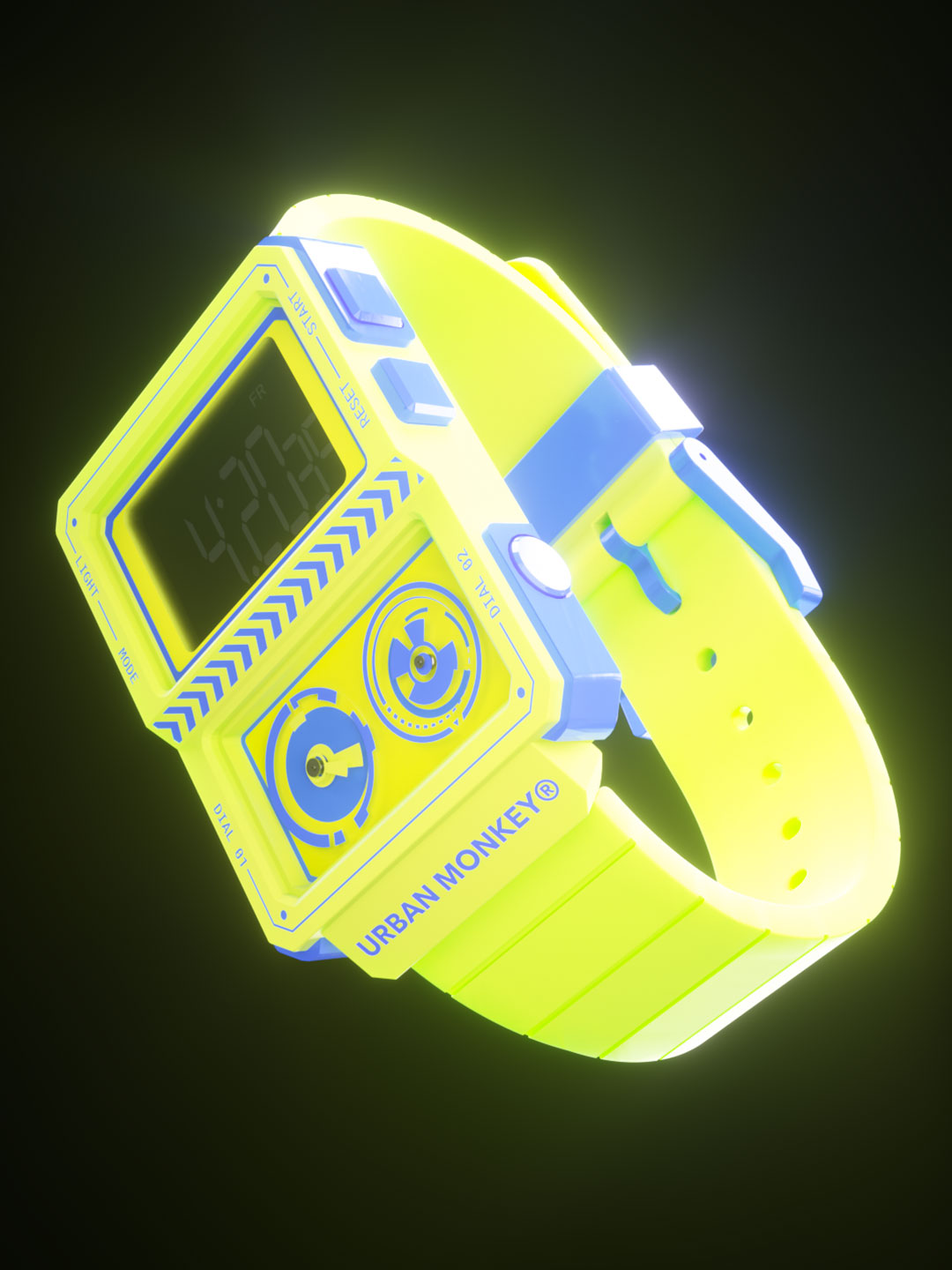
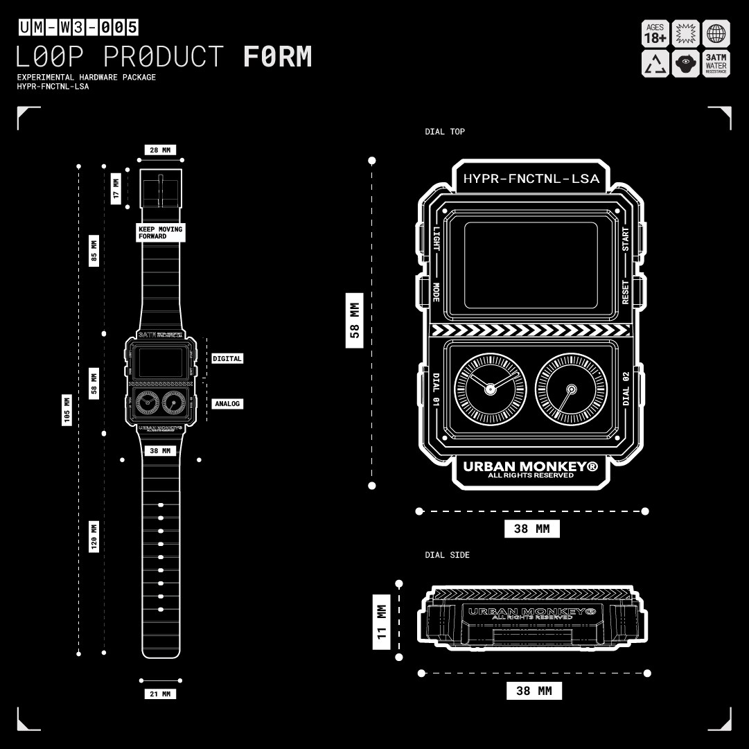
DESIGN DETAILS
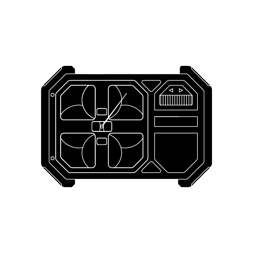
Our Ana-Digi watch was upgraded with the best form features from our initial exploration, incorporating the technical advice given by our manufacturers.
*
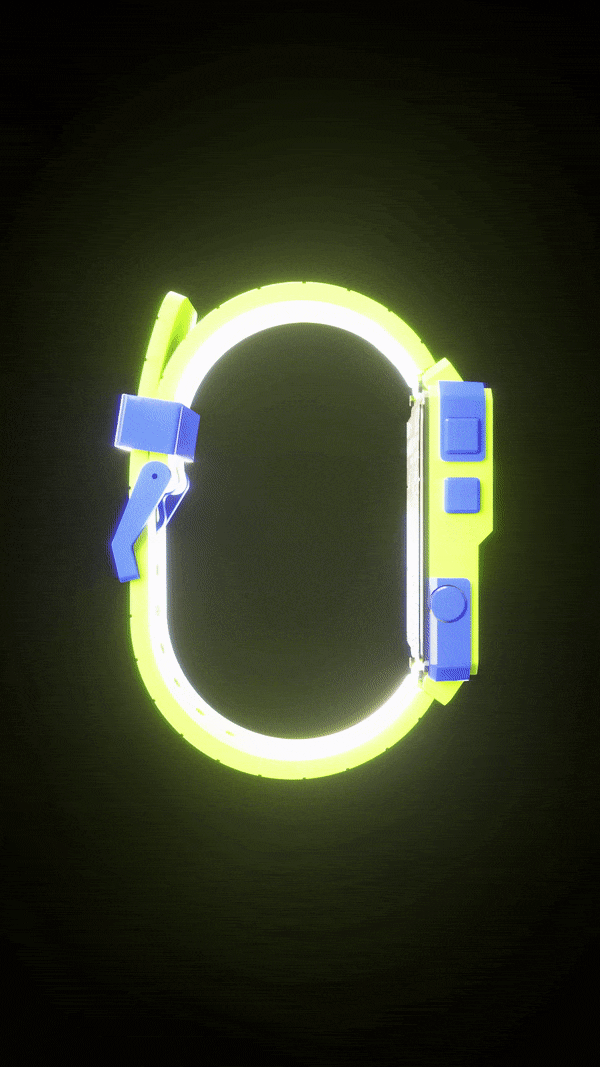
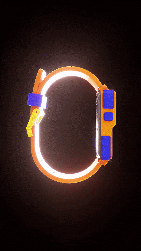
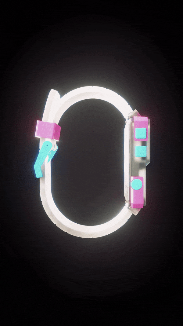
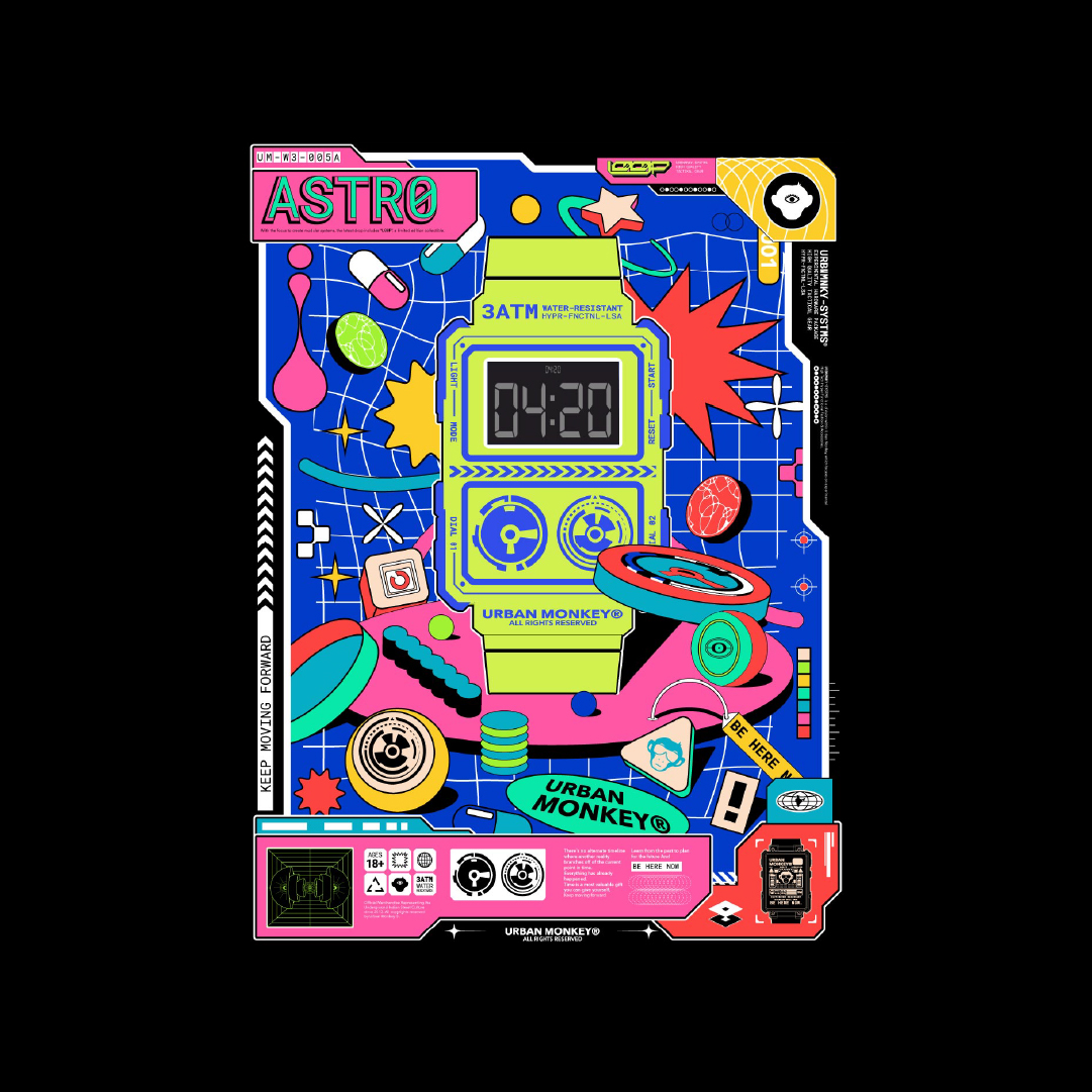
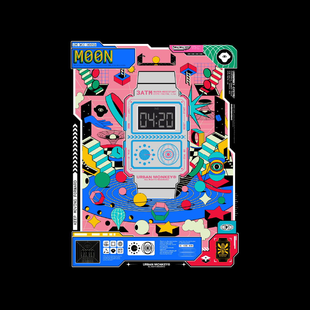
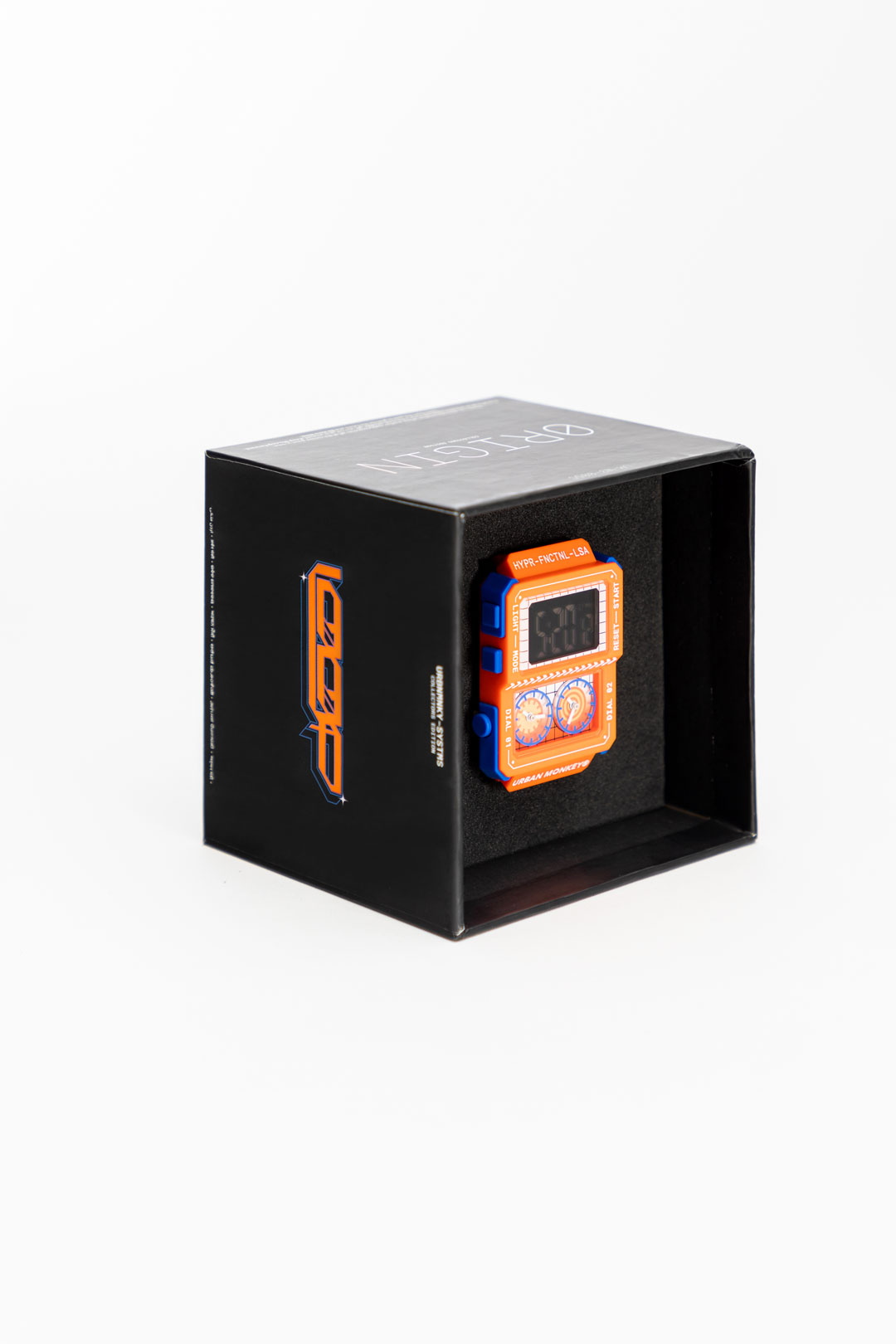
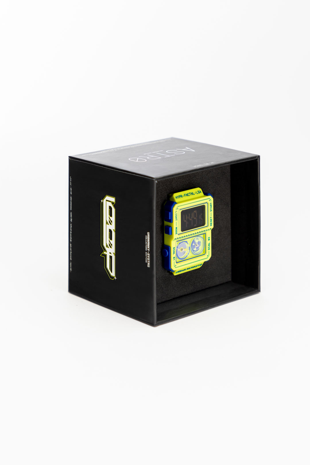
Form & Aesthetics:
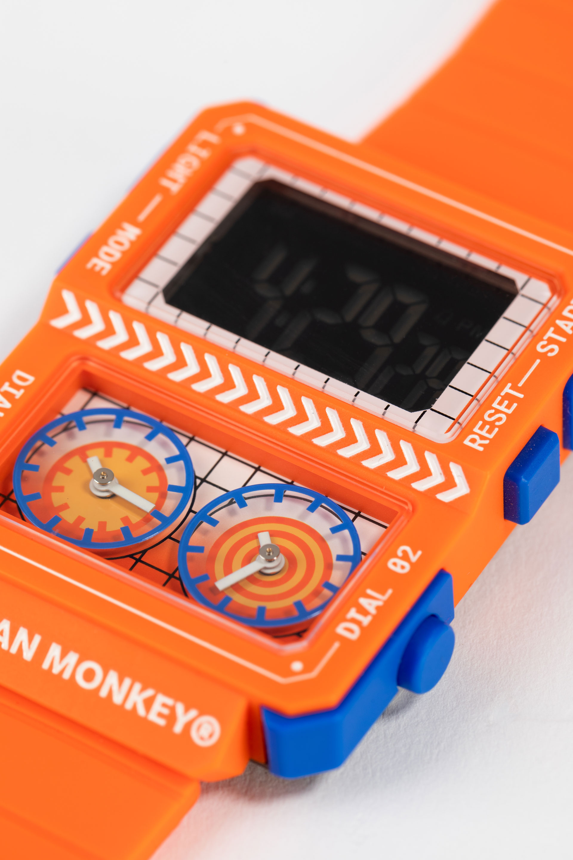
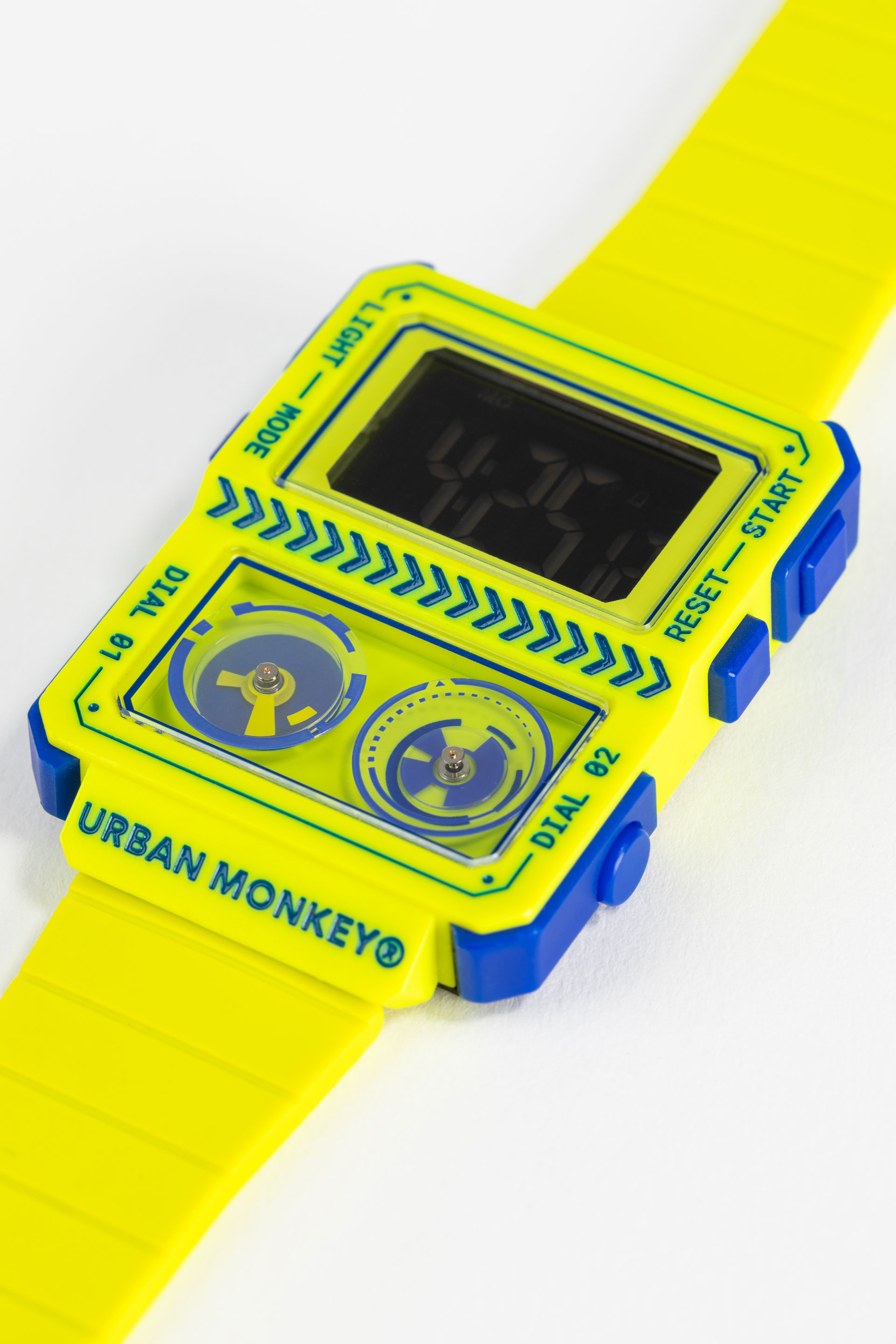
We started calling the aesthetic RETR0FUTR. Our aesthetic was at the intersection of Retro (past tense) and FUTR (future tense). We wanted the design to be a blend of the past and the future. We took inspiration from past products, such as the Game Boy's corner buttons, and juxtaposed them with the cyberpunk chamfered edge aesthetic to develop the form.
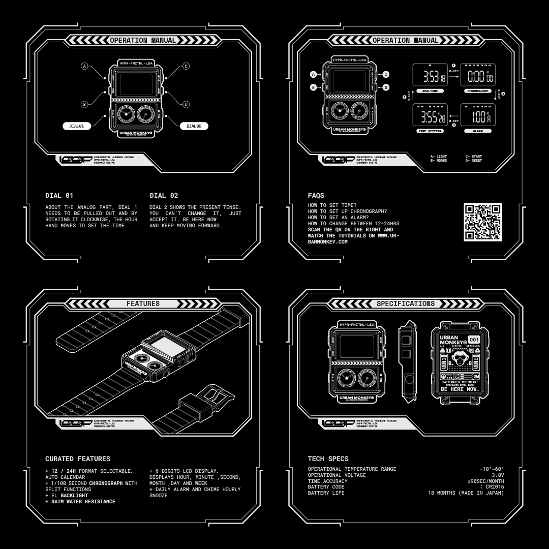
The form allows enough space for the 7-segment display and transitions through a level difference into the analog dials. There are four buttons for the digital functions and two keys for the two dials.

*
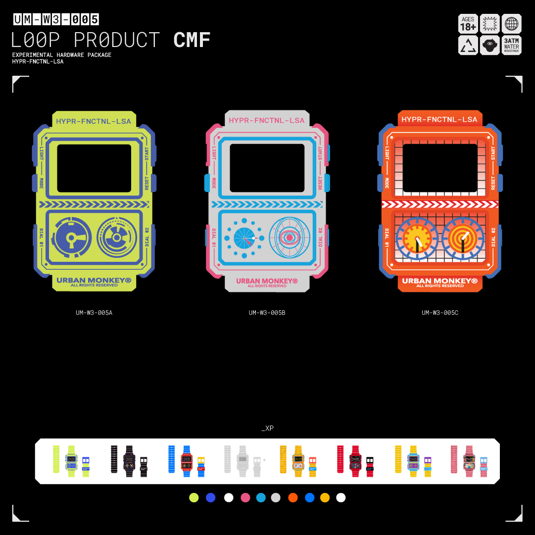
Colors:
Every piece underwent a process of color blocking and theme building through iterative design. The colors were meticulously chosen to stand out on the wrist, featuring Heron Preston Dragon Ball Z Orange, Adder Error, or Europe Police colors, and a subtle translucent pink and blue.
*
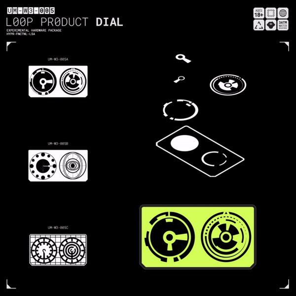
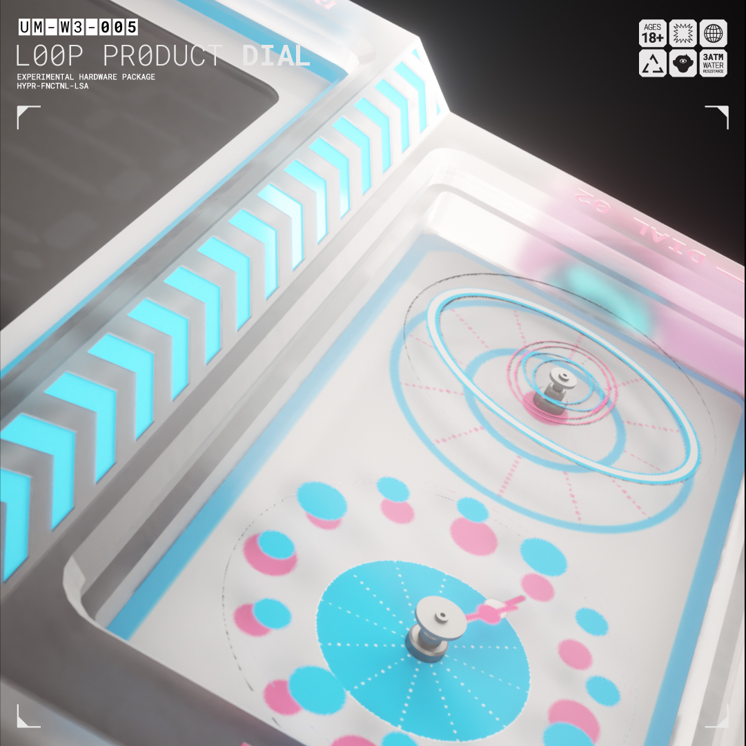
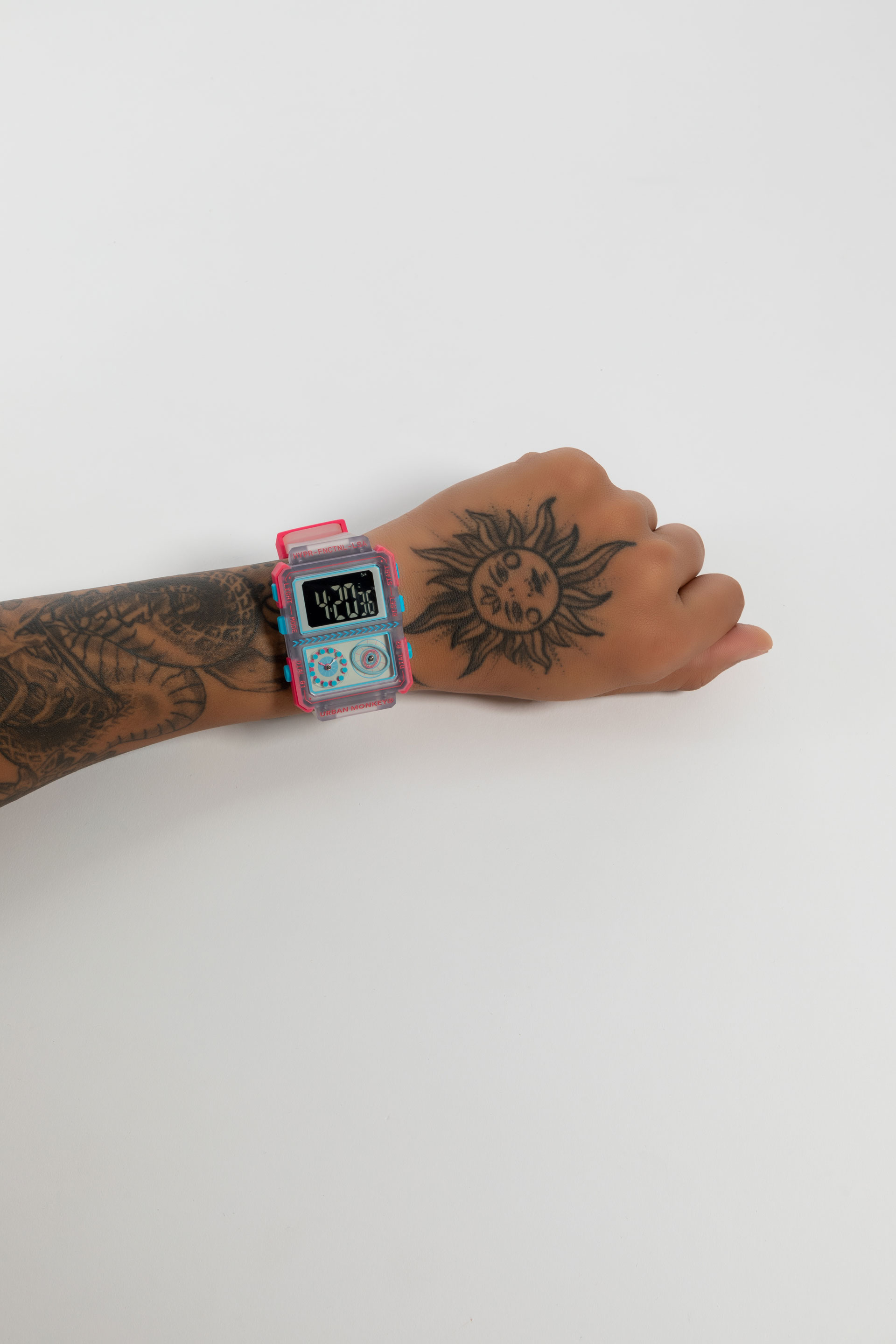
The Dials:
The analog portion of the watch contains two dials. This gave us the opportunity to redesign the seconds, hours, and minutes hands to create layered visual animations that depict time. We restricted the right dial to show only the seconds hand, representing the present tense and how it keeps moving forward.
*
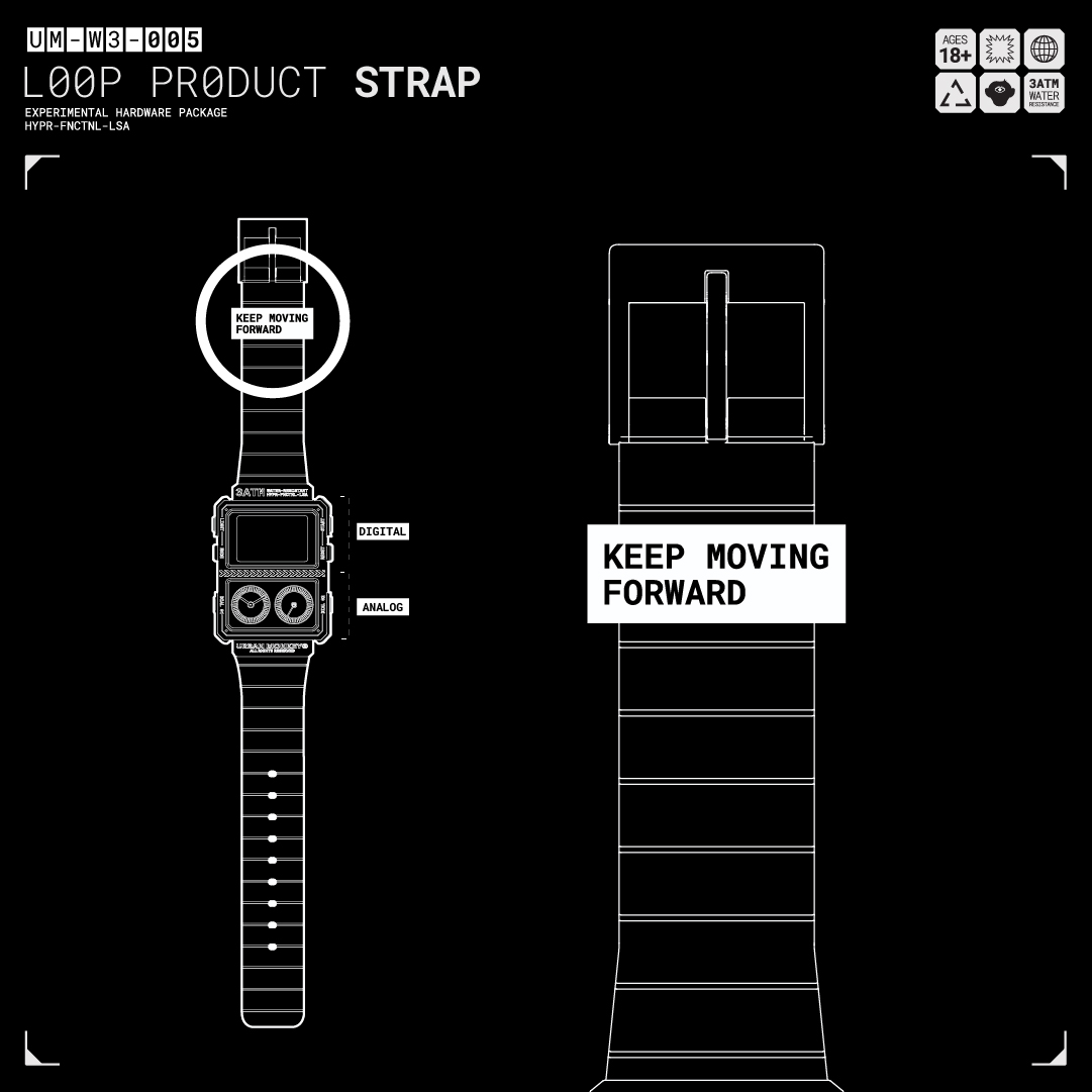
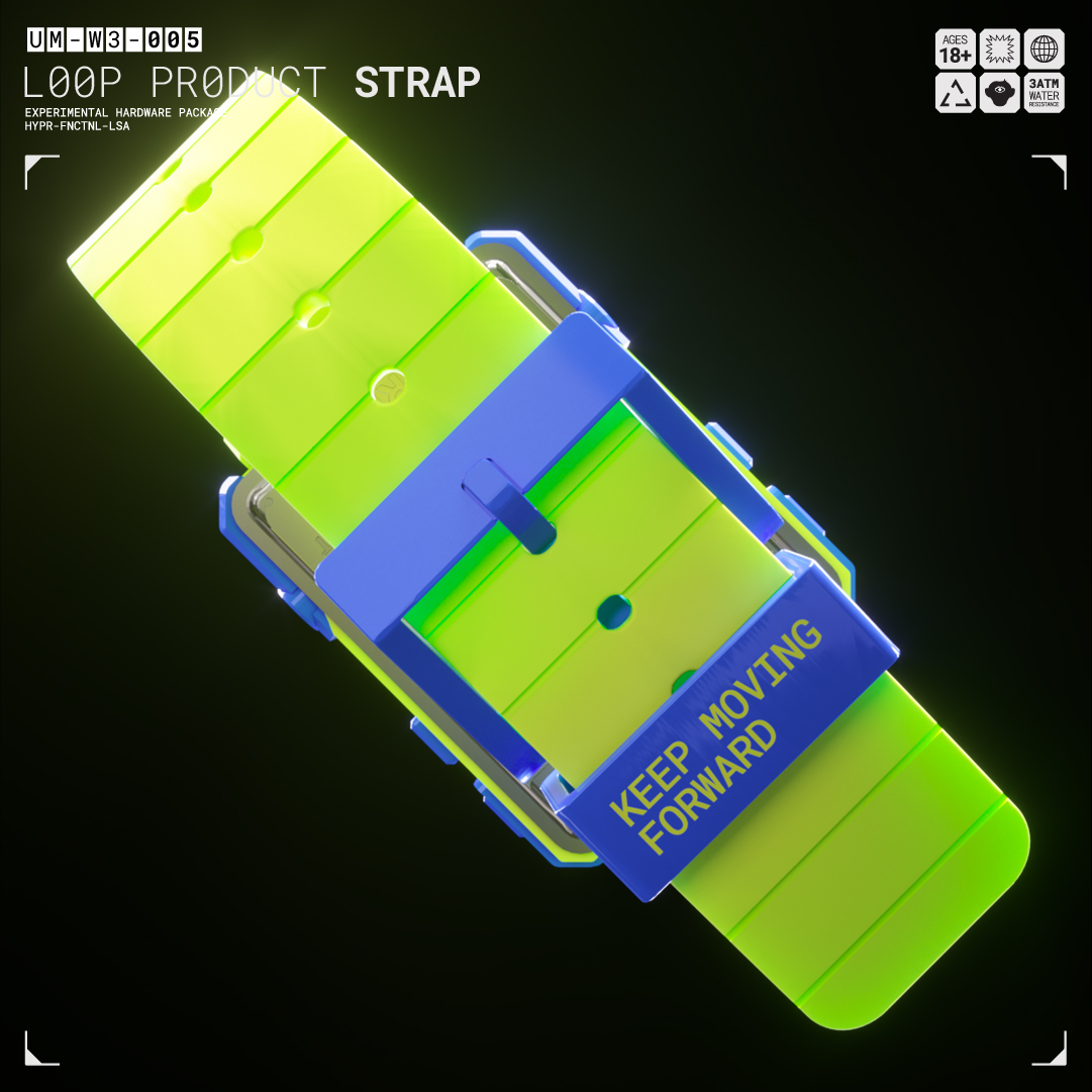
Strap Detail:
Instead of the expected branding, we placed our values on the strap, such as KEEP MOVING FORWARD. Coming from Cudi <3


*
Anotation and Symbolism:
The arrows represent the value of “KEEP MOVING FORWARD”. Complemented by a MONOSPACED Typeface

*
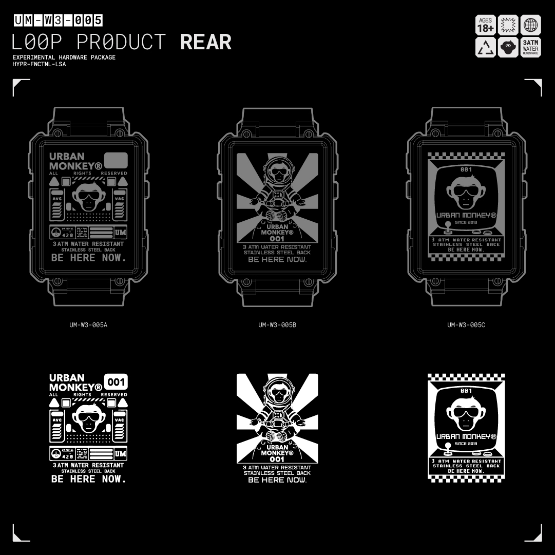
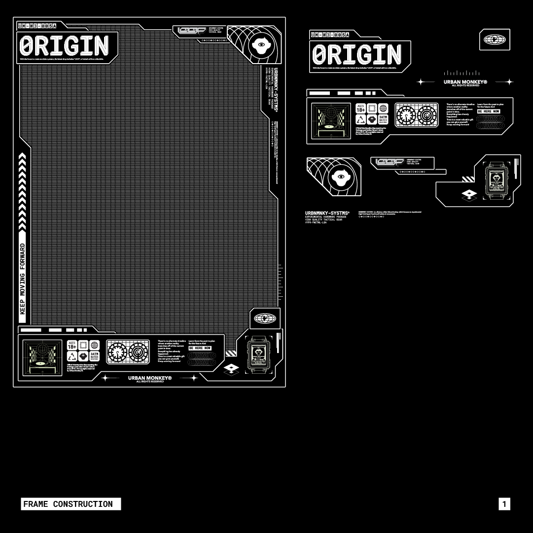
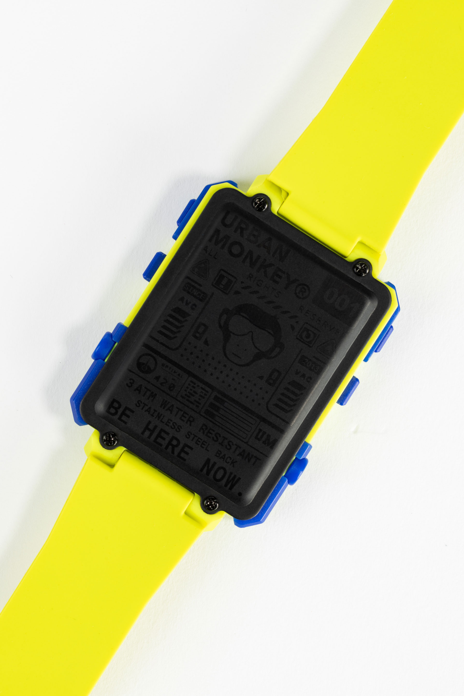
The Rear:
As a collectible, the back of the watch adopts a mini-poster approach that communicates the technical specs and serial number for the watch. Each watch has a number etched at the back.
//6
PRODUCT COMMUNICATION AND PLACEMENT

*
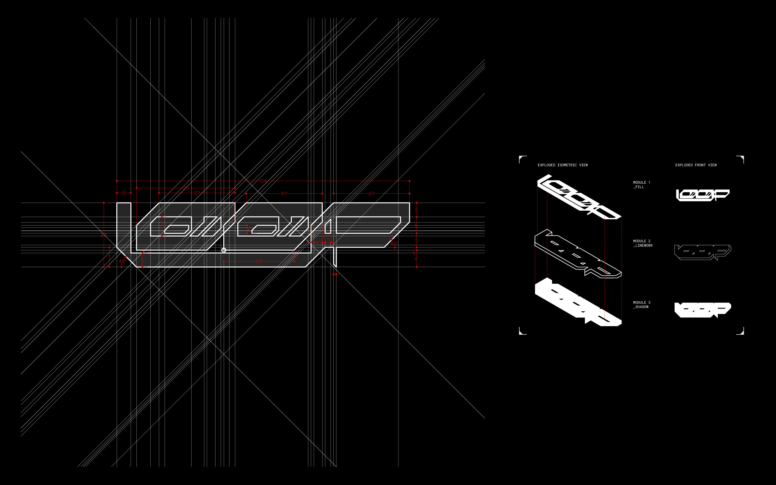
Typography:
The L00P lock-up was created in AutoCAD, featuring three simple chamfered proportions (Inspired by Quiquito). For our secondary type, we used Roboto Mono in uppercase. Mono fonts often associate with technology and the future. We applied drastic proportions and replaced the "O"s with "0"s, as the numbers are the most beautiful glyphs of a mono font.


*
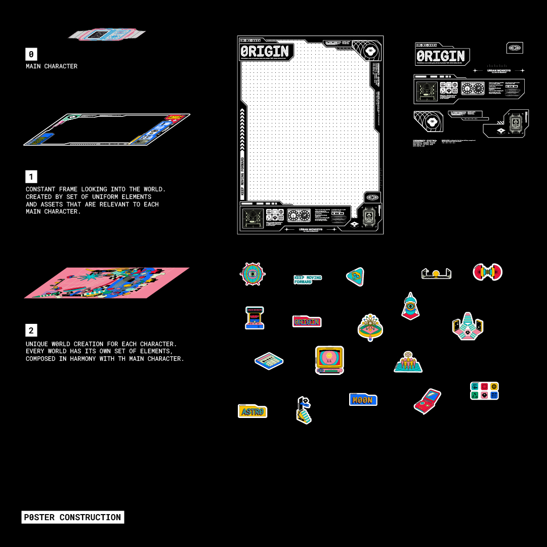
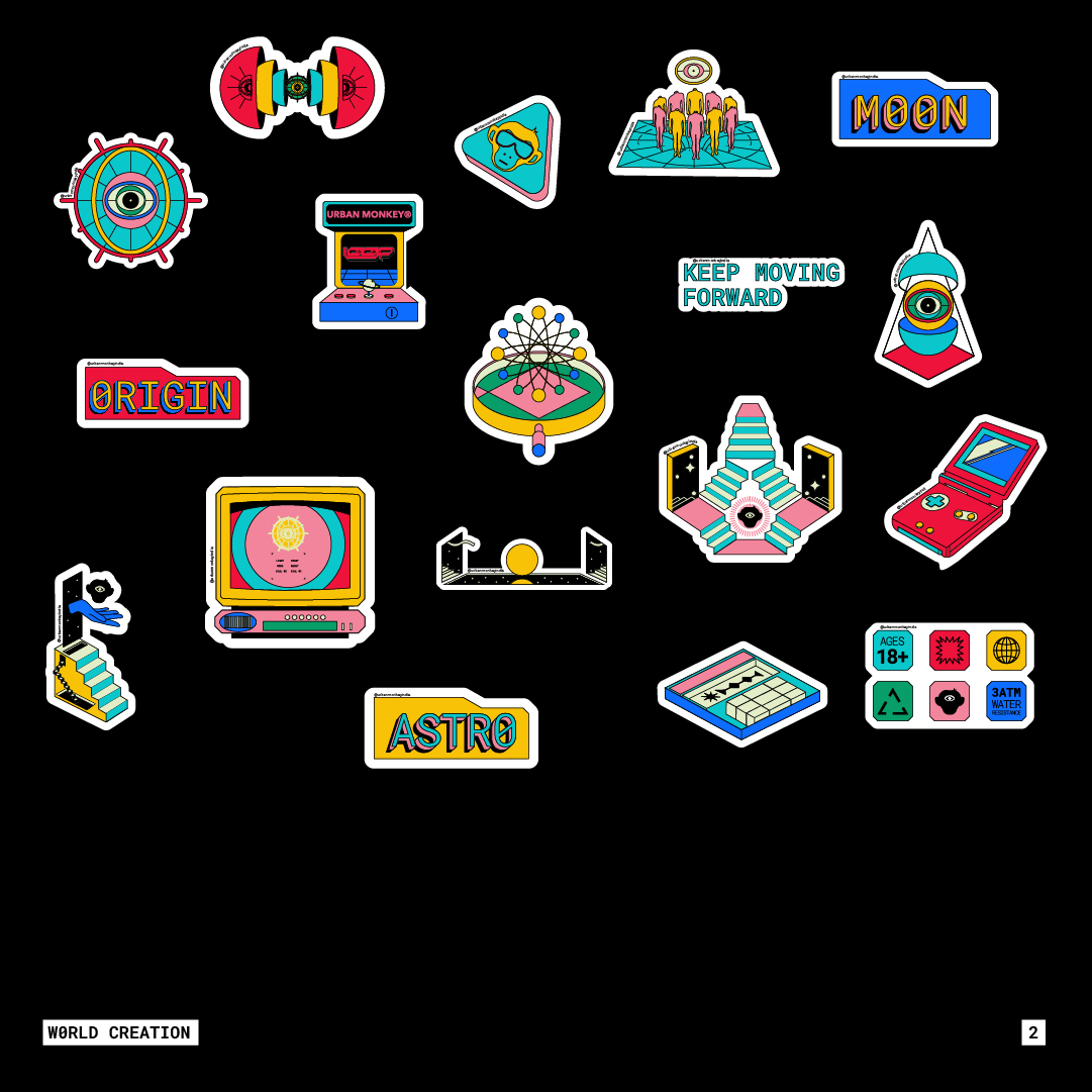
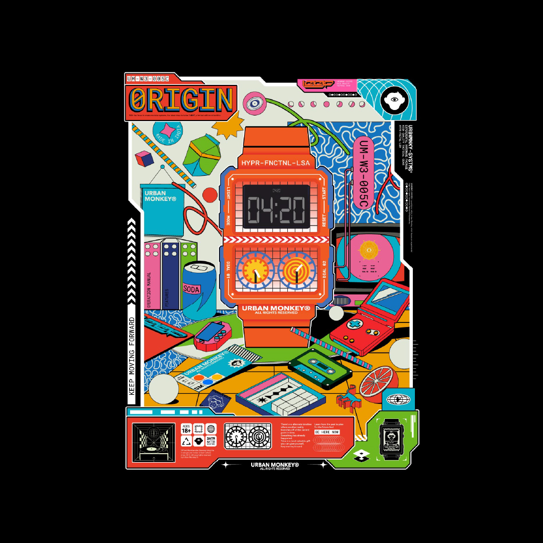
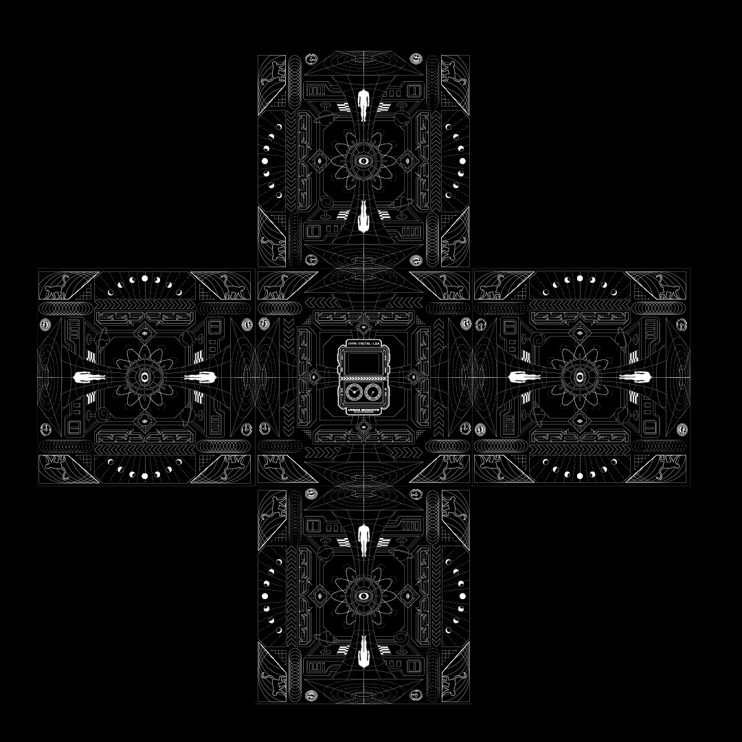
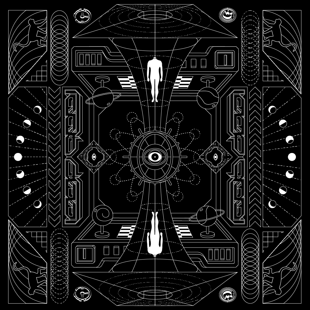
Posters:
The posters provide a window into the world of L00P. They feature objects inspired by the form of the watch, creating highly detailed, colorful retro vibes within a frame of the future. A constant frame represents the collection.

*
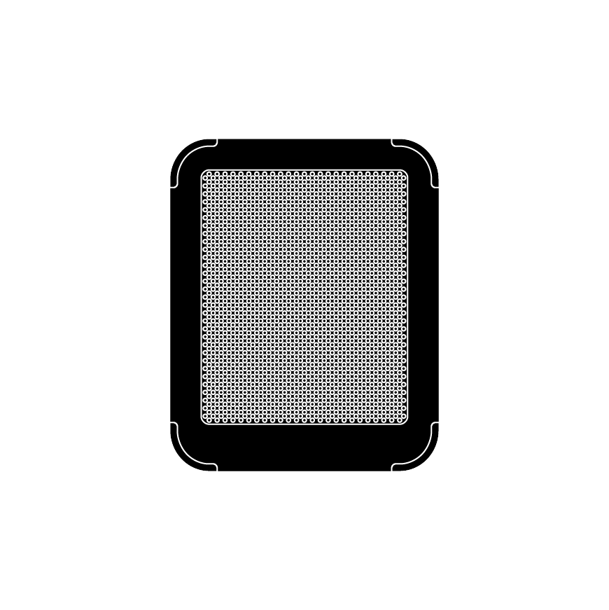
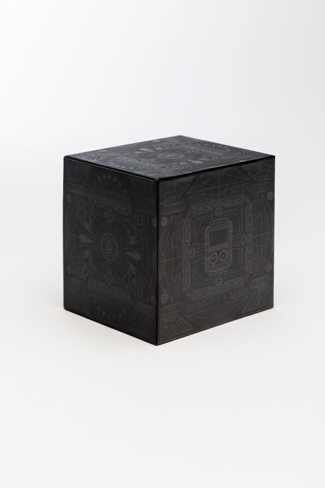
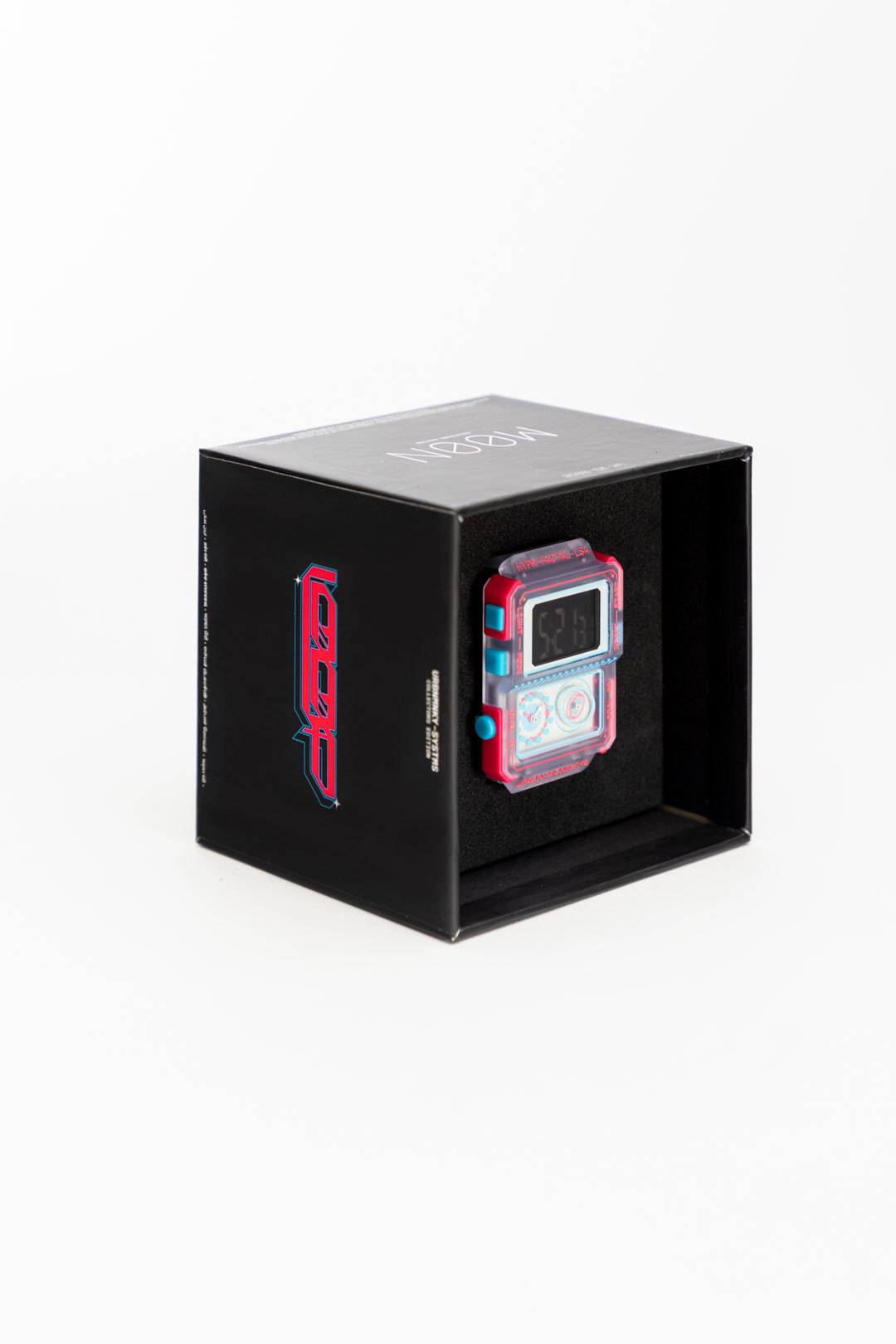
Packaging:
We went through multiple iterations for the packaging, initially drawing inspiration from Gundam models and skateboard tech decks (add images of the tech deck). As the watch is a wearable item, we had to consider the packaging's afterlife. The user should be able to wear the watch and store it back in the box for preservation.
Focusing on the tactile experience and visuals, we aimed to make the prints feel as they appeared. We designed a rigid box featuring minimalist line work print all over, finished with a blind U.V. coating and internal foam padding.

The packaging included three cards: an operational manual, tech specs for the collectible, and a certificate of authenticity with a custom number code printed on each which we scripted into the printing machine.
We are passionate about exploring and experimenting with print to create a memorable unboxing experience.

*
3D Motion Animation:

Existing as a palindrome or L00P, we created a 60-second concept video with no beginning and no end - just the NOW.
*
Product Photography:


//7
LEARNINGS
*
Navigating the Lack of Technical Knowledge:
As an architect, incorporating technical and functional aspects within the design process is essential.
This product explored how to convey feelings and values when needing more technical market knowledge. It demonstrates how storytelling through a functional product can create a ripple effect. It's like sharing innovative thought experiments through your art. Could the purpose of art be to share, engage in dialogue, and evoke emotions?
Problem-solving at macro and micro levels is a MAJOR part of the process. On the other hand, the aesthetic appeal of the product is a MINOR part. It's more about what the product represents and what it stands for.
With the right heart and intent, you can activate the right chords within your team and users. Creativity begins with the right intent. Creativity starts from within.
*
Breaking the Required Uniformity in Aesthetics:
Every design or branding project relies on the uniformity of forms or styles. I created diverse briefs for different team members and took it as a challenge to provide the right direction for maintaining uniformity within the various concepts. This was true even if the stylization and aesthetic for a particular creative were drastically different.
Despite the differences in aesthetics, techniques, or tools, finding a sense of unity and coherence is possible. The key is to strike the right balance and ensure that all elements come together harmoniously, ultimately falling into their rightful place.
L00P sold out on the day of its launch, in under 3 hours.
In 2024, 2 new upgraded variants will be launched.
TEAM
Mihir Wadhel [Product Research + Development]
Sunay Bhandare [Communication Design + Development]
Ritam Mukherjee [Communication Design]
Vinita Chandrashekhar [Illustrations]
Studio Phenom, Kunal Menon [3D Visualisation]
Executives
Yash Gangwal
Kanchi Choksi [Social Media Communications]
Varun Mehta [Creative Direction, Product Design, Identity & Communication Design]