In & Out
Client: Ameya Alwe, Akshay Kadam
Scope: Logo Design, Print design
Scope: Logo Design, Print design
Status: Complete
Collaborators: -
Collaborators: -

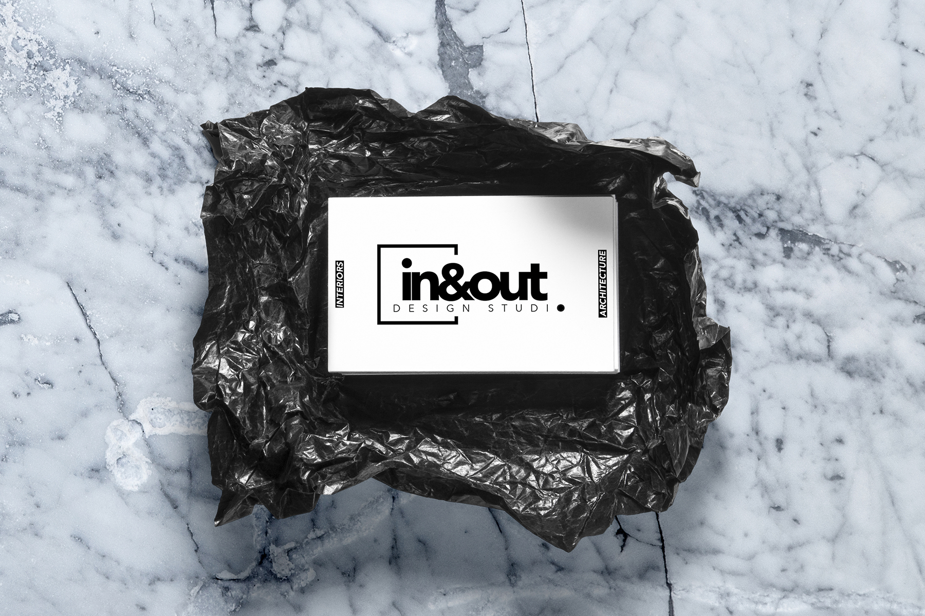
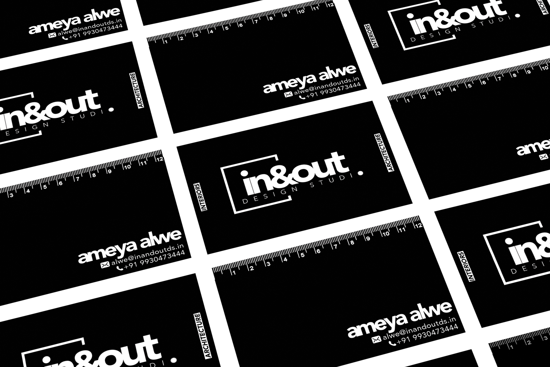
A quick and minimal logo done for a company that focuses on interior and architectural projects. The logo for in&out was sought primarily on the basis of communication through typeface. The monochrome tone aids in selective emphasis on the various textures, tweaks and especially type. The font used in this particular project was ‘Avenier Next’ with 0 kerning.
There is deliberately no kerning maintained to strongly represent and symbolize the closeness and familiarity between the client, brand and their work.
![]()
There is deliberately no kerning maintained to strongly represent and symbolize the closeness and familiarity between the client, brand and their work.
